![[Previous]](prev.gif) |
![[Contents]](contents.gif) |
![[Index]](keyword_index.gif) |
![[Next]](next.gif) |
|
|
|
|
 |
This version of this document is no longer maintained. For the latest documentation, see http://www.qnx.com/developers/docs. |
This chapter describes the widgets in the Photon library. It also includes:
If your browser supports image maps, you can select a widget from this diagram:
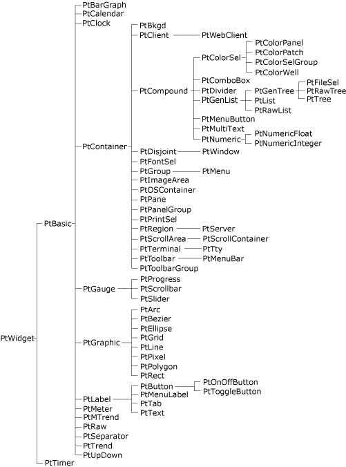
The Photon widget hierarchy.
 |
The widget hierarchy is important because classes inherit resources and behavior from their ancestors. When you're working with a particular class, be sure to look at the descriptions of its ancestors, too. |
The following table lists the Photon widget classes and the icons used in PhAB's widget palette:
| PhAB Icon | Class | Description |
|---|---|---|
|
PtArc | Elliptical arc |
|
PtBarGraph | Bar graph |
|
PtBasic | Superclass of basic resources for most widgets |
|
PtBezier | Bézier curve |
|
PtBkgd | Background of tiled images, gradients, or bitmaps |
|
PtButton | Button for initiating an action |
|
PtCalendar | Calendar |
| N/A | PtClient | Superclass for client widgets — not normally instantiated |
|
PtClock | Analog, digital, or LED clock |
|
PtColorPanel | Color panel |
|
PtColorPatch | Color patch for selecting a hue and shading or tint |
| N/A | PtColorSel | Superclass for color-selector widgets—not normally instantiated |
|
PtColorSelGroup | Group of color selectors |
|
PtColorWell | Rectangle that displays a color and lets you change it |
|
PtComboBox | Text-entry field with a list of choices |
| N/A | PtCompound | Superclass for compound widgets—not normally instantiated |
|
PtContainer | Superclass for container widgets |
| N/A | PtDisjoint | Superclass for disjoint widgets—not normally instantiated |
|
PtDivider | Widget that divides a given space among its child widgets and allows resizing |
|
PtEllipse | Ellipse |
|
PtFileSel | Tree widget for selecting files and directories |
|
PtFontSel | Widget for selecting font attributes |
| N/A | PtGauge | Superclass for gauge-like widgets—not normally instantiated |
| N/A | PtGenList | Superclass for list widgets—not normally instantiated |
| N/A | PtGenTree | Superclass for tree widgets—not normally instantiated |
| N/A | PtGraphic | Superclass for graphical widgets—not normally instantiated |
|
PtGrid | Grid pattern |
| N/A | PtGroup | Group—use PhAB's Group Together button to create this |
|
PtImageArea | An area for viewing an image |
|
PtLabel | A text, bitmap, or image label |
|
PtLine | Straight line (single segment) |
|
PtList | List of text items |
| N/A | PtMenu | Menu—use a Menu module instead |
|
PtMenuBar | Menubar that's placed at the top of a window |
|
PtMenuButton | Button that pops up a menu, or an item in a menu |
|
PtMeter | Meter widget |
|
PtMTrend | Medical trend widget |
|
PtMultitext | Multiple-line stylized text field |
| N/A | PtNumeric | Numeric field superclass—not normally instantiated |
|
PtNumericFloat | Floating-point numeric field |
|
PtNumericInteger | Integer field |
|
PtOnOffButton | Button that's either on or off |
|
PtOSContainer | Offscreen-context container, useful for drawing flicker-free images and animations |
|
PtPane | Container for organizing widgets |
|
PtPanelGroup | Container that manages panels |
|
PtPixel | Set of points |
|
PtPolygon | Set of connected line segments |
|
PtPrintSel | Compound widget for choosing printing options |
|
PtProgress | Progress bar |
|
PtRaw | Widget in which you can use low-level Pg drawing functions |
|
PtRawList | Raw list |
|
PtRawTree | Raw tree |
|
PtRect | Rectangle |
| N/A | PtRegion | Photon region—must be created with PtCreateWidget() |
| N/A | PtScrollArea | Superclass for scrolling widgets—not normally instantiated |
|
PtScrollBar | Scrollbar |
|
PtScrollContainer | Viewport for viewing a large virtual area |
|
PtSeparator | Separator for organizing widgets |
| N/A | PtServer | Server widget — must be created with PtCreateWidget() |
|
PtSlider | Numerical input mechanism with a range |
|
PtTab | Terminal emulator |
|
PtTerminal | Terminal emulator |
|
PtText | Single-line text field |
|
PtTimer | Timer |
|
PtToggleButton | Toggle button |
|
PtToolbar | Superclass for toolbar widgets |
|
PtToolbarGroup | Group of toolbars |
|
PtTree | Hierarchy tree |
|
PtTrend | Display of connected points that shift in a specified direction at the rate in which data is fed |
|
PtTty | Terminal device |
|
PtUpDown | Up/Down button |
|
PtWebClient | Widget for displaying web pages |
| N/A | PtWidget | Widget superclass—not normally instantiated |
| N/A | PtWindow | Window—use a PhAB window module instead |
You'll find the following sections in a typical widget-class description:
The classes a widget inherits its resources and behavior from.
The icon in PhAB's widget palette for the widget.
The name of the header file containing the resource manifests, data structures, and #define directives associated with the widget class.
How to use the widget. This section may include sample code as well as an example of the widget's appearance.
The new resources introduced by this widget class. This section describes the following for each resource:
The Pt types are:
This section lists the resources that the widget class inherits from its ancestors, or in the case of a compound widget, from its exported subordinate children. The default values that a widget class inherits can be overridden. The Inherited resources table contains the following columns of information:
The value in the Default override column may start with |=, as in the following example:
|=Pt_SELECTABLE | Pt_HIGHLIGHTED
This symbol indicates that the flags listed are added to the resource without destroying any flags already set in it (i.e. the new flags and the default value are combined in an OR operation).
A &=~ symbol means that one or more flags are cleared. In the following example, the Pt_SELECTABLE flag is added to the resource and the Pt_HIGHLIGHTED flag is cleared:
|=Pt_SELECTABLE &=~Pt_HIGHLIGHTED
If the widget does anything special with an inherited resource, it's described after the table.
This section describes the functions you can use to control the widget once it has been created.
|
|
|
|