![[Previous]](prev.gif) |
![[Contents]](contents.gif) |
![[Index]](keyword_index.gif) |
![[Next]](next.gif) |
|
|
|
|
 |
This version of this document is no longer maintained. For the latest documentation, see http://www.qnx.com/developers/docs. |
A container that manages panels
PtWidget → PtBasic → PtContainer → PtPanelGroup
For more information, see the diagram of the widget hierarchy.
<photon/PtPanelGroup.h>
A PtPanelGroup is a container that manages panels and optionally provides a method for you to switch between them.
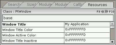
A PtPanelGroup widget as used in PhAB.
PtPanelGroup provides two modes to switch between panels:
You can make the PtPanelGroup switch automatically between these two selection modes as necessary, depending on the available space — single-tab mode is useful when there isn't much horizontal space. For more information, see Pt_ARG_PG_SELECTION_MODE.
You can populate a PtPanelGroup in the following ways, depending on your requirements:
 |
|
When you design the UI for your application, you can put container widgets (i.e. descendants of PtContainer) into a PtPanelGroup. PtPanelGroup manages these containers and incorporates them into the selection mechanism (i.e. it assigns tabs to them).
The panel group uses the Pt_ARG_TITLE resource for each container widget for that widget's tab title.
This method gives you complete control over the layout in an application-building environment (for example, PhAB). The drawback to this method is that it requires more memory at runtime, since all of the widgets in all of the panels exist for the lifetime of the PtPanelGroup.
To add panels to a PtPanelGroup in PhAB, select a container widget from the palette and click on the PtPanelGroup. The container is automatically sized to fit the panel group. When you add other panels, click on the top part of the panel group (i.e. above the existing panels and tabs). Use the Module Tree control panel to verify that the panels are where you want them (for more information, see the chapter on PhAB's environment in the Photon Programmer's Guide).
To flip between existing panels in PhAB, select the PtPanelGroup and change Pt_ARG_PG_CURRENT_INDEX to the number of the panel you wish to edit.
At runtime, your application's code can clear and repopulate the PtPanelGroup when a new panel is selected. This method might save a significant amount of memory at runtime, but it's less convenient than the first method, since it requires some code to intercept the panel switching and to repopulate the panel group's display.
This method yields slower switches, since your application must clear the panel group's display and then reconstruct it each time you select a different panel. However, you can design the individual panels in PhAB (as picture modules) and then use PtClearWidget() and ApCreateModule() whenever you switch panels.
If you choose this method to populate a PtPanelGroup, use the Pt_ARG_PG_PANEL_TITLES resource to specify number of panels and their titles.
For an example of using this method, see Pt_CB_PG_PANEL_SWITCHING.
PtPanelGroup defines its own margins in addition to the margin width defined by the PtBasic widget class. There are separate left, right, top, and bottom margins, which are specified using these resources:
These margins are cumulative, so that the actual margin of one edge of the widget is the corresponding resource value added to the margin width.
Panels are indexed from 0 through n - 1, where n is the number of panels managed by the PtPanelGroup. An index value of Pt_PG_INVALID may be interpreted as a “NULL” value.
|
The panel indexes indicate the order of panels in the PtPanelGroup; they change when panels are added, removed, or reordered. |
| Resource | C type | Pt type | Default |
|---|---|---|---|
| Pt_ARG_MARGIN_BOTTOM | unsigned short | Scalar | 5 |
| Pt_ARG_MARGIN_LEFT | unsigned short | Scalar | 5 |
| Pt_ARG_MARGIN_RIGHT | unsigned short | Scalar | 5 |
| Pt_ARG_MARGIN_TOP | unsigned short | Scalar | 3 |
| Pt_ARG_PG_CURRENT | char * | String | NULL |
| Pt_ARG_PG_CURRENT_INDEX | uint16_t | Scalar | Pt_PG_INVALID |
| Pt_ARG_PG_FLAGS | unsigned short | Flag | 0x0 |
| Pt_ARG_PG_OVERLAP_THRESHOLD | unsigned char | Scalar | 128 |
| Pt_ARG_PG_PANEL_TITLES | char *, unsigned short | Array | NULL |
| Pt_ARG_PG_SELECTION_MODE | unsigned char | Scalar | Pt_PG_AUTO |
| Pt_CB_PG_PANEL_SWITCHING | PtCallback_t * | Link | NULL |
| C type | Pt type | Default |
|---|---|---|
| unsigned short | Scalar | 5 |
The amount of space between the bottom of the panel group's canvas and the canvas defined by the basic widget.
| C type | Pt type | Default |
|---|---|---|
| unsigned short | Scalar | 5 |
The amount of space between the left side of the panel group's canvas and the canvas defined by the basic widget.
| C type | Pt type | Default |
|---|---|---|
| unsigned short | Scalar | 5 |
The amount of space between the right side of the panel group's canvas and the canvas defined by the basic widget.
| C type | Pt type | Default |
|---|---|---|
| unsigned short | Scalar | 3 |
The amount of space between the top of the panel group's canvas and the canvas defined by the basic widget.
| C type | Pt type | Default |
|---|---|---|
| char * | String | NULL |
The name of the currently selected panel.
You can set this resource to switch to another panel. If more than one panel has the same title, the widget switches to the first one it finds with the specified title.
| C type | Pt type | Default |
|---|---|---|
| uint16_t | Scalar | Pt_PG_INVALID |
The index of the currently selected panel, where 0 indicates the first panel. You can set this resource to switch to another panel.
| C type | Pt type | Default |
|---|---|---|
| unsigned short | Flag | 0x0 |
This resource controls the behavior of the PtPanelGroup. Possible values are:
Panels that are dragged away from the PtPanelGroup are reparented to another container if one is present at the drop site and it also supports drag-and-drop operations. Otherwise a popup window is created at the drop site with a new PtPanelGroup to display the panel.
If the panel group is populated at runtime, drag-and-drop isn't supported and this flag is ignored.
| C type | Pt type | Default |
|---|---|---|
| unsigned char | Scalar | 128 |
The amount by which tabs can overlap before switching to/from single-tab selection mode (providing the selection type is set to Pt_PG_AUTO).
This quantity is specified as an integer between 0 and 255 and represents a fraction of tab width. For example, a value of 0 doesn't let tabs overlap at all, while a value of 128 lets tabs overlap by up to half their width.
|
If you set this to too large a value, it might be difficult to use the tabs. |
| C type | Pt type | Default |
|---|---|---|
| char *, unsigned short | Array | NULL |
An array of strings that represent the titles for the panels managed by this PtPanelGroup.
|
If the PtPanelGroup is populated with multiple containers, Pt_ARG_PG_PANEL_TITLES is a read-only resource. |
When you get the value of this resource, it gives the titles of the panels and the number of panels, regardless of how the panel group was populated.
| C type | Pt type | Default |
|---|---|---|
| unsigned char | Scalar | Pt_PG_AUTO |
This resource indicates the method you'll use to select panels. One of:
| C type | Pt type | Default |
|---|---|---|
| PtCallback_t * | Link | NULL |
A list of PtCallback_t structures that define the callbacks that are invoked when a new panel is selected. This resource lets you clear and repopulate the display container (if necessary), set up resources of existing panels (if applicable), or prevent the switch by returning a value other than Pt_CONTINUE.
If the widget has the Pt_CALLBACKS_ACTIVE bit set in its Pt_ARG_FLAGS resource, these callbacks are also invoked when your application changes Pt_ARG_PG_CURRENT or Pt_ARG_PG_CURRENT_INDEX by calling PtSetResource() or PtSetResources().
Each callback is passed a PtCallbackInfo_t structure that contains at least the following members:
|
The panel indexes indicate the order of panels in the PtPanelGroup; they change when panels are added, removed, or reordered. |
These callbacks should return Pt_CONTINUE to permit the switch to occur. Returning a value other than Pt_CONTINUE prevents the switch from taking place. This is useful if you want to “lock” the PtPanelGroup to the currently selected panel.
For example, to clear and repopulate a PtPanelGroup at runtime in a Pt_CB_PG_PANEL_SWITCHING callback:
int panelswitch_cb( PtWidget_t *widget,
                    ApInfo_t *apinfo,
                    PtCallbackInfo_t *cbinfo)
{
    PtPanelGroupCallback_t *pgcb =
      (PtPanelGroupCallback_t*)(cbinfo->cbdata);

    /* We use some arbitrary user function that returns
       nonzero if switch is ok */

    if(!switch_ok(widget))
        /* Prevent the switch from happening */
        return(Pt_END);

    /* Clear the PtPanelGroup display */

    PtClearWidget(widget);

    /* Here we use the panel indexes rather than titles
       to figure out current panel. This is deterministic,
       provided the Pt_ARG_PG_PANEL_TITLES resource
       isn't changed. */

    switch(pgcb->new_panel_index)
    {
        case 0:

            /* Populate the display.  Note that we provide
               widget (the PtPanelGroup pointer) as the
               parent.  In this case, PtPanelGroup accepts
               the widgets as children. */

            ApCreateModule(ABM_pic_module_0,widget,NULL);
            PtReRealizeWidget( widget );
            break;

        case 1:

            ApCreateModule(ABM_pic_module_1,widget,NULL);
            PtReRealizeWidget( widget );
            break;

        …
    }

    return(Pt_CONTINUE);    /* Let the switch proceed */
}
If the widget modifies an inherited resource, the “Default override” column indicates the new value. This modification affects any subclasses of the widget.
The PtPanelGroup widget defines the following convenience functions:
|
|
|
|