![[Previous]](prev.gif) |
![[Contents]](contents.gif) |
![[Index]](keyword_index.gif) |
![[Next]](next.gif) |
|
|
|
|
 |
This version of this document is no longer maintained. For the latest documentation, see http://www.qnx.com/developers/docs. |
A color panel
PtWidget → PtBasic → PtContainer → PtCompound → PtColorSel → PtColorPanel
For more information, see the diagram of the widget hierarchy.
<photon/PtColorPanel.h>
A composite color selector that provides color selection via a combination of the following optional mechanisms:
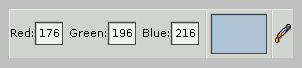
A PtColorPanel widget.
| Resource | C type | Pt type | Default |
|---|---|---|---|
| Pt_ARG_CPANEL_FLAGS | uint16_t | Flag | Pt_CPANEL_SHOW_FIELDS | Pt_CPANEL_SHOW_WELL | Pt_CPANEL_SHOW_DROPPER |
| C type | Pt type | Default |
|---|---|---|
| uint16_t | Flag | Pt_CPANEL_SHOW_FIELDS | Pt_CPANEL_SHOW_WELL | Pt_CPANEL_SHOW_DROPPER |
Flags that affect the appearance and behavior of the color panel. Bits include:
If the widget modifies an inherited resource, the “Default override” column indicates the new value. This modification affects any subclasses of the widget.
|
|
|
|