![[Previous]](prev.gif) |
![[Contents]](contents.gif) |
![[Index]](keyword_index.gif) |
![[Next]](next.gif) |
|
|
|
|
 |
This version of this document is no longer maintained. For the latest documentation, see http://www.qnx.com/developers/docs. |
A widget for choosing a value from a range
PtWidget → PtBasic → PtGauge → PtSlider
For more information, see the diagram of the widget hierarchy.
<photon/PtSlider.h>
A PtSlider widget lets you choose numerical values within a specified range from minimum to maximum.
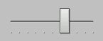
A PtSlider widget.
A slider consists of a narrow trough (representing the total range), a movable handle, and optional tick marks. The handle — which appears on top of the trough — represents the current position within the range. You can specify the size of the handle by setting Pt_ARG_SLIDER_HANDLE_WIDTH.
If you want to create your own style of slider, you can specify:
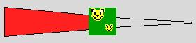
A PtSlider widget with a custom handle and trough.
You need to set Pt_ARG_SLIDER_FLAGS appropriately to use these images.
When you press the mouse button, the result depends on the location of the pointer.
| If the pointer is: | Then: |
|---|---|
| In the trough | The handle moves up or down one slider multiple |
| On the handle | A drag is started |
If you hold down the Ctrl key and click in the trough, the handle jumps to the position of the pointer.
| If you press: | The handle moves: |
|---|---|
| ↑ | Up one increment |
| ↓ | Down one increment |
| → | Right one increment |
| ← | Left one increment |
| Pg Up | Up/right one “page” |
| Pg Down | Down/left one “page” |
| Home | To the minimum value |
| End | To the maximum value |
where:
| Resource | C type | Pt type | Default |
|---|---|---|---|
| Pt_ARG_SLIDER_FLAGS | short int | Flag | 0 |
| Pt_ARG_SLIDER_HANDLE_COLOR | PgColor_t | Scalar | PgGrey(217) |
| Pt_ARG_SLIDER_HANDLE_WIDTH | short int | Scalar | 15 |
| Pt_ARG_SLIDER_IMAGE | PhImage_t * | Image | NULL |
| Pt_ARG_SLIDER_INCREMENT | unsigned short | Scalar | 1 |
| Pt_ARG_SLIDER_MULTIPLE | unsigned short | Scalar | 10 |
| Pt_ARG_SLIDER_TICK_MAJOR_DIV | unsigned long | Scalar | 10 |
| Pt_ARG_SLIDER_TROUGH_IMAGE1 | PhImage_t * | Image | NULL |
| Pt_ARG_SLIDER_TROUGH_IMAGE2 | PhImage_t * | Image | NULL |
| Pt_CB_SLIDER_MOVE | PtCallback_t * | Link | NULL |
| C type | Pt type | Default |
|---|---|---|
| short int | Flag | 0 |
Valid flags:
| C type | Pt type | Default |
|---|---|---|
| PgColor_t | Scalar | PgGrey(217) |
The color of the slider handle. See PgColor_t in the Photon Library Reference.
| C type | Pt type | Default |
|---|---|---|
| short int | Scalar | 15 |
The width of the slider handle.
| C type | Pt type | Default |
|---|---|---|
| PhImage_t * | Image | NULL |
You can use this resource to create your own style of slider. It specifies an image to be used as the slider's handle. For more information about the PhImage_t structure, see the Photon Library Reference.
| C type | Pt type | Default |
|---|---|---|
| unsigned short | Scalar | 1 |
The slider increment when you press the cursor keys.
| C type | Pt type | Default |
|---|---|---|
| unsigned short | Scalar | 10 |
The slider increment when you click the pointer button in the trough, or you press Pg Up or Pg Down.
| C type | Pt type | Default |
|---|---|---|
| unsigned long | Scalar | 10 |
The number of major divisions.
| C type | Pt type | Default |
|---|---|---|
| PhImage_t * | Image | NULL |
You can use these resources to create your own style of slider. Use them to specify the images to be displayed as the trough. The slider becomes the same size as Pt_ARG_SLIDER_TROUGH_IMAGE1.
If you specify just Pt_ARG_SLIDER_TROUGH_IMAGE1, it's used as the background for the entire slider.
If you specify both images:
 |
If the image specified by Pt_ARG_SLIDER_TROUGH_IMAGE2 is a different size than the one specified by Pt_ARG_SLIDER_TROUGH_IMAGE1, you should use a non-transparent color to avoid drawing artifacts when the handle position changes. |
By default, the maximum value is on the right side of a horizontal slider. The widget displays the first image to the left of the handle, and the second image to the right. If you set Pt_GAUGE_MAX_ON_LEFT in the Pt_ARG_GAUGE_FLAGS resource (inherited from PtGauge), the widget displays the first image to the right of the handle, and the second image to the left.
You get similar results with a vertical slider if you set Pt_GAUGE_MAX_ON_TOP.
|
The images aren't rotated if you change the slider's Pt_ARG_ORIENTATION resource (inherited from PtGauge). You should create horizontal images for a horizontal slider, and vertical images for a vertical slider. |
For more information about the PhImage_t structure, see the Photon Library Reference.
| C type | Pt type | Default |
|---|---|---|
| PtCallback_t * | Link | NULL |
A list of PtCallback_t structures that define the callbacks that the slider invokes when the handle position changes.
If you've set the Pt_CALLBACKS_ACTIVE bit set in the widget's Pt_ARG_FLAGS resource, these callbacks are also invoked when your application changes the handle position by calling PtSetResource() or PtSetResources().
Each callback is passed a PtCallbackInfo_t structure that contains at least the following members:
These callbacks should return Pt_CONTINUE.
If the widget modifies an inherited resource, the “Default override” column indicates the new value. This modification affects any subclasses of the widget.
|
|
|
|