[Previous] [Contents] [Index] [Next]

PtOnOffButton

An on/off button that can be set or unset

Class hierarchy:

PtWidget -> PtBasic -> PtLabel -> PtToggleButton -> PtOnOffButton

For more information, see the diagram of the widget hierarchy.

PhAB icon:

PtOnOffButton button in PhAB

Public header:

<photon/PtOnOffButton.h>

Description:

A PtOnOffButton widget displays an on/off button that can be set or unset. Instances of this class of widget are typically used in exclusive or nonexclusive groups.


PtOnOffButton


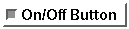
A PtOnOffButton widget.


New resources:

Resource C type Pt type Default
Pt_ARG_ONOFF_STATE short Scalar 0 (off)
Pt_CB_ONOFF_NEW_VALUE PtCallback_t * Link NULL

Pt_ARG_ONOFF_STATE

C type Pt type Default
short Scalar 0 (off)

Indicates the current state of the on/off button. If the button is off, this resource has a value of 0; if the button is on, this resource has a nonzero value.

Pt_CB_ONOFF_NEW_VALUE

C type Pt type Default
PtCallback_t * Link NULL

A list of callbacks that the widget invokes when the state of the on/off button changes.

These callbacks are also invoked whenever a call to PtSetResources() changes the state of the button, provided the Pt_CALLBACKS_ACTIVE flag is set (see the description of Pt_ARG_FLAGS under PtWidget).

Each callback is passed a PtCallbackInfo_t structure that contains at least the following members:

reason
Pt_CB_ONOFF_NEW_VALUE
reason_subtype
0 (not used).
event
The event that caused this callback to be invoked.
cbdata
A pointer to a PtOnOffButtonCallback_t structure that contains at least the following member:
int state;
The current state of the on/off button.

These callbacks should return Pt_CONTINUE.

Inherited resources:

If the widget modifies an inherited resource, the "Default override" column indicates the new value. This modification affects any subclasses of the widget.

Resource Inherited from Default override
Pt_ARG_ACCEL_KEY PtLabel
Pt_ARG_AREA PtWidget
Pt_ARG_BALLOON_COLOR PtLabel
Pt_ARG_BALLOON_FILL_COLOR PtLabel
Pt_ARG_BALLOON_POSITION PtLabel
Pt_ARG_BANDWIDTH_THRESHOLD PtBasic Not used by this class.
Pt_ARG_BITMAP_CURSOR PtWidget
Pt_ARG_BORDER_WIDTH PtWidget 0
Pt_ARG_BOT_BORDER_COLOR PtBasic
Pt_ARG_COLOR PtBasic
Pt_ARG_CURSOR_COLOR PtWidget
Pt_ARG_CURSOR_TYPE PtWidget
Pt_ARG_DATA PtWidget
Pt_ARG_DIM PtWidget
Pt_ARG_EFLAGS PtWidget
Pt_ARG_FILL_COLOR PtBasic
Pt_ARG_FILL_PATTERN PtBasic
Pt_ARG_FLAGS PtWidget |=Pt_SELECTABLE
&=~Pt_TOGGLE
Pt_ARG_HELP_TOPIC PtWidget
Pt_ARG_HIGHLIGHT_ROUNDNESS PtBasic
Pt_ARG_HORIZONTAL_ALIGNMENT PtLabel
Pt_ARG_INDICATOR_COLOR PtToggleButton Pg_MGRAY
Pt_ARG_INDICATOR_DEPTH PtToggleButton
Pt_ARG_INDICATOR_HEIGHT PtToggleButton
Pt_ARG_INDICATOR_TYPE PtToggleButton
Pt_ARG_INDICATOR_WIDTH PtToggleButton
Pt_ARG_LABEL_BALLOON PtLabel
Pt_ARG_LABEL_DATA PtLabel
Pt_ARG_LABEL_FLAGS PtLabel
Pt_ARG_LABEL_TYPE PtLabel
Pt_ARG_LINE_SPACING PtLabel
Pt_ARG_MARGIN_BOTTOM PtLabel
Pt_ARG_MARGIN_HEIGHT PtBasic
Pt_ARG_MARGIN_LEFT PtLabel
Pt_ARG_MARGIN_RIGHT PtLabel
Pt_ARG_MARGIN_TOP PtLabel
Pt_ARG_MARGIN_WIDTH PtBasic
Pt_ARG_POS PtWidget
Pt_ARG_RESIZE_FLAGS PtWidget Pt_RESIZE_XY_AS_REQUIRED
Pt_ARG_SET_COLOR PtToggleButton Pg_GREEN
Pt_ARG_SET_FILL PtToggleButton Not used by this class.
Pt_ARG_SPACING PtToggleButton
Pt_ARG_TEXT_FONT PtLabel
Pt_ARG_TEXT_STRING PtLabel
Pt_ARG_TOP_BORDER_COLOR PtBasic
Pt_ARG_TRANS_PATTERN PtBasic
Pt_ARG_UNDERLINE_TYPE PtLabel
Pt_ARG_UNDERLINE1 PtLabel
Pt_ARG_UNDERLINE2 PtLabel
Pt_ARG_USER_DATA PtWidget
Pt_ARG_VERTICAL_ALIGNMENT PtLabel
Pt_CB_ACTIVATE PtBasic
Pt_CB_ARM PtBasic
Pt_CB_BLOCKED PtWidget
Pt_CB_DESTROYED PtWidget
Pt_CB_DISARM PtBasic
Pt_CB_GOT_FOCUS PtBasic
Pt_CB_HOTKEY PtWidget
Pt_CB_LOST_FOCUS PtBasic
Pt_CB_MENU PtBasic
Pt_CB_RAW PtWidget
Pt_CB_REALIZED PtWidget
Pt_CB_REPEAT PtBasic
Pt_CB_UNREALIZED PtWidget

[Previous] [Contents] [Index] [Next]