![[Previous]](image-lib/prev.gif) |
![[Contents]](image-lib/contents.gif) |
![[Index]](image-lib/keyword_index.gif) |
![[Next]](image-lib/next.gif) |
|
|
|
|
A toggle switch that's either off or on
PtWidget --> PtBasic --> PtLabel --> PtToggleButton
For more information, see the diagram of the widget hierarchy.

<photon/PtToggleButton.h>
A PtToggleButton widget is like a toggle switch, although it behaves like a button. It has on and off states, and pressing the button inverts the current state of the button.
Various button styles supported by PtToggleButton.
Like PtButton pushbuttons, toggle buttons inherit resources from the PtLabel class. Therefore, you specify the label for toggle buttons the same way you do for label and button widget classes.
A toggle button is displayed as a button with its label beside it. The button is either set or unset. Normally the button will appear recessed when it's set. You can control this appearance with the Pt_ARG_SET_COLOR resource, which specifies the fill color for the button's interior when the button is set. This resource is ignored if the value of the Pt_ARG_SET_FILL resource isn't set to Pt_TRUE.
To determine whether or not the button is set, check the:
A group can control how several toggle buttons behave together. Toggles placed within a group can behave like the channel selector buttons on an analog car radio. Only one of the buttons can be set at any given time. Selecting any button to set it automatically clears the button that's currently set.
To make the group widget enforce radio button behavior in its toggle button children, you must set the Pt_GROUP_EXCLUSIVE bit within the Pt_ARG_GROUP_FLAGS resource of the group.
By default, a toggle button indicator displays the toggle's state as a raised or recessed square. When the toggle is set, the square is recessed. If you want a different appearance, consider a raised or recessed diamond. For this appearance, set the Pt_ARG_INDICATOR_TYPE resource to Pt_ONE_OF_MANY on each of the toggle buttons that are placed in the group with radio button behavior.
The following example shows how to create a group of three radio buttons, giving each the appropriate appearance:
PtSetArg ( &argt[n], Pt_ARG_GROUP_FLAGS, Pt_TRUE, Pt_GROUP_EXCLUSIVE );
n++;
PtSetArg ( &argt[n], Pt_ARG_GROUP_ORIENTATION, Pt_GROUP_VERTICAL, 0 ) ;
n++;
group = PtCreateWidget (PtGroup, parent, n, argt );
PtSetArg ( &argt[0], Pt_ARG_TEXT_STRING, "Button", 0 ) ;

PtCreateWidget ( PtButton, parent, 1, argt ) ;
PtCreateWidget ( PtButton, parent, 1, argt ) ;
PtCreateWidget ( PtButton, parent, 1, argt ) ;

PtRealizeWidget ( group ) ;
| Resource | C type | Pt type | Default |
|---|---|---|---|
| Pt_ARG_INDICATOR_COLOR | PgColor_t | Scalar | Pg_GRAY |
| Pt_ARG_INDICATOR_DEPTH | unsigned short | Scalar | 2 |
| Pt_ARG_INDICATOR_HEIGHT | unsigned short | Scalar | See below |
| Pt_ARG_INDICATOR_TYPE | unsigned char | Scalar | Pt_N_OF_MANY |
| Pt_ARG_INDICATOR_WIDTH | unsigned short | Scalar | See below |
| Pt_ARG_SET_COLOR | PgColor_t | Scalar | PgGray(170) |
| Pt_ARG_SET_FILL | unsigned char | Scalar | Pt_TRUE |
| Pt_ARG_SPACING | unsigned short | Scalar | 4 |
| C type | Pt type | Default |
|---|---|---|
| PgColor_t | Scalar | Pg_GRAY |
The default fill color for the toggle button's indicator.
| C type | Pt type | Default |
|---|---|---|
| unsigned short | Scalar | 2 |
The border width, in pixels, of the indicator box.
| C type | Pt type | Default |
|---|---|---|
| unsigned short | Scalar | See below |
The height of the indicator box. By default, the height is determined by the font size.
| C type | Pt type | Default |
|---|---|---|
| unsigned char | Scalar | Pt_N_OF_MANY |
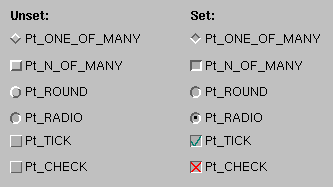
Determines how the indicator is drawn. Possible values:
Here's how these types look, both set and unset:
| C type | Pt type | Default |
|---|---|---|
| unsigned short | Scalar | See below |
The width of the indicator box. By default, the width is determined by the font size.
| C type | Pt type | Default |
|---|---|---|
| PgColor_t | Scalar | PgGray(170) |
The background color used when the button is set (pressed in).
| C type | Pt type | Default |
|---|---|---|
| unsigned char | Scalar | Pt_TRUE |
Indicates whether or not Pt_ARG_SET_COLOR will be used. Possible values:
| C type | Pt type | Default |
|---|---|---|
| unsigned short | Scalar | 4 |
The distance in pixels between the toggle indicator and the text label.
If the widget modifies an inherited resource, the "Default override" column indicates the new value. This modification affects any subclasses of the widget.
|
|
|
|