This chapter describes PhAB's environment in more detail, and
how you can customize it.
This chapter includes:
Across the top of PhAB's workspace you'll see the following menubar:

PhAB's menubar.
The menus include:
Commands that deal with your application and its files:
- New
- Standalone PhAB only*. Create a new application;
see “Creating an
application” in the Working with Applications chapter.
- Open
- Standalone PhAB only*. Open an existing application;
see “Opening an
application” in the Working with Applications chapter. This
command is also available through PhAB's
toolbars.
- Close
- Standalone PhAB only*. Close the current application;
see “Closing an
application” in the Working with Applications chapter.
- Revert
- Discard any changes and
re-load the project from the last saved version.
- Save
Save As
- Save the current application,
under the same or a different name; see “Saving an application” in the Working with Applications chapter. The
Save command is also available through PhAB's
toolbars. Save As is available in Standalone PhAB only*.
- Import
- Import files created by other applications; see “Importing PhAB modules
from other applications” in the Working with Applications chapter.
- Export
- Export the code used to create a module in a file called module.code;
see “Export files” in the Working with Applications chapter.
- Exit
- End your current PhAB session. PhAB prompts you if there
are any changes that you haven't yet saved.
This menu also lists the last few applications that you edited.
*When using PhAB in the IDE, projects are managed
from the IDE, so these menu items are disabled. For more information
see “Creating
a QNX Photon Appbuilder Project”, in the Developing Photon Applications chapter
of the IDE User's Guide.
Commands for editing widgets:
- Undo
Redo
- Undo and redo an operation, including:
- creating, deleting, moving, resizing, aligning, and selecting a
widget
- changing the order of widgets
- changing a callback resource — PhAB can't undo/redo
any changes you make to a callback function's code
- pasting
- joining and splitting a group
- editing a resource
- importing images, XBMs, and modules.
- changing a widget's class, matching widget resources and callbacks,
and transferring widgets
The text Undo and Redo menu items changes depending
on the current operation.
- Cut
Copy
Paste
- Cut and copy widgets to the clipboard, and paste them from
it; see “Clipboard” in the Creating Widgets in PhAB chapter. These operations
also apply to module links.
- Move Into
- Move a widget from one container to another; see “Transferring widgets
between containers” in the Creating Widgets in PhAB chapter.
- Delete
- Delete a widget without saving it on the clipboard; see “Deleting widgets” in the Creating Widgets in PhAB chapter.
- Select All
- Select all the widgets in the current module
- Select All Children
- Select all the children widgets in the current selected widget
or module.
- Deselect
- Deselect the current widget or widgets. This option also
selects the current module.
- Find...
- Display the Find dialog, which allows you to do
find widgets in the current application by name, type, contained
text, called function, or link.
- Add Widget Class...
- Add a brand new widget class to the application
- Templates...
- Customize PhAB's widget palettes. You can create new palette folders,
add widgets to a folder, delete widgets, and change icons, colors
and other properties.
- Preferences
- PhAB preferences, such as colors, editing commands, and styles
of resource names.
Many of these commands also appear in PhAB's
toolbars.
Commands for building and configuring a project:
- Add Window
- Open the New Window Style dialog to add a new window
to your project.
- Add Dialog
- Open the New Dialog Style dialog to add a new dialog
to your project.
- Add Menu
- Add a new menu module to your project.
- Add Picture Module
- Add a new picture module to your project.
- Edit Mode
- Switch to edit mode, which means you can add widgets and
modules to your projects, add callbacks, and so on. When PhAB is
launched, it starts in this mode.
- Test Mode
- Switch to test mode, which means you can test the appearance
of your GUI.
- Zoom Mode
- Allows you to zoom in, zoom out or move around, by using
the mouse and keyboard. After zooming in or out on the desired area, you
must return to Edit Mode or Test Mode to continue editing or testing.
- Internal Links
- An internal link is a PhAB mechanism that lets
you access a PhAB module directly from your application's code;
see the
Accessing PhAB Modules from Code chapter.
- Generate Report
- Generate a report on the application's widgets and modules.
- Language editor
- A menu of commands used to create multilingual versions of
your application; see the
International Language Support chapter.
- Properties
- Information used for the application as a whole, including
global headers, initialization function, and which modules to
display at startup. For more information, see “Specifying your
project properties” in the Working with Applications chapter.
- Convert to Eclipse Project
- Standalone PhAB only. Explicitly converts your project to
the Eclipse PhAB Project format, if it hasn't already been converted.
A project must be in this format to be opened by PhAB from the
IDE. New projects are created in Eclipse PhAB project format by
default, but you must explicitly convert multiplatform projects
created in a previous version of PhAB.
Commands for compiling and running an application:
- Build & Run
- Standalone PhAB only*. Builds the current project,
and then runs it. If required, this command will save open files,
generate support files, compile, and link the application. See the
Generating, Compiling, and Running
Code chapter.
- Build & Debug
- Standalone PhAB only*. Builds the current project,
then launches it inside the preferred debugger. You can set breakpoints,
step instruction by instruction, etc. See the
Generating, Compiling, and Running
Code chapter.
- Rebuild All
- Standalone PhAB only*. Rebuilds the current application
by compiling all the files (equivalent to a “Make Clean” and
then a “Build”). See the
Generating, Compiling, and Running
Code chapter.
- Build
- Standalone PhAB only*. Builds the current application.
If required, this command will save open files, generate support
files, compile, and link the application. See the
Generating, Compiling, and Running
Code chapter.
- Make Clean
- Standalone PhAB only*. Runs a “make clean” for
all the current target platforms.
- Generate UI
- Generates just the supporting files for the current application.
See the
Generating, Compiling, and Running
Code chapter.
- Run
- Standalone PhAB only*. Runs the last compiled
version of the current application. See the
Generating, Compiling, and Running Code chapter.
- Targets
- Standalone PhAB only*. Opens the Manage Targets dialog, which allows you
to add and delete target platforms for the current application.
See the
Generating, Compiling, and Running
Code chapter.
*When using PhAB in the IDE, projects are built and
run from the IDE, so these menu items are disabled. For more information
see “Building a QNX
Photon Appbuilder Project”, in the Developing Photon Applications chapter
of the IDE User's Guide.
Commands for manipulating widgets:
- Arrange
- Contains commands that let you change the order of selected widgets
relative to one another. You can Raise, Lower, Move
To Front, Move To Back.
- Align
- Contains commands for aligning the selected widgets; see
“Aligning widgets” in the Creating Widgets in PhAB chapter.
- Distribute
- Contains commands to evenly distribute selected widgets horizontally
or vertically, taking into account the size of each widget.
- Match Height
MatchWidth
Match Resources
Match Callbacks
- These commands match the respective resources or callbacks
of the selected widgets. The widget selected first is used as the
source and subsequently selected widgets are modified. The source
and destination widgets are highlighted with different colors (provided
you have Show Selection set in the View menu).
- Match Advanced
- Opens the Match resources and callbacks dialog,
which lets you match multiple resources and callbacks. The widget
selected first is used as the source and subsequently selected widgets
are modified. If the destination widget has the selected resource,
then its value is set to the same value as the source widget's corresponding
resource.
- Group
Ungroup
- Combine selected widgets into a group, or split up a selected
group; see “Aligning widgets
using groups” in the Geometry Management chapter.
- Lock
- Contains commands to lock the position or size of the selected widget.
- Change Class
- Change the class of the selected widgets; see “Changing a widget's class” in the Creating Widgets in PhAB chapter.
- Define Template
- A template is a customized widget that you want to use as
the basis for other widgets. This command opens the Define template dialog, which
lets you create or edit a template; see “Templates” in the Creating Widgets in PhAB chapter.
Commands that change the way the modules in the work area are displayed:
- Zoom In
Zoom Out
- Zoom the display in or out. Use these commands for doing
precise alignments of your widgets. For example, if you zoom out
so that the zoom factor is less than 100%, your workspace is larger,
helping you work on a 1280x1024 application even if your display
is set to 800x600.
- Fit in Window
- Fits the current selection to the window by adjusting the
zoom factor.
- Actual Size
- Returns to 100% zoom, the default screen size.
- Show Grid
- Toggles the grid display. The settings for the grid can be
adjusted on the Grid tab of the AppBuilder Preference
Settings dialog. See the Preferences option of the
Edit menu.
- Snap to Grid
- Toggles the snap to grid option. When this option is on,
new or moved widgets are “snapped” to the grid—that
is, they are aligned with the closest vertical and horizontal grid
lines. The grid does not have to be visible for this option to
work.
- Show Selection
- Toggles the widget selection option. When this option is
on, selected widgets are highlighted with colored rectangles. When
multiple widgets are selected, the first widget has a different
selection color than subsequently selected widgets. This makes it
easier to align or match widgets, where the first selected widget
is the source. It also makes it easier to see what's exactly selected
when widgets overlap.
Commands that manipulate PhAB's windows:
- Cascade
- Arranges the currently open modules so that they're stacked
from the upper left to lower right in PhAB's workspace.
- Arrange Icons
- Arranges iconified modules in PhAB's workspace in a grid
along the bottom of the workspace.
- Send To Back
- Sends the currently selected module to the back of the workspace. Note
that a module will always appear in front of the iconified modules.
- Close
- Iconifies the currently selected module. A closed module
appears as an icon at the bottom of the workspace.
- Close All
- Iconifies all the application's modules.
- Show Templates
Show Resources
Show
Callbacks
Show Module Links
Show Module
Tree
Show Project
- These commands show or hide control panels for defined templates, resources,
callbacks, module links, module trees, and project files. If a
control panel is shown, the corresponding menu command changes to Hide.
Get online help information:
- Welcome to PhAB
Tutorials
PhAB Concepts
Tools + Techniques
- Links to the appropriate section of this programmer's guide.
- PhAB Library API
- A link to the Photon
Library Reference.
- About PhAB
- The version number and copyright information for PhAB.
There are other forms of help available in PhAB:
- Context-sensitive help — To get help on a part of PhAB's
user interface, click on the question mark button, then click
on the item in question. The Helpviewer displays the information
on the selected item.
- Balloon help — To find out what a button in the widget
palette or toolbars is for, pause the pointer over it. A descriptive balloon
appears.
The toolbars give you quick access to frequently used commands
from the menu bar:
PhAB's toolbars.
- Open
- Standalone PhAB only*. Open an existing application;
see “Opening an
application” in the Working with Applications chapter. This
command is also available through the
File menu.
- Save
- Save the current application; see “Saving an application” in the Working with Applications chapter. The
Save command is also available through the
File menu.
- Print
- Not implemented.
- Cut
Copy
Paste
- Delete and copy widgets to the clipboard, and paste them
from it; see “Clipboard” in the Creating Widgets in PhAB chapter. These
commands are also available through the
Edit menu.
- Move Into
- Move a widget from one container to another; see “Transferring widgets
between containers” in the Creating Widgets in PhAB chapter. This
command corresponds to the Move Into command in the
Edit menu.
- Anchoring on/off
- Turn the anchor flags for widgets on or off in the design
workspace. This setting does not affect run-time anchoring in your
application. For more information on anchoring widgets, see “Constraint management using
anchors” in the Geometry Management chapter.
- Edit Mode
- Switch to edit mode, where you can add widgets and modules
to your project, add callbacks, and so on. This is the default mode
when PhAB is launched. This command corresponds to the Edit Mode command
in the
Project menu.
- Test Mode
- Switch to test mode, where you can test the appearance of
your GUI. This command corresponds to the Test Mode command in the
Project menu.
- Zoom Mode
- Switch to zoom mode, where you can increase or decrease the
zoom by using the mouse and keyboard. After changing the zoom, you must
return to edit or test mode to continue editing or testing. This command
corresponds to the Zoom Mode command in the
Project menu.
- Raise
Lower
To Front
To Back
- Move the selected widgets forward or backward in, or to the
front or back of the widgets in the container; see “Ordering widgets” in the Creating Widgets in PhAB chapter. The
To Front and To Back commands are also available through the Arrange
submenu of the
Widget menu.
- Align
- The most frequently used commands for aligning the selected widgets;
see “Aligning widgets” in the Creating Widgets in PhAB chapter. For
more choices of alignment, see the Alignment item in the
Widget menu.
- Group
Ungroup
- Combine selected widgets into a group, or break up a selected group;
see “Aligning widgets
using groups” in the Geometry Management chapter. These commands
are also available through the
Widget menu.
- X
Y
W
H
- The coordinates and size of the currently selected widget.
To change them, type the new values and press Enter.
To avoid changing a coordinate or dimension for the current widget,
lock it by clicking on the padlock so that it closes. You can't
change the field (either by typing or dragging) until you unlock
it, although you can change its position using the nudge tool.
The locks are saved with your application.
- Nudge tool
- This tool lets you move, expand, or shrink a widget. Click
on the button for the desired mode, and then click on the frame
buttons above:
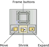
The nudge tool's components.
Every click on the frame buttons nudges, stretches, or shrinks
the selected widget by one pixel. To nudge by multiple pixels,
hold down the mouse button.
 |
You can also use the Ctrl key and the numeric
keypad to nudge, stretch, or shrink a widget. Each key corresponds
to one of the nudge buttons. Pressing Ctrl-5 switches
between modes, and Ctrl-↑
works like the tool's top frame button. |
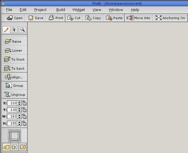
PhAB includes a set of control panels (also referred to as “palette
windows”) that display information about the currently selected widget
or widgets. They're displayed by default in PhAB, and you can move
them anywhere you like. If you close a control panel, you can reopen
it by choosing the appropriate item from the View menu.
The control panels include:
They're described in the sections that follow.
The control panels are originally displayed as a stack in a
PtPanelGroup widget. If you click on the panel tab, a menu of the panels
appears. If you expand the window enough, all the tabs are displayed
in a line.
You can drag panels away from this group to customize the display.
If you drop it on the background of PhAB's work area, it becomes
a new panel group. If you drop it on another panel group, the panel
joins that group. You're then free to resize the panel groups are
you see fit. Depending on your choices in the
AppBuilder Preferences Settings dialog, the arrangement of panels is saved with your application
or for all your PhAB sessions.
The widget palette lets you add widgets to your application.
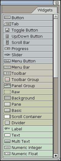
PhAB's widget palette.
If you close this panel, you can reopen it by choosing Show Templates from
the Window menu, then selecting a pallet.
|
The predefined Widget palette is a collection of templates
grouped into a folder called “Widgets”. You can create
your own templates by selecting . You can also customize the templates in
the Widget palette by choosing Templates from the Edit menu. If
a template is permanently removed from the Widget palette, you can
always add it back by selecting Add Widget Class from the Edit menu.
For more information on templates, see
Adding a widget class in the Creating Widgets in PhAB chapter.. |
The widgets are arranged and color-coded by type. The names are optional;
to hide or display them, right-click on the palette and choose the appropriate
item from the pop-up menu.
To find out what widget a button represents if the widget names
aren't displayed:
- Pause the pointer over it until a help balloon pops up.
Or
- See the
Widgets at a Glance appendix.
For information on using specific widget classes, see the Photon
Widget Reference.
The widget palette has two modes:
- Select mode
- Lets you select existing widgets and modules in the work
area.
- Create mode
- Lets you create new widgets.
To find out which mode you're in:
- Look at the widget palette—If an icon
button is pushed in, you're in create mode.
- Look at the pointer—If the pointer is a single-headed
arrow when you move it into the work area, you're in select
mode. If the pointer is anything else, you're in create
mode.
To switch to create mode, click on any widget icon in the widget palette.
You can now create one or more instances of that widget. For more
information, see “Creating a widget” in the Creating Widgets in PhAB chapter.
To switch from create mode to select mode, do one of the following:
- Click the right mouse button in a module or on the background
of the PhAB work area.
Or:
- Click on the background of the PhAB work area. Note that this might
not work if the selected template in the Widget palette creates
a module. In this case, even if you click on the background of PhAB,
the module specified by the template is created at the pointer position.
Or:
- Click on the selected widget in the widget palette.
For most widgets, PhAB returns to select mode as soon as you've created
a widget, but you can stay in create mode by pressing the Ctrl.
This allows you to create multiple instances of the widget, one
after another. Note that PhAB stays in create mode when you create some widgets (such
as PtLine, PtPolygon, and PtPixel).
The Resources panel displays a list of resources for the selected widget
or widgets. (If more than one widget is selected, this panel displays
only the resources they have in common.) Here's an example:
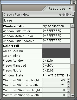
The Resources panel.
If you close this panel, you can reopen it by choosing Show Resources from
the Window menu.
It includes the following:
- Widget class
- The class of the selected widget.
- Next and previous buttons
- Let you navigate sequentially through widgets in the current
module. These buttons also let you select multiple widgets
or select widgets within a group. For more info, see
the “Selecting widgets” section in the Creating Widgets in PhAB chapter.
- Instance name
- Lets you enter a unique instance name for the widget.
For more information, see “Instance names” in the Creating Widgets in PhAB chapter.
You can change the value of a resource right in the control panel,
or you can use the full-featured editor by clicking on the resource
name. For more information, see the
Editing Resources and Callbacks in
PhAB chapter.
By default, the Resources and Callbacks control panels display resource
labels descriptively. If you pause the pointer over a resource,
the header manifest is displayed in a popup balloon.
To have the labels displayed as the actual header manifests (convenient when
writing code), open the
Preferences dialog and change the setting in the Resource Names field. To open
this dialog, choose Preferences from the Edit menu.
Now if you pause the pointer over a resource, the popup balloon
displays the descriptive label. You can also copy a resource manifest
or value by right clicking on the left column of the resources or
callback panel. Select Copy resource manifest to ph clipboard to
copy the resource manifest (for example, Pt_ARG_WINDOW_RENDER_FLAGS).
Select Copy resource value to ph clipboard to copy the
actual resource value.
|
The control panel doesn't display all the resources for a widget.
PhAB sets
Pt_ARG_AREA,
Pt_ARG_DIM,
Pt_ARG_EXTENT, and
Pt_ARG_POS automatically when you move or resize a widget. Some other
resources are too complex to edit in PhAB. |
The Callbacks panel displays a list of callback resources for
the selected widget. You can use this panel only when you've selected
a single widget. The widget must have a unique instance name. Here's
an example:
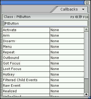
The Callbacks panel.
If you close this panel, you can reopen it by choosing Show Callbacks from
the Window menu.
This panel, like the Resources panel, displays the widget class
and instance names, and the next and previous buttons.
The left side of the list indicates the callback type. The right
side displays:
- “None” if there are no callbacks
- the callback type and name if there's one callback
- the number of callbacks if there's more than one.
You can right-click a callback name to copy its manifest or value.
Pause the mouse over a callback name to view its manifest and a
short description in a pop-up balloon.
To create a callback or to edit an existing one, click on the
appropriate resource (for example, Pt_CB_ACTIVATE).
The Module Tree panel displays a hierarchical tree of the widgets
in the current module. Here's an example:
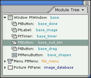
The Module Tree panel.
If you close this panel, you can reopen it by choosing Show Module Tree
from the Window menu.
This panel makes it easy to:
- See the parent/child relationships of the module's widgets.
- Select a widget inside a group.
- Find a widget by name.
- Select a widget hidden underneath another widget.
To select a widget from the tree, click on the widget's name.
If you right-click on this panel, a menu appears:
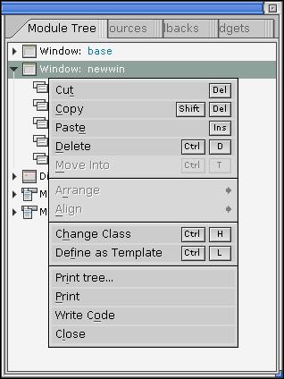
The menu for the Module Tree panel.
The Module Links panel displays a list of all link callbacks both
to and from the current module. As you can see from the following
example, the callbacks are displayed in a two-line format:
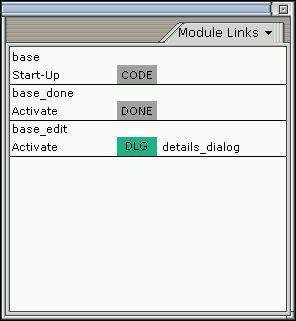
The Module Links panel.
| To do this: |
Click on the: |
| Select a widget |
Instance name (e.g. base_file) in line 1 |
| Edit a widget callback |
Appropriate callback type (e.g. Arm) in line 2 |
If you close this panel, you can reopen it by choosing Module
Links from the View menu.
The Browse Files panel is a file browser that you can use to
view, edit, delete, print, create, and rename the files related
to your application.
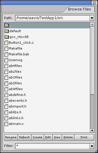
The Browse Files panel.
Use the Filter to select or enter a regular expression
to filter the list of files. For example, *.c displays
only files with a .c extension.
The Search dialog lets you search your application for widgets
of a specified type, name, text resource, and so on.
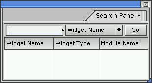
The Search dialog.
Open this dialog by choosing Find from the Edit menu.
Just choose the category you want to find from the combo box
and specify the pattern (which is case-sensitive) as appropriate:
- Widget Name
- In the text field, type the exact name of the widget or a
regular expression. For example, a value of my_button* matches
all the widgets whose names begin with my_button.
- Widget Type
- Type a class name or a regular expression (e.g. PtScroll*),
or use the combobox to select a widget class.
- Widget Text
- Type specific text or a regular expression to look for in
the widgets' text resources.
- Callback Type
- Search for the widgets that have attached a callback of the
type (Code, Done, and so on) selected from the pattern combo
box.
- Callback Function Name
- Type a function name or a regular expression.
- Callback Module Name
- Type a module name or a regular expression. All the widgets
that have a callback pointing to a module whose name matches the pattern
are selected.
Next, press the Go button. The matching widgets are displayed
in a list. Select entries from the list to select the actual widgets;
the PhAB modules they're in are opened or made visible.
To customize PhAB to your preferences:
- Choose Preferences from the Edit menu. You'll see the Preference
Settings dialog:
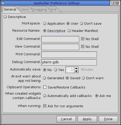
Setting PhAB preferences.
- Click on the tab for the group of settings you wish to change:
General,
Colors,
Dragging, or
Grid.
- When you're finished, click Done.
You can set the following general preferences:
- Workspace
- Lets you decide whether to save your preferences on a per-application
or per-user basis, or not at all.
- Resource Names
- By default, the Resources and Callbacks panels display
resource labels descriptively. This field lets you display
the labels as the actual header manifests, which you may find helpful
when writing code. Note, however, that manifests are long and
take up more screen space.
If you pause the pointer over a resource, the label not displayed
in the control panel is displayed in a popup balloon.
- Edit Command
- Lets you specify an external editor to edit source files.
- View Command
- Lets you specify the file viewer to use to view source
files.
- Print Command
- Lets you specify the print command used to print
a selected file (in the Project tab, for example).
- Debug Command
- Lets you specify the command used to debug your application.
- Automatically save
- Whether or not to save the application automatically, and
how often.
- Warnings on exiting
- Whether or not to warn you when you exit PhAB without generating or
saving your application.
- Clipboard Operations
- Lets you specify if callbacks should be saved along with
widgets when copying from or cutting to the clipboard.
- When created widgets contain callbacks
- Lets you specify whether you're prompted to add callbacks
when newly created widgets contain callbacks.
- Ask for run arguments
- Lets you specify whether PhAB prompts you to enter runtime arguments
when you run an application from the Build menu.
You can set the following color preferences:
- Resize Handle
Non-Resizable Handle
- If you choose a window background that makes it difficult
to see resize handles, use these options to customize
the color. (If you select a widget and the resize handles
appear in the nonresize color, the widget can't be resized.)
- Selection Color - First Item
- The color for the first widget selected. Turn this feature
on by selecting .
- Selection Color
- The color for widgets selected after the first widget. Turn
this feature on by selecting .
You can set the following dragging preferences:
- Widget
Module
- Drag widgets and modules as outlines rather than
as full objects.
- Drag Damping Factor
- The amount you must drag a widget or module before it moves.
This factor helps avoid the annoyance of moving a widget when
you really mean to select it.
You can use a grid to position and size widgets.
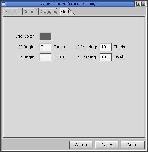
Grid Preferences.
You can:
- Choose the color of the grid.
- Specify the origin and spacing of the grid.
![[Previous]](prev.gif)
![[Contents]](contents.gif)
![[Index]](keyword_index.gif)
![[Next]](next.gif)
