![[Previous]](image-lib/prev.gif) |
![[Contents]](image-lib/contents.gif) |
![[Index]](image-lib/keyword_index.gif) |
![[Next]](image-lib/next.gif) |
|
|
|
|
A popdown or pullup menu
PtWidget --> PtBasic --> PtContainer --> PtGroup --> PtMenu
For more information, see the diagram of the widget hierarchy.
None - use PhAB's Menu module.
<photon/PtMenu.h>
The PtMenu class provides popup and pulldown menus. Menus work in either press-drag-release or click-move-click mode.
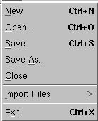
A PtMenu widget that contains various menu items.
 |
Use PhAB's Menu module instead of this widget. See "Menu modules" in the Working with Modules chapter of the Photon Programmer's Guide. |
Although menus usually consist of PtMenuButton widgets, any type of widget may become a menu item by making itself the child of a PtMenu widget.
If PtMenu has any PtLabel-class children that have the Pt_ARG_ACCEL_KEY resource defined, it will attach hotkey callbacks on behalf of those children.
|
A PtMenu widget blocks any nonmenu hotkeys while it's displayed. |
To make menu items selectable by the user, you must set the Pt_SELECTABLE flag in Pt_ARG_FLAGS (see PtWidget). PtMenu will then set up callbacks on its children to alter their behavior where necessary, thus ensuring that the children operate as the user expects. For example, the children will automatically highlight in press-drag-release mode.
If a menu item has a PtMenu widget as a child, and that child has the Pt_MENU_CHILD bit set in its Pt_ARG_MENU_FLAGS resource, the child behaves as a submenu and will be realized when necessary.
Menus display a list of possible selections and allow the user to choose one of them. The selections displayed in a menu are usually pushbuttons that activate application functions, but they may also be used to display toggle buttons, cascaded menu buttons that invoke submenus, or any other selectable widget.
Most applications will have a menu bar (usually a PtMenuBar widget), a horizontal bar across the top of the application window. The menu bar will have a number of entries within it. Each of these entries is a menu button with an associated pull-down menu. A menu button appears as a label until it's selected. When the menu button is selected, the button's border is etched so that it takes on the same 3-D appearance as a pushbutton.
A menu button is selected by clicking it. This causes the pulldown menu associated with the menu button to be activated or dropped down.
A menu may also be activated or popped up in response to an event such as a pointer-button press inside another type of widget. Known as a popup menu, this type of menu normally appears at the current pointer position.
A menu is displayed when it's activated; it may be in either of two modes:
In press-drag-release mode, the user can drag the menu by pressing the pointer button and holding it down to keep the menu on screen.
The user can initiate click-stay mode by clicking the pointer button - that is, pressing and then releasing the pointer button without moving the pointer. The menu stays up until a menu selection is made.
Using press-drag-release mode, the user drags the pointer to the desired selection and releases the pointer button over the selection to choose it. While dragging the pointer, the user will see a visual cue that indicates which selection would be chosen if the pointer button were released. The selection underneath the pointer is highlighted by giving it a raised 3-D appearance.
Using click-stay mode, the user chooses a menu selection by pressing the pointer button over top of the desired selection. Once a selection is chosen, it's given a raised 3-D appearance as a visual cue of the selection.
When a selectable widget (such as a button or toggle) is chosen from the menu:
If the selected item is a cascaded menu button, its menu is activated and it's displayed to the right of or below the selection.
To get either a pull-down or a popup menu, you must create a menu pane. This container holds all the items in the menu. The pane is what is actually displayed when the menu is activated.
You use the PtMenu widget class to create menu panes. The Pt_ARG_MENU_FLAGS resource controls the menu pane's behavior and appearance.
You use these flags to control:
You can specify a menu title to be displayed at the top of the menu pane when the menu is activated. You can also specify the title's font. You use the Pt_ARG_MENU_TITLE and Pt_ARG_MENU_TITLE_FONT resources to specify these two title attributes.
If you specify a title for the menu, it will appear visually distinct from the menu's selections by means of a separator placed below the title.
You can use the Pt_ARG_MENU_TEXT_FONT resource to control what font is used for displaying menu items. This resource overrides the normal default font for text items placed in the menu.
As with other containers, items are placed in a menu by creating them as children of the menu itself. The widgets you place in the menu will behave according to their type. Widgets that have the Pt_SELECTABLE flag set in the Pt_ARG_FLAGS resource may be used as menu selections. This includes buttons, toggles, and menu buttons.
Menu buttons within the menu allow cascaded submenus. For more information on how to create cascaded submenus, see the section "Cascaded Menus."
Widgets that have the Pt_AUTOHIGHLIGHT flag set automatically have the visual cuing provided for the user. All the widgets in the Photon widget library that set the Pt_SELECTABLE flag by default set this flag as well. If you explicitly set either of these flags for other widget types, be sure to use them appropriately in combination so they'll behave correctly in a menu.
The menu may also contain other widgets that aren't menu selections. For example, separators and labels can be placed in the menu to make a visual distinction between different sections of the menu and to enhance its appearance.
Normally, the menu pane will be made wide enough to fit the widest menu item placed within it, and all the menu items will be made this size as well. The Pt_MENU_AUTO flag in the Pt_ARG_MENU_FLAGS resource controls menu sizing..
If you want to explicitly control the sizes of the menu items, you can clear this flag - it's then your responsibility to set the dimensions of each menu item.
A menu may be created either in advance or dynamically in response to the action that activated it.
If you create the menu in advance, you'll have to create a callback function to position the menu and realize it in response to the user action that activates it. When the user has made a selection, the menu will unrealize itself.
To create the menu dynamically, your callback function must create the menu first, then position it and realize it. You may also want the menu to be re-created from scratch the next time the callback is invoked. In this case, it should be destroyed after the user has made a menu selection.
You can deal with the above case by creating the menu as a transient menu. To make a menu transient, set the Pt_MENU_TRANSIENT flag on the Pt_ARG_MENU_FLAGS resource when the menu is created. This menu will destroy itself after a menu selection has been made.
|
The menu might be destroyed before the selected menu item's callback
is invoked. To make sure that the menu item's callback is called
first, attach the menu item callback as follows:
PtCallback_t callbacks[] = { { menu_item_callback, NULL } };

PtSetArg( &arg[0], Pt_ARG_TEXT_STRING, "Open", 0 );
PtSetArg( &arg[1], Pt_CB_ACTIVATE, callbacks, Pt_LINK_INSERT );
item = PtCreateWidget( PtMenuButton, menu, 2, arg );
|
To create a pulldown menu, you must create the menu pane as a child of the menu button. You must also attach a callback to the menu button that pulls down the menu in response to a button press.
Attach the callback to the Pt_CB_ARM or Pt_CB_MENU callback list so that both press-drag-release and click-stay modes will work, then provide the pointer to the menu widget as the client_data for the callback.
Your callback must position the menu beneath the menu button and make it appear. To do this, call PtPositionMenu() with the menu widget as the first parameter, passing a NULL pointer as the second parameter. This function determines the correct position for the menu, knowing that its parent is a menu button. After this you can make the menu appear by calling PtRealizeWidget(). For more information about these functions, see the Photon Library Reference.
The following function can be used to display the pulldown menu:
void
postMenu( PtWidget_t *w, void *client_data,
          PtCallbackInfo_t *info)
{
   if (client_data)
   {
      PtWidget_t *menu = (PtWidget_t *)client_data;

      PtPositionMenu(menu, NULL);
      PtRealizeWidget(menu);
   }
}
To create a pulldown menu invoked by a "File" menu button with this routine as the callback function, use the following code:
   fileMenu = PtCreateWidget(PtMenu, fileButton, 0, NULL);
   create_file_items(fileMenu);

   PtAddCallback(fileButton, Pt_CB_ARM, postMenu, fileMenu);
In this example, the create_file_items() function creates the menu items in the file menu.
Popup menus are frequently used in an application's work area. Often this area is not a container widget. In this case, you won't create the menu as a child of the work area itself. Instead, create the menu as a child of the work area's parent.
As with pulldown menus, you have to provide a callback function or event handler to activate your popup menu. This callback has to position the menu and make it appear.
If the widget that you wish to associate with the popup menu doesn't have a Pt_CB_ARM or Pt_CB_MENU callback list, the simplest way to activate the menu is to associate an event handler with button-press events. Provide the menu pointer to the event handler as client_data. The event handler should make sure that the appropriate menu button was pressed before activating the menu.
The event handler should position the menu with a call to PtPositionMenu(). In this case, it should pass the Photon event from the PtCallbackInfo_t structure as the second parameter to the function. This identifies the pointer position where the menu should be placed.
The following function illustrates how a popup menu can be activated:
void
postMenu( PtWidget_t *w, void *client_data,
          PtCallbackInfo_t *info)
{
   PhEvent_t *event = info ? info->event : NULL;
   PhPointerEvent_t *ptr = event ? (PhPointerEvent_t *)
      PhGetData(event) : NULL;

   /* post the popup if the right button was pressed */
   if (event && client_data &&
       (event->type & Ph_EV_BUT_PRESS) &&
       (ptr->buttons == 1))
   {
      PtWidget_t *menu = (PtWidget_t *)client_data;

      PtPositionMenu(menu, event);
      PtRealizeWidget(menu);
   }
}
The following code illustrates how you can create a popup and activate it using the above function:
PtSetArg(&arg[0], Pt_ARG_POS, &offsets.ul, 0);
PtSetArg(&arg[1], Pt_ARG_DIM, &workarea, 0);
PtSetArg(&arg[2], Pt_ARG_ANCHOR_FLAGS,
         Pt_LEFT_ANCHORED_LEFT|Pt_RIGHT_ANCHORED_RIGHT|
         Pt_TOP_ANCHORED_TOP|Pt_BOTTOM_ANCHORED_BOTTOM,
         Pt_IS_ANCHORED);
PtSetArg(&arg[3], Pt_ARG_ANCHOR_OFFSETS, &offsets, 0);
raw = PtCreateWidget(PtRaw, window, 4, arg);

popupMenu = PtCreateWidget(PtMenu, window, 0, NULL );
create_file_items(popupMenu);
PtAddEventHandler(raw, Ph_EV_BUT_PRESS, popup_menu_cb,
                  popupMenu);
If you place a menu button in a menu pane and create a menu pane as its child, you'll get a cascaded submenu. Unlike pulldown menus or popup menus, you don't have to attach any callbacks to activate submenus - they're handled automatically.
You must, however, set a flag on the submenu's menu pane to indicate that it is a submenu. Set the Pt_MENU_CHILD flag on the Pt_ARG_MENU_FLAGS resource. If you want the submenu to appear to the right of its parent - the conventional way that submenus cascade - you'll also have to set the Pt_MENU_RIGHT flag in the menu button's Pt_ARG_BUTTON_TYPE resource.
We can now look at the create_file_items() function in our previous example to see how it creates a cascaded submenu:
void create_file_items(PtWidget_t *parent)
{
   PtArg_t       arg[3];
   PtWidget_t    *importButton, *importMenu;
   PtCallback_t  quit_callbacks[] = { {quit_cb, NULL} };
   PtCallback_t  noop[] = { {nop_cb, NULL} };

   PtSetArg(&arg[0], Pt_ARG_TEXT_STRING, "Open", 0);
   PtSetArg(&arg[1], Pt_ARG_TEXT_FONT, "helv14B", 0);
   PtSetArg(&arg[2], Pt_CB_ACTIVATE, noop, 1);
   PtCreateWidget(PtButton, parent, 3, arg);

   PtSetArg(&arg[0], Pt_ARG_TEXT_STRING, "New", 0);
   PtSetArg(&arg[1], Pt_ARG_TEXT_FONT, "helv14B", 0);
   PtSetArg(&arg[2], Pt_CB_ACTIVATE, noop, 1);
   PtCreateWidget(PtButton, parent, 3, arg);

   PtSetArg(&arg[0], Pt_ARG_TEXT_STRING, "Import", 0);
   PtSetArg(&arg[1], Pt_ARG_TEXT_FONT, "helv14B", 0);
   PtSetArg(&arg[2], Pt_ARG_BUTTON_TYPE, Pt_MENU_RIGHT,
            Pt_MENU_RIGHT);
   importButton = PtCreateWidget(PtMenuButton, parent, 3, arg);

   PtSetArg(&arg[0], Pt_ARG_MENU_FLAGS,
            Pt_MENU_AUTO|Pt_MENU_CHILD,
            Pt_MENU_AUTO|Pt_MENU_CHILD);
   importMenu = PtCreateWidget(PtMenu, importButton, 1, arg );

   create_import_items(importMenu);

   PtCreateWidget(PtSeparator, parent, 0, NULL);

   PtSetArg(&arg[0], Pt_ARG_TEXT_STRING, "Quit", 0);
   PtSetArg(&arg[1], Pt_ARG_TEXT_FONT, "helv14B", 0);
   PtSetArg(&arg[2], Pt_CB_ACTIVATE, quit_callbacks, 1);
   PtCreateWidget(PtButton, parent, 3, arg);
}
We can now put together a complete example using all the techniques described above. In this example, we have an application window with a menu bar along the top and a work area. The menu bar consists of a file menu and a help menu. The work area is a PtRaw widget that has a popup menu associated with the right pointer button. The popup menu contains the same selections as the file menu.
Here's the complete example:
#include <Pt.h>
#include <stdlib.h>

void
post_menu_cb(PtWidget_t *w, void *client_data, PtCallbackInfo_t *info)
{
   PtArg_t     arg[4];
   void        *data;
   PhArea_t    *area;
   unsigned short    *border;
   unsigned short    *flags;

   client_data = client_data; info = info;

   if (client_data)
   {
      PtWidget_t *menu = (PtWidget_t *)client_data;

      PtPositionMenu(menu, NULL);
      PtRealizeWidget(menu);
   }
}

void
popup_menu_cb(PtWidget_t *w, void *client_data, PtCallbackInfo_t *info)
{
   PhEvent_t *event = info ? info->event : NULL;
   PhPointerEvent_t *ptr = event ? (PhPointerEvent_t *)
      PhGetData
      (event) : NULL;

   w = w;

   /* post the popup if the right button was pressed */
   if (event && client_data &&
       (event->type & Ph_EV_BUT_PRESS) &&
       (ptr->buttons == 1))
   {
      PtWidget_t *menu = (PtWidget_t *)client_data;

      PtPositionMenu(menu, event);
      PtRealizeWidget(menu);
   }
}

void
nop_cb(PtWidget_t *w, void *client_data,
       PtCallbackInfo_t *info)
{
   PtArg_t arg[1];
   char    *text;

   w = w; client_data = client_data; info = info;

   PtSetArg(&arg[0], Pt_ARG_TEXT_STRING, &text, 0);
   PtGetResources(w, 1, arg);

   if (text)
      printf("Pushed the %s button\n", text);
}

void
quit_cb(PtWidget_t *w, void *client_data, PtCallbackInfo_t *info)
{
   w = w; client_data = client_data; info = info;

   exit(0);
}

void create_import_items(PtWidget_t *parent)
{
   PtArg_t      arg[3];
   PtCallback_t noop[] = { {nop_cb, NULL} };

   PtSetArg(&arg[0], Pt_ARG_TEXT_STRING, "Image", 0);
   PtSetArg(&arg[1], Pt_ARG_TEXT_FONT, "helv14B", 0);
   PtSetArg(&arg[2], Pt_CB_ACTIVATE, noop, 1);
   PtCreateWidget(PtButton, parent, 3, arg);

   PtSetArg(&arg[0], Pt_ARG_TEXT_STRING, "Bitmap", 0);
   PtSetArg(&arg[1], Pt_ARG_TEXT_FONT, "helv14B", 0);
   PtSetArg(&arg[2], Pt_CB_ACTIVATE, noop, 1);
   PtCreateWidget(PtButton, parent, 3, arg);
}

void create_file_items(PtWidget_t *parent)
{
   PtArg_t       arg[3];
   PtWidget_t    *importButton, *importMenu;
   PtCallback_t  quit_callbacks[] = { {quit_cb, NULL} };
   PtCallback_t  noop[] = { {nop_cb, NULL} };

   PtSetArg(&arg[0], Pt_ARG_TEXT_STRING, "Open", 0);
   PtSetArg(&arg[1], Pt_ARG_TEXT_FONT, "helv14B", 0);
   PtSetArg(&arg[2], Pt_CB_ACTIVATE, noop, 1);
   PtCreateWidget(PtButton, parent, 3, arg);

   PtSetArg(&arg[0], Pt_ARG_TEXT_STRING, "New", 0);
   PtSetArg(&arg[1], Pt_ARG_TEXT_FONT, "helv14B", 0);
   PtSetArg(&arg[2], Pt_CB_ACTIVATE, noop, 1);
   PtCreateWidget(PtButton, parent, 3, arg);

   PtSetArg(&arg[0], Pt_ARG_TEXT_STRING, "Import", 0);
   PtSetArg(&arg[1], Pt_ARG_TEXT_FONT, "helv14B", 0);
   PtSetArg(&arg[2], Pt_ARG_BUTTON_TYPE, Pt_MENU_RIGHT,
            Pt_MENU_RIGHT);
   importButton = PtCreateWidget(PtMenuButton, parent, 3, arg);

   PtSetArg(&arg[0], Pt_ARG_MENU_FLAGS,
            Pt_MENU_AUTO|Pt_MENU_CHILD,
            Pt_MENU_AUTO|Pt_MENU_CHILD);
   importMenu = PtCreateWidget(PtMenu, importButton, 1, arg );

   create_import_items(importMenu);

   PtCreateWidget(PtSeparator, parent, 0, NULL);

   PtSetArg(&arg[0], Pt_ARG_TEXT_STRING, "Quit", 0);
   PtSetArg(&arg[1], Pt_ARG_TEXT_FONT, "helv14B", 0);
   PtSetArg(&arg[2], Pt_CB_ACTIVATE, quit_callbacks, 1);
   PtCreateWidget(PtButton, parent, 3, arg);
}

void create_help_items(PtWidget_t *parent)
{
   PtArg_t      arg[3];
   PtCallback_t noop[] = { {nop_cb, NULL} };

   PtSetArg(&arg[0], Pt_ARG_TEXT_STRING, "About", 0);
   PtSetArg(&arg[1], Pt_ARG_TEXT_FONT, "helv14B", 0);
   PtSetArg(&arg[2], Pt_CB_ACTIVATE, noop, 1);
   PtCreateWidget(PtMenuButton, parent, 3, arg);
}

main(int argc, char *argv[])
{
   PtAppContext_t app;
   PhDim_t        dim, workarea, *group_size;
   PhPoint_t      pos;
   PtArg_t        arg[5];
   PtWidget_t     *window, *group, *raw;
   PtWidget_t     *fileButton, *helpButton;
   PtWidget_t     *fileMenu, *helpMenu, *popupMenu;

   if ((window = PtAppInit(&app, &argc, argv, 0, NULL)) == NULL)
      exit(EXIT_FAILURE);

   PtSetArg(&arg[0], Pt_ARG_ANCHOR_FLAGS,
            Pt_LEFT_ANCHORED_LEFT|Pt_RIGHT_ANCHORED_RIGHT,
            Pt_IS_ANCHORED);
   PtSetArg(&arg[1], Pt_ARG_BORDER_WIDTH, 2, 0);
   PtSetArg(&arg[2], Pt_ARG_FLAGS, Pt_HIGHLIGHTED, Pt_HIGHLIGHTED);
   group = PtCreateWidget(PtGroup, window, 3, arg);

   PtSetArg(&arg[0], Pt_ARG_TEXT_STRING, "File", 0);
   PtSetArg(&arg[1], Pt_ARG_TEXT_FONT, "helv14B", 0);
   fileButton = PtCreateWidget(PtMenuButton, group, 2, arg);

   PtSetArg(&arg[0], Pt_ARG_TEXT_STRING, "Help", 0);
   PtSetArg(&arg[1], Pt_ARG_TEXT_FONT, "helv14B", 0);
   helpButton = PtCreateWidget(PtMenuButton, group, 2, arg);

   fileMenu = PtCreateWidget(PtMenu, fileButton, 0, NULL);
   create_file_items(fileMenu);

   helpMenu = PtCreateWidget(PtMenu, helpButton, 0, NULL);
   create_help_items(helpMenu);

   PtAddCallback(fileButton, Pt_CB_ARM, post_menu_cb, fileMenu);
   PtAddCallback(helpButton, Pt_CB_ARM, post_menu_cb, helpMenu);

   PtRealizeWidget(window);

   PtSetArg(&arg[0], Pt_ARG_DIM, &group_size, 0);
   PtGetResources(group, 1, arg);

   workarea.w = 300;
   workarea.h = 200;
   pos.x = 0;
   pos.y = group_size->h + 2 * 2;

   PtSetArg(&arg[0], Pt_ARG_POS, &pos, 0);
   PtSetArg(&arg[1], Pt_ARG_DIM, &workarea, 0);
   raw = PtCreateWidget(PtRaw, window, 2, arg);

   popupMenu = PtCreateWidget(PtMenu, window, 0, NULL );
   create_file_items(popupMenu);
   PtAddEventHandler(raw, Ph_EV_BUT_PRESS, popup_menu_cb, popupMenu);

   PtRealizeWidget(raw);

   dim.w = workarea.w;
   dim.h = workarea.h + group_size->h + 2 * 2;
   PtSetArg(&arg[0], Pt_ARG_DIM, &dim, 0);
   PtSetResources(window, 1, arg);

   PtMainLoop();
}
| Resource | C type | Pt type | Default |
|---|---|---|---|
| Pt_ARG_MENU_FLAGS | unsigned long | Flag | Pt_MENU_AUTO |
| Pt_ARG_MENU_SPACING | short | Scalar | Value of Pt_ARG_BORDER_WIDTH |
| Pt_ARG_MENU_TEXT_FONT | char * | String | NULL |
| Pt_ARG_MENU_TITLE | char * | String | NULL |
| Pt_ARG_MENU_TITLE_FONT | char * | String | "helv12b" |
| C type | Pt type | Default |
|---|---|---|
| unsigned long | Flag | Pt_MENU_AUTO |
Menu flags. Possible values:
| C type | Pt type | Default |
|---|---|---|
| short | Scalar | Value of Pt_ARG_BORDER_WIDTH |
The amount of space, in pixels, between each menu item.
| C type | Pt type | Default |
|---|---|---|
| char * | String | NULL |
The font used for PtLabel-based menu items; see PgSetFont() in the Photon Library Reference. This resource overrides the normal default font for text items placed in the menu.
| C type | Pt type | Default |
|---|---|---|
| char * | String | NULL |
The menu title. If you want to remove a title, specify NULL.
| C type | Pt type | Default |
|---|---|---|
| char * | String | "helv12b" |
The font used for displaying the title.
If the widget modifies an inherited resource, the "Default override" column indicates the new value. This modification affects any subclasses of the widget.
|
|
|
|