![[Previous]](image-lib/prev.gif) |
![[Contents]](image-lib/contents.gif) |
![[Index]](image-lib/keyword_index.gif) |
![[Next]](image-lib/next.gif) |
|
|
|
|
Modules are the major pieces of the user interface in a PhAB application. This chapter describes how to work with them, and includes:
Modules serve as containers to hold your application's widgets. Some modules, such as windows and dialogs, are actually Photon container-class widgets and let you place widgets directly inside them. Others, such as icons and menus, have either predefined widgets or a specialized editor for creating the widgets that they contain.
PhAB provides a number of types of modules, each with a specific usage. Each module type is identified as follows:
 |
These are all binary files. Don't edit them with a text editor or you could damage them. |
| Module | Usage | Color | Extension |
|---|---|---|---|
| window | Major application activities | Blue | .wgtw |
| dialog | Obtain additional information from the user | Green | .wgtd |
| menu | Multilevel text-only menus | Yellow | .wgtm |
| picture | Change the contents of an existing module, or create a widget database | Cyan | .wgtp |
| icon | Your application's icons for use by PDM and the Taskbar | Red | .wgti |
| "other" | Predefined modules for specific purposes | Purple | .wgtx |
When you select a module within PhAB, the Control Panel changes to display the list of widget resources available for that module's class. Depending on which resources you change, you may see no immediate effect. All changes will take effect, however, when you run the application.
Because PhAB displays all modules as child windows within its work area, you can work with any number of modules at the same time.
PhAB displays each module as a window in its work area. Like windows, modules have a set of controls in their frames.
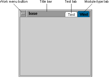
Anatomy of a typical PhAB module.
Most modules include these elements:
Note that using the Work menu to close a module doesn't delete the module. It simply removes the module from the work area to give you more space to work with. To get the module back any time, use the module selector, which lets you access, create, and delete any type of module. For more info, see "Using the Module selector" in this chapter.
When you save your application, PhAB stores all the application's modules as files within the application's wgt directory. Each module is saved in its own file with a file extension based on the module's type. Later, when you "make" your application, PhAB binds all the modules into the binary executable. This makes the application a single free-standing program that you can distribute easily.
For more info, see "How application files are organized" in the Generating, Compiling, & Running Code chapter.
Your application needs a way to make modules appear when you run it. You can:
When you use the Application menu to create or view any of the six PhAB module types (windows, dialogs, menus, etc.), PhAB displays the module selector dialog:
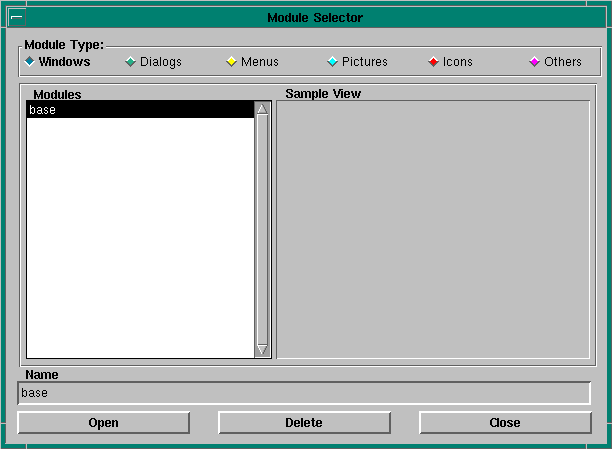
Module Selector dialog.
At the top of the dialog you'll see a set of color-coded toggle buttons. These let you select which type of module you wish to create/open, delete or close. The default type is determined by the menu option you chose to bring up the dialog.
To create any new module, follow these simple steps:
 |
Module names must not be longer than 48 characters. |
|
|
For more info on creating specific types of modules, see the sections on each type of module in this chapter.
To see a sample view of any module:
To display a module in your work area:
Or
Or
To delete a module:
|
Deleting a module doesn't delete the module's file; it just removes the name from the list. Any callbacks belonging to the module or its children are deleted. |
| Widget class | Color code | File extension | Widget creation |
|---|---|---|---|
| PtWindow | Dark blue | .wgtw | Directly from the widget bar |
Typically, you use window modules for your application's major activities. Since most applications use a window module for their main window, PhAB automatically generates a window module named base when you first create any application. It also presets the application's startup information to make the base window open when the application starts up. (See "Specifying application startup information" in the Working with Applications chapter.)
Window modules can support multiple instances. That is, two or more copies of the same window module can be displayed at the same time. As a result, you should keep track of each window's instance pointer, which is generated when you create the window. That way, you'll always know which window you're dealing with when you process callbacks. For more information, see "Handling multiple instances of a window" in the Working with Code chapter.
Even though your application's base window is a window module, you usually display it only once, at startup. So unless your application needs to display more than one copy of the base window at the same time you won't have to keep track of the base window's instance pointer.
For an example of code for handling multiple instances of window modules, see "Creating Windows" in the Tutorials chapter.
When you set a window module's size in PhAB, that's the size it will be when you run the application.
| Widget class | Color code | File extension | Widget creation |
|---|---|---|---|
| PtWindow | Green | .wgtd | Directly from the widget bar |
Dialog modules let you obtain additional information from the user. Typically, you use this information to carry out a particular command or task.
Most dialog modules include the following buttons:
From PhAB's perspective, dialog modules are almost identical to window modules, with one important difference-a dialog module can have only one active instance. So if you invoke a dialog that's already open, the PhAB API simply brings the existing instance of the dialog to the front of the screen. This behavior fits with the nature of a dialog-you rarely want to get the same information twice. If for any reason you need a dialog that can support multiple instances, use a window module.
Limiting a dialog to a single instance makes callback handling simpler since you can use the widget manifests that PhAB generates to access the widgets within the dialog. For more info, see the discussion on instance names in the Creating Widgets in PhAB chapter.
When you set a dialog module's size in PhAB, that's the size it will be when you run the application.
| Widget class | Color code | File extension | Widget creation |
|---|---|---|---|
| PtMenu | Yellow | .wgtm | Special editor |
A menu module provides a multilevel text-only menu. Unlike most other modules, a menu module doesn't let you create widgets directly inside it. Instead, you use PhAB's menu editor to create the menu's items.
To open the menu editor:
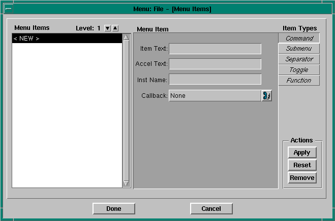
Menu editor.
In the upper-right corner you'll see buttons that represent the types of menu items you can create:
At the bottom of the dialog are two buttons:
| When you want to: | Use this button: |
|---|---|
| Apply any changes and close the editor | Done |
| Cancel any changes made since you opened the editor | Cancel |
To create any command or toggle menu item (that is, any item that can invoke a callback), you must enter a unique instance name-PhAB enforces this. The instance name lets you access the menu item from within your application code.
When PhAB generates the code for your application, it generates an ABN_... global variable for each menu item that requires it. You use this variable with the menu-item related API functions, ApModifyItemState() and ApModifyItemText().
For example, let's say a menu item isn't available when the user clicks on the widget that brings up the menu. Using the instance name, you can dim that item before displaying the menu. For more information, see "Initializing menus" in the Working with Code chapter.
To help the user select a menu item more quickly, you can:
A keyboard shortcut works only when the menu is currently visible. A hotkey, on the other hand, should work whether the menu is visible or not.
Creating a keyboard shortcut is easy. When you're entering the Item Text, simply place "&" in front of the character that will act as the shortcut. For example, let's say you're creating a "Save As" item. You could enter Save &As, which will underline the "A." When the menu opens, the user can press either A or a to invoke the callback associated with "Save As".
Creating a hotkey takes a bit more work, but it's still easy to do. First, you want to make sure that the hotkey accelerator appears next to the menu item when the menu is displayed. To do this, use the Accel Text field. For example, let's say the hotkey accelerator for a "Save" menu item will be Ctrl -S . In that case, you would type Ctrl-S in the Accel Text field.
Next, you need to create a hotkey callback for Ctrl -S . Since the menu might not be created when the user presses Ctrl -S , you can't attach the hotkey callback to the menu or to the menu item. Rather, you must attach the callback to the application's main module, which is usually the base window module. When you specify the hotkey callback's function, use the same function you defined for the menu item's callback.
If for some reason you need to differentiate between the two methods of invoking the callback, look at the callback's reason code. Hotkeys always have a reason code of Pt_CB_HOTKEY.
For more info on creating hotkey callbacks, see "Hotkey callbacks" in the Editing Resources and Callbacks in PhAB chapter.
Feel free to resize a menu module to make it more readable or take up less space. When you run the application, the actual size of the PtMenu widget will be determined by the menu items.
A command item lets you invoke application code or display a module.
| Field | Description |
|---|---|
| Item Text | The text that will be displayed |
| Accelerator Text | The hotkey to invoke the command |
| Instance Name | The name used within the application code |
| Callback | The function that will be called when the item is selected |
To create a command item:
For example, let's say you enter &File. In that case, the user can select the item by pressing F.

For more info on creating a callback, see "Editing callbacks" in the Editing Resources and Callbacks in PhAB chapter.
A submenu item lets you create another menu level.
| Field | Description |
|---|---|
| Item Text | The text that will be displayed |
To create a submenu item:

Click on the down arrow, then add the submenu items you want. You can add any type of menu item to a submenu, including another submenu item.
A separator item lets you create spacings between menu items. You'll find this item type handy for creating logical groupings of menu items. You can choose from several separator styles.
To create a menu separator:
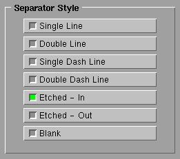
Styles of menu separators.
A toggle item lets you change or display an application state, which can be either on or off.
| Field | Description |
|---|---|
| Item Text | The text that will be displayed |
| Instance Name | The name used within the application code |
| Callback | The function that will be called when the item is selected |
To create a toggle item:
A function item lets you specify an application function that dynamically adds menu items to the menu at runtime. For example, you could use a function item in a File menu to display the last three files the user worked on.
The PhAB library invokes the specified function as the menu is built. The dynamically created menu items appear where you've positioned the function item in the menu.
| Field | Description |
|---|---|
| Function | The function that will be called |
To create a function item:
If you specify this function name, PhAB will generate a stub function; for information on specifying the language (C or C++) and the filename, see "Function names and filenames" in the Working with Code chapter.
For information on the application function, see "Generating menu items" in the Working with Code chapter.
The Menu Items scrolling list lets you move a menu item to a new position in the menu.
Let's say you want to move an item named Browse so it appears just before an item named Edit. You would:
Once you've created a menu module, you need a way to make your application display it. Typically, you do the following:
|
You could add the callback to the
Pt_CB_ACTIVATE
list, but
adding it to Pt_CB_ARM allows the user to access it in two ways:
If you use an Activate callback, the user can only use the second method. |
If you want your menu to appear when you press the right mouse button while pointing at a widget, you'll need to use an internal link. For more information, see the Accessing PhAB Modules from Code chapter - there's even an example.
| Widget class | Color code | File extension | Widget creation |
|---|---|---|---|
| Not applicable | Light blue | .wgtp | Directly from the widget bar |
Using a picture module, you can change the contents of an existing module or create a convenient database of widgets. You always display a picture inside a container-class widget or another module, such as a window or dialog.
Like windows, picture modules support multiple instances. So you should keep track of the instance pointer of the container that each picture is placed into. That way, you'll always know which picture you're dealing with when you process callbacks.
If you're sure that your application will use only one instance of the picture at any given point, you don't have to keep track of instance pointers. Instead, you can use PhAB-generated manifests to access the picture's widgets.
You always access picture modules from within your application code. To access a picture, you must create an internal link to it. This tells PhAB to generate a manifest that you can use with PhAB's API functions-such as ApCreateModule()-to access the picture.
For more info, see "Using internal links to create and access modules" in the Accessing PhAB Modules from Code chapter.
You can use a picture module as a widget database. A widget database contains predefined widgets that you can copy at any time into a window, dialog, or container.
When using a widget database, you don't have worry about handling multiple instances since the generated PhAB widget manifests don't apply to widget databases: each widget you create is a new instance. The instance pointer is returned to you when you create the widget using ApCreateWidget(). You'll need to keep track of this pointer manually if you need to access the widget in the future.
For more info, see "Widget databases" in the Accessing PhAB Modules from Code chapter.
It doesn't matter how large or small you make a picture module. That's because it has no associated widget class. Only the widgets inside the module are used.
| Widget class | Color code | File extension | Widget creation |
|---|---|---|---|
| PtIcon | Red | .wgti | Widgets are predefined |
Icon modules let you design your application's icons. PhAB ensures that these icons are automatically supported by Photon's Desktop and Window Managers.
Icon modules consist of two icon widgets:
PhAB automatically supplies samples of these icons when you create the module. At any point, you can use PhAB's pixmap editor, described in the Editing Resources and Callbacks in PhAB chapter, to redraw these samples into something more appropriate for your application. You can even use the pixmap editor to import an existing graphic.
Feel free to resize an icon module as you wish-it isn't used to display the icons.
When you create your application's icon module, remember to specify Icon as the module's name. Then, open the base window's Window Icon (Pt_ARG_ICON_WINDOW) resource and specify Icon there as well. This ties the icon module to the application's base window module and makes it possible for PDM to find the icon.
The widgets in an icon module can be of any class, but they must have the following sizes and instance names:
| Instance name | Size |
|---|---|
| LIcon | 43*43 pixels |
| SIcon | 15*15 pixels |
The two sample icon widgets that PhAB provides are PtLabel-class widgets with the Label Type resource set to Pt_IMAGE. These icons are prenamed and presized to match the specification. Unless you have a specific icon requirement, we recommend you use these samples and edit them with the pixmap editor.
|
When you view the icon module using the Module Tree mode of the Control Panel, LIcon must come before SIcon for Photon to find the icons properly. |
| Widget class | Color code | File extension | Widget creation |
|---|---|---|---|
| Depends on module's class | Purple | .wgtx | Widgets are predefined |
Other modules are predefined modules that PhAB provides for specific purposes. Currently, you can choose from the following types:
Since each of these modules is predefined, you can't add any widgets. Nevertheless, you can edit several resources provided for the module itself. Note, however, that changing a resource has no immediate visual effect. That's because the displayed module shows either a sample of the widget class it represents or its current list of resources. If you want to see the effects of any change, run the application.
|
We strongly recommend that you not use these modules. Instead, use the PtFileSel and PtMessage widgets (see the Photon Widget Reference) or PtFileSelection(), and PtAskQuestion() or PtMessageBox() (see the Photon Library Reference). |
Feel free to resize these modules to take up less space in PhAB. They'll appear in a predefined size when you run your application.

PhAB's work area lets you work on several application modules at once. You can iconify modules to organize your work area. The icons are color-coded so you can identify what kind of module each icon represents. See "Module types" in this chapter.
To reduce any module in the work area to an icon:
Or
Once it's iconified, the module positions itself at the bottom of the work area. You can drag it anywhere in the work area, so (for example) you can group commonly used or related icons.
To automatically rearrange module icons into neat rows starting at the bottom-left corner, choose Arrange Icons from the Window menu.
To import a PhAB module from another application:
|
Callbacks aren't imported, only the module and the widgets themselves.
After importing the module, you can attach new application-specific
callbacks.
Normally, PhAB retains the instance name of each imported widget. However, if it detects a duplicate name, it changes that name to the widget-class name to avoid code-generation errors. |
To import a QNX Windows picture (.pict) file:
|
|
If you wish to stop working on a module and remove it from the work area:
If you simply wish to iconify the module, choose the Minimize item.
To reopen any module that's been closed, see the "Module selector" section in this chapter.
You can specify where a module will display when you create a link callback from a widget to that module. To do this, you use the location dialog.
To open the Location dialog and select a module's location:
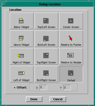
Location dialog.
For windows and dialogs, the default location is Default (0,0), which places the window at the next available position defined by the Window Manager. The default location for a menu module is Below Widget.
|
If you choose Default as the location, the offsets are ignored. |
To select a module that's in the PhAB work area:
Or
Or
Whichever method you choose, you'll see resize handles that indicate the module is selected.
For information on opening a module that's not currently in PhAB's work area, see "Opening a module" in this chapter.
To find a lost module or icon:
If the above techniques don't work, you may have "closed" the module. (PhAB lets you close a module to remove it from your work area and reduce clutter.) To find how to reopen a closed module, see "Opening a module" in this chapter.
|
|
|
|