The VolumeUI and VolumeSlider components use QML to define the UI for the audio volume control.
This UI consists of a slider indicating the current volume level and two buttons on the sides that increase and decrease the
volume. You can tap the slider in a certain spot to set the volume to that exact level.
To add the QML components:
-
In the Project view, right-click the QtHmi folder and click
Add New...
-
In the New File dialog, select Qt in the Files and Classes
list, then QML File (Qt Quick 2) in the list of file types (shown in the middle), then click
Choose...
-
In the Location page of the resulting dialog, name the file VolumeUI,
then click Next.
-
In the Summary page, ensure the Add to project field is
set to project file (QtHmi.pro), then click Finish.
Qt Creator adds VolumeUI.qml to the project (under the QML folder)
and opens this file for editing.
-
Replace the contents of this file with the following:
import QtQuick 2.0

Rectangle {
    id: root
    color: "#404040"
    width: parent.width
    height: parent.height / 8

    Row {
        id: volumeRow

        anchors.right: root.right
        anchors.rightMargin: root.width / 16
        anchors.verticalCenter: root.verticalCenter

        Item {
            id: volumeNone
            height: root.height
            width: height
            Image {
                id: volumeNoneImage
                anchors.centerIn: parent
                source: "qrc:/img/ic_vol_none.png"
            }
            Timer {
                id: volumeNoneTimer
                interval: 100
                repeat: true
                running: false
                onTriggered: {
                    // Decrease volume by 1%
                    volumeRow.updateVolumeSlider(
                        volumeSlider.value - 1)
                }
            }
            MouseArea {
                anchors.fill: parent
                onClicked: {
                    // Decrease volume by 1%
                    volumeRow.updateVolumeSlider(
                        volumeSlider.value - 1)
                }
                onPressAndHold: {
                    volumeNoneTimer.start();
                    // Decrease volume by 1%
                    volumeRow.updateVolumeSlider(
                        volumeSlider.value - 1)
                }
                onReleased: {
                    volumeNoneTimer.stop();
                }
            }
        }

        VolumeSlider {
            id: volumeSlider
            width: root.width / 4
            height: volumeNoneImage.height

            anchors.verticalCenter: parent.verticalCenter
            sourceBackground: "qrc:/img/bg_volumebar.png"
            sourceOverlay: "qrc:/img/fill_volumebar.png"
            value: 50
            maxValue: 100
        }

        Item {
            id: volumeFull
            height: root.height
            width: height
            Image {
                id: volumeFullImage
                anchors.centerIn: parent
                source: "qrc:/img/ic_vol_full.png"
            }
            Timer {
                id: volumeFullTimer
                interval: 100
                repeat: true
                running: false
                onTriggered: {
                    // Increase volume by 1%
                    volumeRow.updateVolumeSlider(
                        volumeSlider.value + 1)
                }
            }
            MouseArea {
                anchors.fill: parent
                onClicked: {
                    // Increase volume by 1%
                    volumeRow.updateVolumeSlider(
                        volumeSlider.value + 1)
                }
                onPressAndHold: {
                    volumeFullTimer.start()
                    // Increase volume by 1%
                    volumeRow.updateVolumeSlider(
                        volumeSlider.value + 1)
                }
                onReleased: {
                    volumeFullTimer.stop();
                }
            }
        }

        function updateVolumeSlider(value) {
            if (value > 100) {
                value = 100
            }
            if (value < 0) {
                value = 0
            }
            volumeSlider.value = value;
        }
    }
}
-
Repeat Steps
1 through 4
to add another QML file but this time, name the file VolumeSlider.
-
Replace the contents of this file with the following:
import QtQuick 2.0

// You need to specify the background image and the overlay
Item {
    id: root

    property string sourceBackground: ""
    property string sourceOverlay: ""

    // Max value
    property double maxValue: 0
    // Current value
    property double value: 0

    // Whether this item is user interactive
    property bool interactive: true

    Column {
        spacing: 1
        anchors.verticalCenter: parent.verticalCenter

        Item {
            id: graphicBar

            width: root.width
            height: root.height;

            Image {
                id: sourceImage

                anchors.fill: graphicBar
                fillMode: Image.Tile
                smooth: true
                source: sourceBackground
            }

            Image {
                id: overlayImage

                height: graphicBar.height
                width: handle.x

                fillMode: Image.Tile
                smooth: true
                source: sourceOverlay
            }

            Item {
                // Invisible handle for dragging
                // The item doesn't need a width or height
                // because its x value is all that matters
                id: handle
                x: (maxValue ?
                        (Math.min(value, maxValue) / maxValue)
                         * graphicBar.width : 0)
                width: 0
                height: 0
            }

            MouseArea {
                anchors.centerIn: parent

                height: parent.height * 3
                width: parent.width

                enabled: root.interactive

                drag.target: handle
                drag.minimumX: 0
                drag.maximumX: graphicBar.width

                function moveToPosition(position)
                {
                    if (!maxValue)
                        return;
                    // retrieve the position where the user
                    // dragged to
                    value = (position / graphicBar.width)
                             * maxValue
                }

                // Touch without drag
                onReleased: {
                    moveToPosition(mouseX);
                }

                property bool dragActive: drag.active

                onPositionChanged: {
                    moveToPosition(handle.x);
                }
            }
        }
    }
}
-
Open main.qml and update its contents with the following:
import QtQuick 2.0

Rectangle {

    color: "black"

    Text {
        color: "white"
        text: qsTr("Awesome HMI goes here")
        anchors.centerIn: parent
    }

    VolumeUI {
        id: volumeui
        anchors.left: parent.left
        anchors.right: parent.right
        anchors.bottom: parent.bottom
    }
}
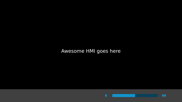
This adds the volume control to the bottom of the HMI.
-
Build and run the HMI application, by following the steps in "Building the HMI application for a QNX target".
The HMI shown on the target screen prints the original message but also displays the volume slider and two control
buttons along the bottom. Clicking the left button decreases the volume by 1% and moves the slider to the left.
Clicking the right button increases the volume by 1% and moves the slider to the right.
Tapping the slider sets the volume to the exact level based on the location. For instance, tapping it in the middle
sets the volume to 50%.
You can also drag the volume slider to the left to decrease the volume or to the right to increase it.
Whenever your tap or drag the slider, the volume level is redrawn immediately and the audio status PPS object is
updated to store this new level.
You've now added an HMI control for setting the audio volume!
Note:
The control defined here lets the user interact with the volume display and keeps the PPS volume setting in sync with the HMI,
but it doesn't tell the Audio Manager service to change the output volume.
To do this, your application has to write a command to the PPS control object used by the Audio Manager service
(for more information, see the
/pps/services/audio/status entry in the
PPS Objects Reference).