|
If the resize policy conflicts with the anchors, the Pt_ARG_RESIZE_FLAGS override Pt_ARG_ANCHOR_OFFSETS and Pt_ARG_ANCHOR_FLAGS. |
This chapter discusses how to set up or fine-tune your widgets' geometry.
It covers the following topics:A container widget is a child of the PtContainer widget class. Container widgets are the only widgets that can have children. Any widget that doesn't have a window of its own is always rendered within the boundaries of its parent. Only widgets belonging to a subclass of the PtWindow widget class get a window of their own.
Container widgets are responsible for performing geometry management. A container widget's primary responsibility is to position each child and size itself appropriately to accommodate all its children at their desired locations. The container may also impose size constraints on its children (for example, forcing them all to be the same size). The container must also constrain the children so that they don't appear outside the container's boundaries. This is normally done by clipping the child.
To understand how different containers handle geometry management, it's important to understand the geometry of a widget. See “Widget Geometry” in the Introduction to this guide.
When a widget is realized, a geometry negotiation process is initiated in all the widgets in the widget family hierarchy. Each child of the widget is given the opportunity to calculate its size. This ripples down through all the widgets in the family, resulting in a calculation of the size of each of the descendants first.
Once each child has calculated its desired size, the parent widget may attempt to determine the layout for its children. The layout that the widget performs depends on:
If the application has specified a size for the widget, then it may choose to lay out the children using only that available space. This is influenced by the resize policy set for the widget. The Pt_ARG_RESIZE_FLAGS resource is a set of flags that determine the resizing policy for the widget. The flags specify a separate resizing policy for the width and height of the widget. If no policy is specified for either dimension, the widget doesn't attempt to resize itself in that dimension when performing the layout. Any other resize policy allows the widget to grow in that dimension to accommodate its children. For more details, see “Resize policy,” below.
If the widget doesn't have a predetermined size, it tries to size itself to accommodate all the children using the appropriate layout policy. It does so by first attempting to determine a correct layout and then determining the space required to accommodate it.
The layout process determines the desired location of each child. The layout policy used by the widget controls how the layout attempts to position the children relative to each other. It must take into account the dimensions of the children. The container is responsible for fixing the position of each child, so the layout policy may choose whether or not to take into account the position attributes of the children.
In performing the layout, the widget may also take the resize policy into account. Based on this policy, it determines whether it must adjust its width or height, or change the layout to account for space restrictions. The widget tries to choose a layout that best meets the constraints imposed by any size restrictions and by the layout policy.
After determining the desired position of each of its children, the widget calculates the width and height it needs to accommodate the children at these locations. It changes its dimensions, if necessary, to fit each of the children at the desired position. If this isn't possible because the resize policy doesn't allow it, the widget recalculates the positions to fit the children within the space available.
Once the layout is successfully established, the widget sets the position of each of the children by altering the child's position attribute.
Any change to a widget that may affect the amount of space required to display its contents can result in the widget's resizing itself to fit its contents. This is governed by the resize policy enforced by the widget.
The resize policy affects both basic widgets and containers. A container checks its resize policy when it lays out its children to determine whether it should resize itself to accommodate all the children at their desired locations. Through the geometry negotiation process, this effect is propagated up the widget family until the size of the window widget is determined.
The Pt_ARG_RESIZE_FLAGS resource controls the resize policy. This resource consists of a separate set of flags for the width and the height. The values of the flags determine the conditions under which the widget recalculates the corresponding dimension. The values are checked whenever the widget is realized or its contents change.
|
If the resize policy conflicts with the anchors, the Pt_ARG_RESIZE_FLAGS override Pt_ARG_ANCHOR_OFFSETS and Pt_ARG_ANCHOR_FLAGS. |
The resize flags are as follows:
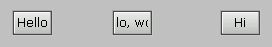
For example, the following figure shows a button with the Pt_RESIZE_X_ALWAYS flag set as the label changes from Hello to Hello, world to Hi:
|
The Pt_RESIZE_XY_ALWAYS flag isn't defined in PhAB. It's provided for your convenience when setting resize flags from your code. |
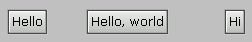
For example, the following figure shows a button with the Pt_RESIZE_X_AS_REQUIRED flag set as the label changes from Hello to Hello, world to Hi.
|
The Pt_RESIZE_XY_AS_REQUIRED flag isn't defined in PhAB. It's provided for your convenience when setting resize flags from your code. |
These flags may also be modified by the values of another set of flags, namely:
|
The Pt_RESIZE_XY_INITIAL flag isn't defined in PhAB. It's provided for your convenience when setting resize flags from your code. |
If you set any of these “initial” flags, the widget doesn't resize in response to a change in the data — it changes its size only during the geometry negotiation process whenever it's realized. The widget either makes itself exactly the right size for its contents, or grows to fit its contents if the dimensions it has at the time aren't large enough.
|
If none of the resize flags is set, the widget doesn't try
to calculate its own dimensions, but uses whatever dimensions have been
set by the application (thereby possibly clipping the widget's contents
as a result).
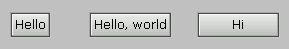
For example, the following figure shows a button with no resize flags set as the label changes from Hello to Hello, world to Hi.
|
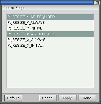
You can set these flags in PhAB by editing the container's resize flags, Pt_ARG_RESIZE_FLAGS, as shown below:
You can also set the container's resize flags in your code, if required, using the method described in the Manipulating Resources in Application Code chapter.
Bit masks are provided for controlling which bits are set. There's one bit mask for each of the x and y resize policies:
For example, to make a container grow to fit all its children if it isn't large enough when it's realized, set both the initial and required resize flags for x and y:
PtSetResource (ABW_my_container, Pt_ARG_RESIZE_FLAGS,
   (Pt_RESIZE_XY_INITIAL|Pt_RESIZE_XY_AS_REQUIRED),
   Pt_RESIZE_X_BITS|Pt_RESIZE_Y_BITS);
To set up the argument list to clear the x resize policy:
PtSetResource (ABW_my_container, Pt_ARG_RESIZE_FLAGS,
   Pt_FALSE, Pt_RESIZE_X_BITS);
There are also some constants that simplify the setting of these flags. For example, there's a constant representing the bitmask for setting both the x and y flags simultaneously, and there are constants for each flag with the x or y shift applied. All these constants are defined in the <photon/PtWidget.h> header file.
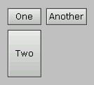
The most basic form of layout a container can provide is to position its children without imposing any size or positioning constraints on them. In such a situation, a child widget is pinned to a particular location within the container, and the container doesn't change its size.
A widget employing this layout policy is somewhat analogous to a bulletin board. You can pin items to the bulletin board, and they stay wherever they're pinned. All container widgets can perform absolute positioning.
The easiest way to position and size each child is to use the mouse in PhAB.
To position each of the children from your application's code, you must set the Pt_ARG_POS resource for each child. If the widgets must be a consistent or predetermined size, you must also set the Pt_ARG_DIM resource for each child. The position you specify is relative to the upper left corner of the parent's canvas, so you can disregard the parent's margins when positioning children.
By default, all widgets that perform absolute positioning use a resize policy of Pt_AS_REQUIRED and Pt_INITIAL. In other words, the container's initial size is chosen when it's realized. The container is made large enough to fit all the children at their specified locations, given their size after they've been realized.
The simplest way to do absolute positioning is to place and position widgets within the main PtWindow widget of the application. If you need to create a container widget that does absolute positioning as part of another container, you can use a PtContainer widget.
PtGroup widgets are container-class widgets that can manage the geometry of their children. You'll find them useful for aligning widgets horizontally, vertically, or in a matrix. They also have the unique ability to stretch child widgets.
PhAB extends the usefulness of this widget class by turning it into an action-oriented “Group” command. Using this command, you can select several widgets within a module and group them together to form a single group widget. If you try to select any widget in the group by clicking on it, the entire group is selected instead.
When you select a group, the Resources control panel shows the resources available to the PtGroup widget class. These include resources that allow you to align the widgets inside the group and to set up exclusive-selection behavior.
The PtGroup widget can be used to arrange a number of widgets in a row, column, or matrix. Several resources are used to control this, and they're interpreted slightly differently depending on the desired arrangement of the children.
To join widgets into a group:
You should use “Shift–click” if you plan to align the widgets in order using the Orientation resource. The first widget you select becomes first within the group. If order isn't important or alignment isn't required, the bounding box method works just fine.

PhAB groups the widgets and selects the group.
Although PhAB treats a group as a single widget, you can still access any of the individual widgets that make up the group. To do this, use the next and previous buttons in the Resources or Callbacks control panel, or select the widget directly in the Module Tree panel. For more info, see “Selecting widgets” in the Creating Widgets in PhAB chapter.
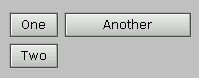
The orientation resource, Pt_ARG_GROUP_ORIENTATION, controls whether the group widget's children are arranged as rows or columns. Pt_GROUP_VERTICAL causes the children to be arranged vertically, while Pt_GROUP_HORIZONTAL causes them to be arranged horizontally.
You can control the amount of space to be left between the widgets arranged in the group widget by using the Pt_ARG_GROUP_SPACING resource. The value of the resource gives the number of pixels to be left between widgets.
The following example shows how several children are laid out if the group uses vertical orientation with a space of five pixels between children:
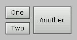
If the orientation is changed to horizontal, the group appears like this:
When first realized, the group widget initially sizes itself to be large enough to hold all the children after they've been arranged.
The group widget may also be used to layout children in both rows and columns for creating tables or spreadsheets by setting the value of Pt_ARG_GROUP_ROWS_COLS resource to some value other than one.
The interpretation of this resource depends on the orientation:
The last row or column may have fewer widgets than the others.
When the elements of a group are laid out in rows and columns, the widgets themselves may either be tightly packed or they may be spaced out equally as rows and/or columns. This is controlled by the Pt_ARG_GROUP_SPACING resource.
The PtGroup widget includes a set of flags, Pt_ARG_GROUP_FLAGS, that can be used to control how the child widgets can be selected, sized, and stretched:
|
Don't set the Pt_GROUP_EQUAL_SIZE_... and Pt_GROUP_STRETCH_... flags for the same direction — the group will expand every time its extent is calculated. |
For more information, see the description of the PtGroup widget in the Widget Reference.
To split a group into its individual widgets:

PhAB splits apart the widgets and removes the PtGroup container.
Here's a common layout situation that's not handled by any of the layout policies we've examined. Suppose a container is divided into a number of panes that have constraints on their size and position. Normally, we don't want the panes to overlap, and we want control over how the panes are resized if the container itself grows or shrinks. A constraint mechanism provides this control.
Anchors are provided as a constraint mechanism on the position and size of any widget used within any container. The position attribute and the anchors of each of the children are always used to determine their positions.
|
In the current version of the Photon microGUI, widgets are anchored immediately upon creation. In earlier versions, anchoring is done when the widgets are realized. |
An anchor may be specified for any side of a child widget. The anchor is attached to one of the sides of the parent. It maintains the corresponding side of the child at a fixed distance, the anchor offset from the anchoring side of the parent. The anchor offset may also be expressed as a proportion of the canvas width or height of the parent.
It's possible — but not always desirable — to anchor a widget's edges beyond its parent's canvas.
Any time the parent is resized, the child's position (and possibly size) is altered to maintain this relationship. If any side of the child is not anchored to the parent, it's allowed to float freely. If you explicitly set the size and/or position of an anchored widget, its anchor offsets are recalculated automatically.
|
When using PhAB, you don't specify anchor offsets. Instead you
position the widgets at the desired offset by setting the position (Pt_ARG_POS)
and dimension (Pt_ARG_DIM) resources. PhAB calculates
the anchor offsets automatically, based on the relative sizes and positions
of the parent and the anchored child.
You can turn anchoring on or off using the Anchoring on/off button on the PhAB toolbar. If a parent widget has children that are anchored, and you want to change the size of the parent widget without affecting size of the children, turn anchoring off. |
The width of the child widget is influenced by the anchors for its left and right sides; the height is influenced by the anchors for the top and bottom. If either of an opposing pair of edges is allowed to float, the constraints are met by altering only the position of the widget in the corresponding dimension. This means that the widget may slide in any of the four directions to satisfy the anchor constraints. If both edges are anchored, the widget must be resized in that dimension as well.
Example of anchoring.
|
If the resize policy conflicts with the anchors, the Pt_ARG_RESIZE_FLAGS override Pt_ARG_ANCHOR_OFFSETS and Pt_ARG_ANCHOR_FLAGS. |
Creating an application's main window provides a simple example of using anchor resources. The window commonly has at least two parts to it: the menu bar and the work area. If we consider an application that has a group widget for the work area, we can identify the types of anchors necessary to make it resize correctly in response to a change in the size of the window widget.
Each edge of the work area is anchored to the corresponding edge of the window. The left and top anchor offsets are set to be the same as the position attribute for the widget. This must be calculated to sit below the menu bar. The dimensions of the widget are set to the desired amount of work space.
When realized, the window positions the work area at the location specified by its position attribute. The window's size is set to be large enough to contain the work area.
If the window is resized, the width and height of the work area are resized accordingly, since all the edges are anchored. If the anchor offsets were specified correctly, the position of the widget aren't altered.
We don't have to do anything for the menu bar, because it's automatically anchored to the top and sides of the window.
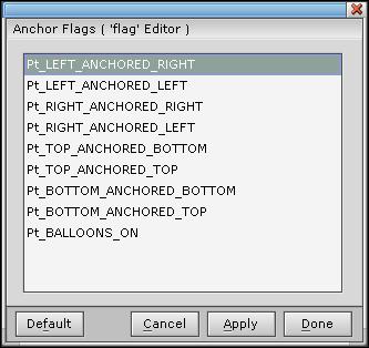
The Pt_ARG_ANCHOR_FLAGS resource (defined by PtWidget) controls the anchor attachments. Within the anchor flags, there are three flags associated with each edge of the widget; these three flags allow each edge to be anchored in one of two possible ways:
These flags use this naming scheme:
Pt_edge_ANCHORED_anchor
where:
Thus, the following flags are defined:
To set the anchor flags, click on the anchor flags (Pt_ARG_ANCHOR_FLAGS) resource and use PhAB's flag editor:
You can also set these flags from your code, using the method described in the Manipulating Resources in Application Code chapter. For convenience, each set of flags has an associated bit mask:
So to set the left and right edge for our menu bar in the example above, the argument list element would be initialized as follows:
PtSetArg(&arg[n], Pt_ARG_ANCHOR_FLAGS,
    Pt_LEFT_ANCHORED_LEFT|Pt_RIGHT_ANCHORED_RIGHT|
    Pt_TOP_ANCHORED_TOP,
    Pt_LEFT_IS_ANCHORED|Pt_RIGHT_IS_ANCHORED|
    Pt_TOP_IS_ANCHORED);
When setting anchor flags from your application's code, all the anchor offsets are specified using the Pt_ARG_ANCHOR_OFFSETS resource. This resource takes a PhRect_t structure (see the Photon Library Reference) as a value. The upper left corner of the rectangle is used to specify the anchor offset for the top and left edges of the widget, and the lower right corner of the rectangle indicates the anchor offset for the right and bottom edges.
If you wish to maintain more complex relationships among the positions of children relative to the container, or relative to each other, consider using layouts. A layout is a property of container widgets that sizes and organizes its children when the container or its children change size.
Layouts are an alternative to the direct geometry management of the widgets using Pt_ARG_POS, Pt_ARG_DIM, and Pt_ARG_AREA. Instead of calculating positions and sizes of the widgets in your code, your code describes the rules of how the widgets should be laid out. This proves to be very efficient and doesn't require additional code to handle resize operations. Layouts usually guarantee that widgets are not overlapping, which is an important feature for many multilingual applications. Each type of layout has its own method of sizing and positioning the children in its container. Each child widget can have detailed info of how it should be sized and positioned in its parent. If a child is a container, it can have its own layout for its children.
These are the layout types in the Photon Widget Library:
You set layouts using resources in the container widget. You can refine the way layouts place widgets by setting resources on the child widgets. Below are the resources involved in using layouts.
PtContainer has these layout-related resources:
PtArg_t               args[20];
int                     i = 0;
PtFillLayoutInfo_t      info;

info.type = Pt_LAYOUT_HORIZONTAL;
info.spacing = 2;
PtSetArg( &args[i++], Pt_ARG_LAYOUT, PtFillLayout, &info );
This callback is called when the layout is about to start laying out children and when it's finished. The cbinfo->reason_subtype indicates which situation called it, and is one of:
You can use this callback to fine-tune the layout procedure.
PtArg_t               args[20];
int                     i = 0;
PtFillLayoutInfo_t      info;

info.type = Pt_LAYOUT_HORIZONTAL;
info.spacing = 2;
PtSetArg( &args[i++], Pt_ARG_LAYOUT_TYPE, Pt_FILL_LAYOUT,
          &info );
* You can set all the Pt_ARG_*_LAYOUT_INFO resources at the same time. The active layout will look for its type of info structure to perform the layout.
PtWidget has these layout-related resources:
* You can set all the Pt_ARG_*_LAYOUT_DATA resources at the same time. The active layout of the widget's parent will look for its type of data structure to perform the layout.
These are the structures used to set layout-related resources:
| Layout type (Pt_ARG_LAYOUT in the container) | Layout Info Structure (Pt_ARG_LAYOUT_INFO or Pt_ARG_*_LAYOUT_INFO in the container) | Layout Data Structure (Pt_ARG_LAYOUT_DATA or Pt_ARG_*_LAYOUT_DATA in child widgets) |
|---|---|---|
| PtFillLayout | PtFillLayoutInfo_t | N/A |
| PtRowLayout | PtRowLayoutInfo_t | PtRowLayoutData_t |
| PtGridLayout | PtGridLayoutInfo_t | PtGridLayoutData_t |
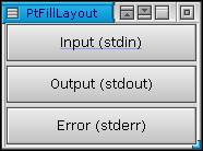
This is a simple type of a layout. It organizes children in one row or one column and makes them the same size. The width of each child will be at least as wide as the widest child's width. The same rule applies to the height.
You can set the layout's options using the layout information structure, PtFillLayoutInfo_t. See the PtContainer resource Pt_ARG_FILL_LAYOUT_INFO for a description of the PtFillLayoutInfo_t structure.
There is no layout data structure for the Pt_ARG_LAYOUT_DATA resource of children for this layout type.
Let's take a look at this example:
/* fill_layout.c example */

#include <Pt.h>

int
main( int argc, char *argv[] )
{
PtWidget_t             *window;
PtArg_t                 args[20];
int                     i = 0;
PtFillLayoutInfo_t      info;

/* Set layout type and spacing between its children */
info.type = Pt_LAYOUT_HORIZONTAL;
info.spacing = 2;

/* Create a window */
i = 0;
PtSetArg( &args[i++], Pt_ARG_WINDOW_TITLE, "PtFillLayout",
0 );
PtSetArg( &args[i++], Pt_ARG_LAYOUT, PtFillLayout, &info
);
if( NULL == ( window = PtAppInit( NULL, &argc, argv, i,
args ) ) ) {
        perror( "PtAppInit()" );
        return 1;
}

/* Create buttons */
i = 0;
PtSetArg( &args[i++], Pt_ARG_TEXT_STRING, "Input (stdin)",
0 );
PtCreateWidget( PtButton, window, i, args );

i = 0;
PtSetArg( &args[i++], Pt_ARG_TEXT_STRING, "Output (stdout)", 0
);
PtCreateWidget( PtButton, window, i, args );

i = 0;
PtSetArg( &args[i++], Pt_ARG_TEXT_STRING, "Error (stderr)", 0
);
PtCreateWidget( PtButton, window, i, args );

PtRealizeWidget( window );
PtMainLoop();
return 0;
}
Build and run the application:
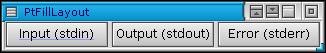
Fill layout initial.
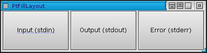
Fill layout after resizing.
Now change the type from Pt_LAYOUT_HORIZONTAL to Pt_LAYOUT_VERTICAL and we get this:
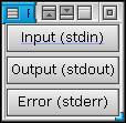
Vertical fill layout.
Vertical fill layout after resizing.
The row layout is similar to the fill layout but it has a very important difference — it can wrap, so it can place children in more than one row or column. When the flags member of the PtRowLayoutInfo_t structure has the Pt_ROW_WRAP flag set, and there is not enough space in the row to fit the next child, the child is moved to the beginning of the next row. The row layout also has margins (the space around all the widgets) and the children of the container can have their own data (in their Pt_ARG_LAYOUT_DATA resources) which can be used to fine-tune the layout.
See the PtContainer resource Pt_ARG_ROW_LAYOUT_INFO for a description of the PtRowLayoutInfo_t structure. The PtRowLayoutData_t structure is described in the PtWidget resource Pt_ARG_ROW_LAYOUT_DATA.
Let's take a look at an example:
#include <Pt.h>

int
main( int argc, char *argv[] )
{
PtWidget_t     *window, *b1, *b2, *b3;
PtArg_t         args[20];
int             i = 0;
PtRowLayoutInfo_t       info;

/* Set layout type and layout info */
info.type = Pt_LAYOUT_HORIZONTAL;
info.flags = Pt_ROW_PACK | Pt_ROW_WRAP;
info.margin.ul.x = 3;
info.margin.ul.y = 3;
info.margin.lr.x = 3;
info.margin.lr.y = 3;
info.h_spacing = 3;
info.v_spacing = 3;

/* Create a window */
i = 0;
PtSetArg( &args[i++], Pt_ARG_WINDOW_TITLE, "PtRowLayout",
0 );
PtSetArg( &args[i++], Pt_ARG_LAYOUT, PtRowLayout, &info
);
if( NULL == ( window = PtAppInit( NULL, &argc, argv, i,
args ) ) ) {
        perror( "PtAppInit()" );
        return 1;
}

/* Create buttons */
i = 0;
PtSetArg( &args[i++], Pt_ARG_TEXT_STRING, "Input", 0 );
b1 = PtCreateWidget( PtButton, window, i, args );

i = 0;
PtSetArg( &args[i++], Pt_ARG_TEXT_STRING, "Output (stdout)", 0
);
b2 = PtCreateWidget( PtButton, window, i, args );

i = 0;
PtSetArg( &args[i++], Pt_ARG_TEXT_STRING, "Err", 0 );
b3 = PtCreateWidget( PtButton, window, i, args );

PtRealizeWidget( window );
PtMainLoop();
return 0;
}
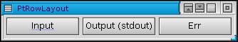
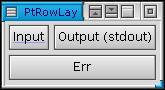
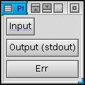
When you build and run this application, you'll see:
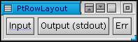
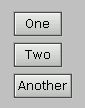
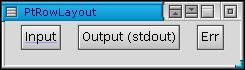
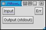
Initial row layout.
Row layout after resizing.
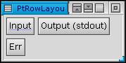
Let's look at what happens when we set and unset some PtRowLayoutInfo_t flags.
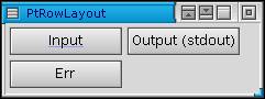
When the Pt_ROW_WRAP is not set, content is clipped to the size of the window. To test this case, you need to clear resize flags for Pt_RESIZE_X_BITS on the window:

Initial window without Pt_ROW_WRAP set.
After shrinking without Pt_ROW_WRAP set.
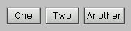
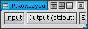
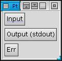
When Pt_ROW_PACK is not set, all the buttons are the same size:
Initial window without Pt_ROW_PACK set.
After resizing without Pt_ROW_PACK set.
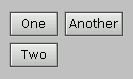
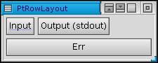
When Pt_ROW_JUSTIFY is set, extra space is distributed evenly between the buttons:

Initial window with Pt_ROW_JUSTIFY set.
After resizing with Pt_ROW_JUSTIFY set.
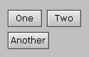
Now see what happens when we set the layout type to Pt_LAYOUT_VERTICAL:
Initial window with Pt_LAYOUT_VERTICAL set.
After resizing with Pt_LAYOUT_VERTICAL set.
If we replace this code:
i = 0;
PtSetArg( &args[i++], Pt_ARG_TEXT_STRING, "Err", 0 );
b3 = PtCreateWidget( PtButton, window, i, args );
with:
PtRowLayoutData_t data = { {0,0}, Pt_ROW_FILL | Pt_ROW_WRAP_BEFORE
};
i = 0;
PtSetArg( &args[i++], Pt_ARG_TEXT_STRING, "Err", 0 );
PtSetArg( &args[i++], Pt_ARG_LAYOUT_DATA, &data,
PtRowLayout );
b3 = PtCreateWidget( PtButton, window, i, args );
The results are:
Initial window.
After stretching.
After shrinking.
What happened? The Err button started its own row because the Pt_ROW_WRAP_BEFORE flag was set. Then the Err button was stretched to fill all the extra space because the Pt_ROW_FILL flag was set.
The Grid Layout is a very powerful and widely used layout. This layout arranges children in a grid, which is why it's sometimes called a “table layout.” The layout info structure PtGridLayoutInfo_t contains a number of members that adjust the layout operation. Children of the layout container can have layout data (PtGridLayoutData_t) attached to them to fine-tune the layout.
See the PtContainer resource Pt_ARG_GRID_LAYOUT_INFO for a description of the PtGridLayoutInfo_t structure. The PtGridLayoutData_t structure is described in the PtWidget resource Pt_ARG_GRID_LAYOUT_DATA.
Let's look at some examples that use a grid layout:
#include <Pt.h>

int
main( int argc, char *argv[] )
{
PtWidget_t             *window;
PtArg_t                 args[20];
int                     i = 0;
PtGridLayoutInfo_t      info = PtGridLayoutInfoDflts;
PtGridLayoutData_t      data = PtGridLayoutDataDflts;

info.n_cols = 3;
info.flags = 0;
data.flags = Pt_H_ALIGN_BEGINNING;

/* Create a window */
i = 0;
PtSetArg( &args[i++], Pt_ARG_WINDOW_TITLE, "PtGridLayout",
0 );
PtSetArg( &args[i++], Pt_ARG_LAYOUT, PtGridLayout, &info
);
if( NULL == ( window = PtAppInit( NULL, &argc, argv, i,
args ) ) ) {
        perror( "PtAppInit()" );
        return 1;
}

/* Create buttons */
i = 0;
PtSetArg( &args[i++], Pt_ARG_TEXT_STRING, "B1", 0 );
PtSetArg( &args[i++], Pt_ARG_LAYOUT_DATA, &data, PtGridLayout
);
PtCreateWidget( PtButton, window, i, args );

i = 0;
PtSetArg( &args[i++], Pt_ARG_TEXT_STRING, "Button 2 (two)", 0
);
PtSetArg( &args[i++], Pt_ARG_LAYOUT_DATA, &data, PtGridLayout
);
PtCreateWidget( PtButton, window, i, args );

i = 0;
PtSetArg( &args[i++], Pt_ARG_TEXT_STRING, "Butt 3", 0 );
PtSetArg( &args[i++], Pt_ARG_LAYOUT_DATA, &data, PtGridLayout
);
PtCreateWidget( PtButton, window, i, args );

i = 0;
PtSetArg( &args[i++], Pt_ARG_TEXT_STRING, "B4", 0 );
PtSetArg( &args[i++], Pt_ARG_LAYOUT_DATA, &data, PtGridLayout
);
PtCreateWidget( PtButton, window, i, args );

i = 0;
PtSetArg( &args[i++], Pt_ARG_TEXT_STRING, "Butt 5", 0 );
PtSetArg( &args[i++], Pt_ARG_LAYOUT_DATA, &data, PtGridLayout
);
PtCreateWidget( PtButton, window, i, args );

PtRealizeWidget( window );
PtMainLoop();
return 0;
}
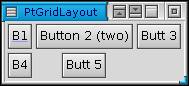
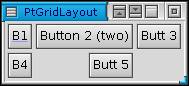
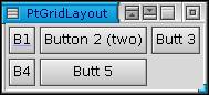
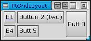
Build and run the sample, and you'll see:
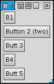
One column (n_cols=1).
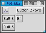
Two columns (n_cols=2).
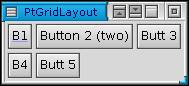
Three columns (n_cols=3).
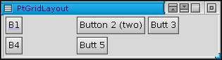
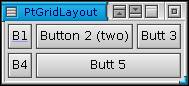
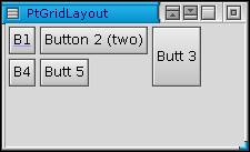
Change the code info.flags = 0; to info.flags |= Pt_EQUAL_COLS;, and we get this:
Now let's see how different cell alignments work.
Set data.flags to Pt_H_ALIGN_BEGINNING:

Set data.flags to Pt_H_ALIGN_CENTER:
Set data.flags to Pt_H_ALIGN_END:
Set data.flags to Pt_H_ALIGN_FILL:
Let's see how spans work. Set the horizontal span of Butt 5 to 2 columns. To do that, add this code before Butt 5 is created:
data.flags = Pt_H_ALIGN_FILL;
data.h_span = 2;
The result is:
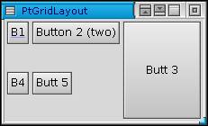
Let's test the vertical span. Undo the changes for the previous example and add the following code before the Butt 3 widget is created:
data.flags = Pt_V_ALIGN_FILL;
data.v_span = 2;
and add the following code after the widget creation call:
data = PtGridLayoutDataDflts;
The result:
Finally, let's see how the grab flags work. If we resize the window we get this:
If we change the flags for the Butt 3 widget to:
data.flags = Pt_ALIGN_FILL_BOTH | Pt_GRAB_BOTH;
We get this:
Let's take a look at a more complicated example. Here is the draft drawing of what we need to program
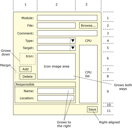
Sketch of grid layout.
The code example below implements this grid-layout plan. Please note that this example is for demonstration purposes only and there are no optimizations in the code.
#include <Pt.h>

int
main( int argc, char *argv[] )
{
PtWidget_t              *window, *w, *ctnr;
PtArg_t                         args[20];
int                                     i = 0;
PtGridLayoutInfo_t      info;
PtGridLayoutData_t      data;

info = PtGridLayoutInfoDflts;
info.n_cols = 3;
info.margin.ul.x = info.margin.ul.y = 5;
info.margin.lr.x = info.margin.lr.y = 5;

/* Create a window */
i = 0;
PtSetArg( &args[i++], Pt_ARG_WINDOW_TITLE, "Module Config", 0 );
PtSetArg( &args[i++], Pt_ARG_LAYOUT, PtGridLayout, &info );
if( NULL == ( window = PtAppInit( NULL, &argc, argv, i, args ) ) ) {
        perror( "PtAppInit()" );
        return 1;
}

data = PtGridLayoutDataDflts;
data.flags = Pt_H_ALIGN_END | Pt_V_ALIGN_CENTER;
i = 0;
PtSetArg( &args[i++], Pt_ARG_LAYOUT_DATA, &data, PtGridLayout );
PtSetArg( &args[i++], Pt_ARG_TEXT_STRING, "Module:", 0 );
PtCreateWidget( PtLabel, window, i, args );

data = PtGridLayoutDataDflts;
data.flags = Pt_H_ALIGN_FILL | Pt_H_GRAB;
data.h_span = 2;
i = 0;
PtSetArg( &args[i++], Pt_ARG_LAYOUT_DATA, &data, PtGridLayout );
PtSetArg( &args[i++], Pt_ARG_TEXT_STRING, "phlocale", 0 );
PtCreateWidget( PtText, window, i, args );

data = PtGridLayoutDataDflts;
data.flags = Pt_H_ALIGN_END | Pt_V_ALIGN_CENTER;
i = 0;
PtSetArg( &args[i++], Pt_ARG_LAYOUT_DATA, &data, PtGridLayout );
PtSetArg( &args[i++], Pt_ARG_TEXT_STRING, "File:", 0 );
PtCreateWidget( PtLabel, window, i, args );

data = PtGridLayoutDataDflts;
data.flags = Pt_H_ALIGN_FILL | Pt_H_GRAB;
i = 0;
PtSetArg( &args[i++], Pt_ARG_LAYOUT_DATA, &data, PtGridLayout );
PtSetArg( &args[i++], Pt_ARG_TEXT_STRING, "/usr/photon/bin/phlocale", 0 );
PtCreateWidget( PtText, window, i, args );

data = PtGridLayoutDataDflts;
data.flags = Pt_H_ALIGN_FILL | Pt_V_ALIGN_CENTER;
i = 0;
PtSetArg( &args[i++], Pt_ARG_LAYOUT_DATA, &data, PtGridLayout );
PtSetArg( &args[i++], Pt_ARG_TEXT_STRING, "Browse...", 0 );
PtCreateWidget( PtButton, window, i, args );

data = PtGridLayoutDataDflts;
data.flags = Pt_H_ALIGN_END | Pt_V_ALIGN_CENTER;
i = 0;
PtSetArg( &args[i++], Pt_ARG_LAYOUT_DATA, &data, PtGridLayout );
PtSetArg( &args[i++], Pt_ARG_TEXT_STRING, "Comment:", 0 );
PtCreateWidget( PtLabel, window, i, args );

data = PtGridLayoutDataDflts;
data.flags = Pt_H_ALIGN_FILL | Pt_H_GRAB;
data.h_span = 2;
i = 0;
PtSetArg( &args[i++], Pt_ARG_LAYOUT_DATA, &data, PtGridLayout );
PtSetArg( &args[i++], Pt_ARG_TEXT_STRING, "Localization utility
(timezone, language, keyboard)", 0 );
PtCreateWidget( PtText, window, i, args );

data = PtGridLayoutDataDflts;
data.flags = Pt_H_ALIGN_END | Pt_V_ALIGN_CENTER;
i = 0;
PtSetArg( &args[i++], Pt_ARG_LAYOUT_DATA, &data, PtGridLayout );
PtSetArg( &args[i++], Pt_ARG_TEXT_STRING, "Type:", 0 );
PtCreateWidget( PtLabel, window, i, args );

data = PtGridLayoutDataDflts;
data.flags = Pt_H_ALIGN_FILL | Pt_V_ALIGN_CENTER;
i = 0;
PtSetArg( &args[i++], Pt_ARG_LAYOUT_DATA, &data, PtGridLayout );
PtSetArg( &args[i++], Pt_ARG_TEXT_STRING, "<module
type>", 0 );
w = PtCreateWidget( PtComboBox, window, i, args );
{
        const char *list[] = { "Binary", "Config", "Development", "Support" };
        PtListAddItems( w, list, sizeof(list)/sizeof(list[0]), 1
);
}

data = PtGridLayoutDataDflts;
data.flags = Pt_H_ALIGN_CENTER | Pt_V_ALIGN_CENTER;
i = 0;
PtSetArg( &args[i++], Pt_ARG_LAYOUT_DATA, &data, PtGridLayout );
PtSetArg( &args[i++], Pt_ARG_TEXT_STRING, "CPU", 0 );
PtCreateWidget( PtLabel, window, i, args );

data = PtGridLayoutDataDflts;
data.flags = Pt_H_ALIGN_END | Pt_V_ALIGN_CENTER;
i = 0;
PtSetArg( &args[i++], Pt_ARG_LAYOUT_DATA, &data, PtGridLayout );
PtSetArg( &args[i++], Pt_ARG_TEXT_STRING, "Target:", 0 );
PtCreateWidget( PtLabel, window, i, args );

data = PtGridLayoutDataDflts;
data.flags = Pt_H_ALIGN_FILL | Pt_V_ALIGN_CENTER;
i = 0;
PtSetArg( &args[i++], Pt_ARG_LAYOUT_DATA, &data, PtGridLayout );
PtSetArg( &args[i++], Pt_ARG_TEXT_STRING, "<target>",
0 );
w = PtCreateWidget( PtComboBox, window, i, args );
{
        const char *list[] = { "OS targets", "GUI target", "DEV target" };
        PtListAddItems( w, list, sizeof(list)/sizeof(list[0]), 1 );
}

data = PtGridLayoutDataDflts;
data.flags = Pt_V_ALIGN_FILL | Pt_H_ALIGN_FILL;
data.v_span = 5;
data.hint.h = 30;       // This is important to keep the list "in bounds"
PtSetArg( &args[i++], Pt_ARG_LAYOUT_DATA, &data, 0 );
w = PtCreateWidget( PtList, window, i, args );
{
        const char *list[] = { "arm", "mips", "sh", "x86" };
        PtListAddItems( w, list, sizeof(list)/sizeof(list[0]), 1 );
}

data = PtGridLayoutDataDflts;
data.flags = Pt_H_ALIGN_END | Pt_V_ALIGN_BEGINNING | Pt_V_GRAB;
i = 0;
PtSetArg( &args[i++], Pt_ARG_LAYOUT_DATA, &data, PtGridLayout );
PtSetArg( &args[i++], Pt_ARG_TEXT_STRING, "Icon:", 0 );
PtCreateWidget( PtLabel, window, i, args );

data = PtGridLayoutDataDflts;
data.flags = Pt_ALIGN_FILL_BOTH | Pt_GRAB_BOTH;
data.v_span = 3;
i = 0;
PtSetArg( &args[i++], Pt_ARG_LAYOUT_DATA, &data, PtGridLayout );
PtSetArg( &args[i++], Pt_ARG_TEXT_STRING, "<img>", 0 );
PtCreateWidget( PtButton, window, i, args );

data = PtGridLayoutDataDflts;
data.flags = Pt_H_ALIGN_BEGINNING | Pt_V_ALIGN_BEGINNING;
data.margin.ul.x = 10;
i = 0;
PtSetArg( &args[i++], Pt_ARG_LAYOUT_DATA, &data, PtGridLayout );
PtSetArg( &args[i++], Pt_ARG_TEXT_STRING, "Add", 0 );
PtCreateWidget( PtButton, window, i, args );

data = PtGridLayoutDataDflts;
data.flags = Pt_H_ALIGN_BEGINNING | Pt_V_ALIGN_BEGINNING;
data.margin.ul.x = 10;
i = 0;
PtSetArg( &args[i++], Pt_ARG_LAYOUT_DATA, &data, PtGridLayout );
PtSetArg( &args[i++], Pt_ARG_TEXT_STRING, "Delete", 0 );
PtCreateWidget( PtButton, window, i, args );

data = PtGridLayoutDataDflts;
data.h_span = 2;
data.flags = Pt_H_ALIGN_FILL;
i = 0;

PtSetArg( &args[i++], Pt_ARG_LAYOUT_DATA, &data, 0 );
PtSetArg( &args[i++], Pt_ARG_CONTAINER_FLAGS,
        Pt_SHOW_TITLE|Pt_ETCH_TITLE_AREA | Pt_GRADIENT_TITLE_AREA,
        Pt_SHOW_TITLE|Pt_ETCH_TITLE_AREA | Pt_GRADIENT_TITLE_AREA
);

PtSetArg( &args[i++], Pt_ARG_TITLE, "Responsible", 0 );
ctnr = PtCreateWidget( PtPane, window, i, args );
{
        PtGridLayoutInfo_t info = PtGridLayoutInfoDflts;
        info.n_cols = 2;

        PtSetResource( ctnr, Pt_ARG_LAYOUT, PtGridLayout, &info );

        i = 0;
        data = PtGridLayoutDataDflts;
        data.flags = Pt_H_ALIGN_END;
        PtSetArg( &args[i++], Pt_ARG_LAYOUT_DATA, &data, 0 );
        PtSetArg( &args[i++], Pt_ARG_TEXT_STRING, "Name:", 0 );
        PtCreateWidget( PtLabel, ctnr, i, args );

        i = 0;
        data = PtGridLayoutDataDflts;
        data.flags = Pt_H_GRAB | Pt_H_ALIGN_FILL;
        PtSetArg( &args[i++], Pt_ARG_LAYOUT_DATA, &data, 0 );
        PtSetArg( &args[i++], Pt_ARG_TEXT_STRING, "David Johnson", 0 );
        PtCreateWidget( PtText, ctnr, i, args );

        i = 0;
        data = PtGridLayoutDataDflts;
        data.flags = Pt_H_ALIGN_END;
        PtSetArg( &args[i++], Pt_ARG_LAYOUT_DATA, &data, 0 );
        PtSetArg( &args[i++], Pt_ARG_TEXT_STRING, "Location:", 0 );
        PtCreateWidget( PtLabel, ctnr, i, args );

        i = 0;
        data = PtGridLayoutDataDflts;
        data.flags = Pt_H_GRAB | Pt_H_ALIGN_FILL;
        PtSetArg( &args[i++], Pt_ARG_LAYOUT_DATA, &data, 0 );
        PtSetArg( &args[i++], Pt_ARG_TEXT_STRING, "North America", 0 );
        PtCreateWidget( PtText, ctnr, i, args );

}

i = 0;
data = PtGridLayoutDataDflts;
data.flags = Pt_H_ALIGN_FILL;
data.h_span = 3;
data.hint.h = 6;
PtSetArg( &args[i++], Pt_ARG_SEP_FLAGS, Pt_SEP_HORIZONTAL, 0 );
PtSetArg( &args[i++], Pt_ARG_LAYOUT_DATA, &data, PtGridLayout );
PtCreateWidget( PtSeparator, window, i, args );

i = 0;
data = PtGridLayoutDataDflts;
data.flags = Pt_H_ALIGN_END;
data.h_span = 3;
PtSetArg( &args[i++], Pt_ARG_TEXT_STRING, "Save", 0 );
PtSetArg( &args[i++], Pt_ARG_LAYOUT_DATA, &data, PtGridLayout );
PtCreateWidget( PtButton, window, i, args );

PtRealizeWidget( window );
PtMainLoop();
return 0;
}
Here's what the resulting interface looks like:
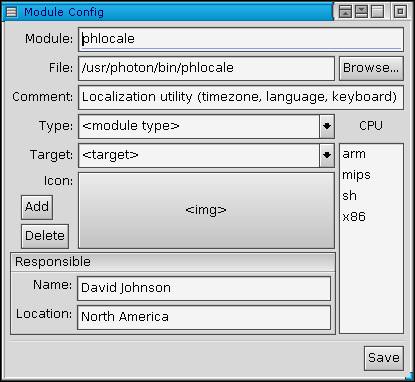
Complex grid layout — initial.
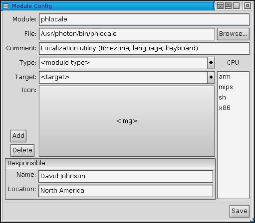
Complex grid layout — resize.
Let's take a look at an interesting way of using hints with the grid layout. We will use a “draggable” separator to obtain the user's input and adjust the width hint of one of the widgets in the layout.
This is what we'll do:
Here is the actual implementation:
#include <Pt.h>

#define MARGIN_W 2
#define SPACING_W        2
#define SEP_WIDTH        5

/* These variables contain the limits for the separator movement
*/
static short col1_min_width, col2to4_width;

/****************************************************************
DRAG_CB() ***/
int
drag_cb( PtWidget_t *widget, void *data, PtCallbackInfo_t *cbinfo)
{
PtSeparatorCallback_t   *cb = (PtSeparatorCallback_t*)cbinfo->cbdata;
PtWidget_t              *b1 = (PtWidget_t*)data;
short                   pos_x = cb->rect.ul.x;
PtGridLayoutData_t      *_grid_data, grid_data;
const PhRect_t          *p_canvas = PtGetCanvas( widget->parent
);
short                   parent_width = p_canvas->lr.x - p_canvas->ul.x&
#SPACE
+ 1;

/* Validate the pos.x of the separator, so that it stays in the
range */
pos_x = max( col1_min_width, pos_x );
pos_x = min( pos_x, parent_width - col2to4_width );

PtGetResource( b1, Pt_ARG_LAYOUT_DATA, &_grid_data, PtGridLayout
);
grid_data = *_grid_data;
grid_data.hint.w = pos_x - (MARGIN_W + SPACING_W);
PtSetResource( b1, Pt_ARG_LAYOUT_DATA, &grid_data, PtGridLayout
);

return Pt_CONTINUE;
}

/*******************************************************************
MAIN() ***/
int
main( int argc, char *argv[] )
{
int                     i;
PtWidget_t      *window, *sep, *b1, *b2, *b3;
PtArg_t         args[20];
PhDim_t                 dim;
PtGridLayoutData_t      data;
PtGridLayoutInfo_t      info = PtGridLayoutInfoDflts;

info.n_cols = 4;
info.margin.ul.x = info.margin.lr.x = MARGIN_W;
info.h_spacing = SPACING_W;

i = 0;
PtSetArg( &args[i++], Pt_ARG_WINDOW_TITLE, "example: Draggable
Separator", 0 );
PtSetArg( &args[i++], Pt_ARG_HEIGHT, 100, 0 );
PtSetArg( &args[i++], Pt_ARG_WIDTH,  400, 0 );
PtSetArg( &args[i++], Pt_ARG_CONTAINER_FLAGS, Pt_AUTO_EXTENT,
Pt_AUTO_EXTENT );
PtSetArg( &args[i++], Pt_ARG_LAYOUT, PtGridLayout, &info
);

if( NULL == ( window = PtAppInit( NULL, &argc, argv, i,
args ) ) ) {
        perror( "PtAppInit()" );
        return 1;
}

data = PtGridLayoutDataDflts;
data.flags = Pt_V_ALIGN_FILL | Pt_H_ALIGN_FILL;
i = 0;
PtSetArg( &args[i++], Pt_ARG_TEXT_STRING, "B1", 0 );
PtSetArg( &args[i++], Pt_ARG_LAYOUT_DATA, &data, PtGridLayout
);
b1 = PtCreateWidget( PtButton, NULL, i, args );

data = PtGridLayoutDataDflts;
data.hint.w = SEP_WIDTH;
data.flags = Pt_V_ALIGN_FILL;
i = 0;
PtSetArg( &args[i++], Pt_ARG_SEP_ORIENTATION, Pt_VERTICAL,
0 );
PtSetArg( &args[i++], Pt_ARG_SEP_TYPE, Pt_DOUBLE_LINE,
0 );
PtSetArg( &args[i++], Pt_ARG_SEP_FLAGS, Pt_SEP_DRAGGABLE, Pt_SEP_DRAGGABLE&
#SPACE
);
PtSetArg( &args[i++], Pt_ARG_CURSOR_TYPE, Ph_CURSOR_DRAG_HORIZONTAL,
0 );
PtSetArg( &args[i++], Pt_ARG_LAYOUT_DATA, &data, PtGridLayout
);
sep = PtCreateWidget( PtSeparator, NULL, i, args );
PtAddCallback( sep, Pt_CB_SEP_DRAG, drag_cb, b1 );

i = 0;
data = PtGridLayoutDataDflts;
data.flags = Pt_V_ALIGN_FILL | Pt_H_ALIGN_FILL | Pt_GRAB_BOTH;
PtSetArg( &args[i++], Pt_ARG_TEXT_STRING, "B2", 0 );
PtSetArg( &args[i++], Pt_ARG_LAYOUT_DATA, &data, PtGridLayout
);
b2 = PtCreateWidget( PtButton, NULL, i, args );

data = PtGridLayoutDataDflts;
data.flags = Pt_V_ALIGN_FILL | Pt_H_ALIGN_FILL | Pt_GRAB_BOTH;
i = 0;
PtSetArg( &args[i++], Pt_ARG_TEXT_STRING, "B3", 0 );
PtSetArg( &args[i++], Pt_ARG_LAYOUT_DATA, &data, PtGridLayout
);
b3 = PtCreateWidget( PtButton, NULL, i, args );

/* Calculate the limits of the dragging */

/* Column 1: width of the b1 + left margin + spacing */
PtGetPreferredDim( b1, 0, 0, &dim );
col1_min_width = dim.w + MARGIN_W + SPACING_W;

/* Column 2 to 4:
 *      separator width + spacing + b2 width + spacing + b3 width
+ right margin
 */
col2to4_width = SEP_WIDTH + SPACING_W;

PtGetPreferredDim( b2, 0, 0, &dim );
col2to4_width += dim.w + info.h_spacing;

PtGetPreferredDim( b3, 0, 0, &dim );
col2to4_width += dim.w + info.margin.lr.x;

PtRealizeWidget( window );

PtMainLoop(  );

return 0;
}
This is how the application behaves when resized:
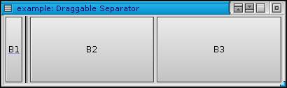
Initial Hints example.
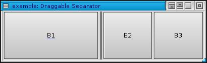
Hints example after resizing.
If you wish to maintain more complex relationships among the positions of children relative to the container, or relative to each other, and you don't want to use layouts, you must catch resize events for the container. The PtContainer widget class provides a resize callback, Pt_CB_RESIZE, that you can use for this purpose.
The cbdata member of the PtCallbackInfo_t structure (see the Photon Widget Reference) is a pointer to a PtContainerCallback_t structure that contains at least the following: