![[Previous]](prev.gif) |
![[Contents]](contents.gif) |
![[Index]](keyword_index.gif) |
![[Next]](next.gif) |
|
|
|
|
 |
This version of this document is no longer maintained. For the latest documentation, see http://www.qnx.com/developers/docs. |
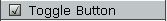
A toggle switch that's either off or on
PtWidget → PtBasic → PtLabel → PtButton → PtToggleButton
For more information, see the diagram of the widget hierarchy.
<photon/PtToggleButton.h>
A PtToggleButton widget is like a toggle switch, although it behaves like a button. It has on and off states, and pressing the button inverts the current state of the button.
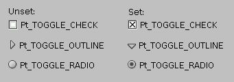
Various button styles supported by PtToggleButton.
Toggle buttons inherit resources from PtLabel and PtButton; specify the label for toggle buttons the way you do for these classes.
A toggle button is displayed as a button with a label beside it. The button is either set or unset, and you can control its appearance with the Pt_ARG_INDICATOR_COLOR and Pt_ARG_INDICATOR_TYPE resources. You can set the position of the text relative to the button with the Pt_ARG_BALLOON_POSITION resource.
You can also set Pt_ARG_ARM_COLOR, which specifies the fill color for the button's interior when the button is set. This resource is used only if the value of Pt_ARG_ARM_FILL is Pt_TRUE. These resources are inherited from PtButton.
To determine whether or not the button is set, check the:
A group can control how several toggle buttons behave together. If you place the toggle buttons in a group and make them mutually exclusive, they behave like the channel-selector buttons on a car radio: only one of the buttons can be set at any given time, and setting any button automatically unsets the button that's currently set.
To make a group of toggle buttons mutually exclusive, set the Pt_GROUP_EXCLUSIVE bit in the group's Pt_ARG_GROUP_FLAGS resource. For example:
PtSetArg (&argt[n], Pt_ARG_GROUP_FLAGS, Pt_TRUE,
          Pt_GROUP_EXCLUSIVE );
n++;
PtSetArg (&argt[n], Pt_ARG_GROUP_ORIENTATION,
          Pt_GROUP_VERTICAL, 0 ) ;
n++;
group = PtCreateWidget (PtGroup, parent, n, argt );

PtSetArg (&argt[0], Pt_ARG_TEXT_STRING,
          "Button 1", 0 ) ;
button1 = PtCreateWidget (PtToggleButton, group,
                           1, argt ) ;

PtSetArg (&argt[0], Pt_ARG_TEXT_STRING,
          "Button 2", 0 ) ;
button2 = PtCreateWidget (PtToggleButton, group,
                          1, argt ) ;

PtSetArg (&argt[0], Pt_ARG_TEXT_STRING,
          "Button 3", 0 ) ;
button3 = PtCreateWidget (PtToggleButton, group,
                          1, argt ) ;

PtRealizeWidget ( group ) ;
You can use the same callback for all the buttons, but how do you determine which one is selected? There are several ways:
Or:
Or:
| Resource | C type | Pt type | Default |
|---|---|---|---|
| Pt_ARG_INDICATOR_COLOR | PgColor_t | Scalar | Pg_WHITE |
| Pt_ARG_INDICATOR_TYPE | unsigned char | Scalar | Pt_TOGGLE_CHECK |
| C type | Pt type | Default |
|---|---|---|
| PgColor_t | Scalar | Pg_WHITE |
The fill color for the toggle button's indicator. See PgColor_t in the Photon Library Reference.
| C type | Pt type | Default |
|---|---|---|
| unsigned char | Scalar | Pt_TOGGLE_CHECK |
Determines how the indicator is drawn. Possible values:
Here's how these types look, both set and unset:
If the widget modifies an inherited resource, the “Default override” column indicates the new value. This modification affects any subclasses of the widget.
|
|
|
|