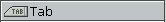
A tab button for initiating an action
PtWidget →
PtBasic →
PtLabel →
PtTab
For more information, see the
diagram of the widget hierarchy.
<photon/PtTab.h>
The PtTab class draws a tab such as is found on a
file folder.
Clicking the tab invokes an application callback.
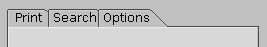
A group of PtTab widgets positioned at the top of a
PtPane.
Instead of using a PtTab, you should use a
PtPanelGroup.
This is the preferred method, since PtPanelGroup manages all
aspects of a tabbed panel for you.
If you insist on using PtTab widgets, you typically:
- Group the tabs together and set the Pt_GROUP_EXCLUSIVE
bit in the
PtGroup widget's
Pt_ARG_GROUP_FLAGS resource. This flag allows only one
of the tabs to be set at a time.
- Use other PtGroup flags and resources to make
the tabs the same size, aligned horizontally, and so on.
For more information, see
“Aligning
widgets using groups” in the Geometry Management chapter
of the Photon Programmer's Guide.
- Place the tabs at the top of a PtPane or some
other container. Use the same border width for the tabs and
the container, and line up the top of the container's border with the
top of the bevel on the tab.
- Use PhAB's
Picture module
and internal links to
change the contents of the container widget for the tabs.
For more information, see the Photon Programmer's Guide.
| C type
|
Pt type
|
Default |
| unsigned int
|
Flag
|
0 |
Flags that affect how the widget appears.
The defined bits are:
- Pt_TAB_UPSIDE_DOWN
-
Vertically invert the tab; display the rounded
corners on the bottom of the widget instead of the top.
- Pt_TAB_RIGHTSIDE_LEFT
- Horizontally invert the tab.
- Pt_TAB_DRAG_HANDLE
- Show a textured drag handle within the tab, visually indicating that
the associated panel can be pulled away.
You need to write some code to support the dragging
(PtPanelGroup supports it already).
- Pt_TAB_MULTI
- Indicate that this tab produces a popup panel of some sort
when pressed (the term “multi” is used since, in this case,
the tab generally represents multiple choices).
You need to write some code to this
(PtPanelGroup supports it already).
| C type
|
Pt type
|
Default |
| PgColor_t
|
Scalar
|
PgGray(0xc0) |
The color of the tab when it isn't selected (i.e. not set).
See
PgColor_t
in the Photon Library Reference.
When the
tab is set, it gets its color from
Pt_ARG_FILL_COLOR
(see PtBasic).
If the widget modifies an inherited resource, the “Default
override” column indicates the new value. This modification
affects any subclasses of the widget.
The PtTab widget defines the following
macros that make it easier to use the tab
once it's been created:
- PtTabIsUpsideDown()
- Return a nonzero value if the tab is upside down, 0 otherwise
- PtTabIsRightsideUp()
- Return a nonzero value if the tab is rightside up, 0 otherwise
- PtTabIsRightsideLeft()
- Return a nonzero value if the tab is flipped left-to-right, 0 otherwise
- PtTabIsRightsideRight()
- Return a nonzero value if the tab isn't flipped left-to-right, 0 otherwise
- PtTabIsDraggable()
- Return a nonzero value if the panel can be dragged away, 0 otherwise
- PtTabIsMulti()
- Return a nonzero value if the tab produces a popup panel of some sort
when pressed, 0 otherwise
- PtTabDragHandleRect()
- Retrieve the rectangle that encompasses the drag area of the tab
![[Previous]](prev.gif)
![[Contents]](contents.gif)
![[Index]](keyword_index.gif)
![[Next]](next.gif)
