![[Previous]](prev.gif) |
![[Contents]](contents.gif) |
![[Index]](keyword_index.gif) |
![[Next]](next.gif) |
|
|
|
|
 |
This version of this document is no longer maintained. For the latest documentation, see http://www.qnx.com/developers/docs. |
A scrollbar
PtWidget → PtBasic → PtGauge → PtScrollbar
For more information, see the diagram of the widget hierarchy.
<photon/PtScrollbar.h>
A PtScrollbar widget provides a scrollbar. It returns values (via callbacks) that indicate a value within the provided range.
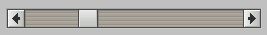
A PtScrollbar widget.
A scrollbar consists of the following parts:
A scrollbar can return values from minimum to (maximum - size-of-handle + 1). You'll find the returned values useful for implementing scrolling areas, text viewers/editors, and so on.
The handle size is determined by the Pt_ARG_SLIDER_SIZE resource. If you don't set this resource, the handle size is one-tenth of the specified range.
The handle's value is represented by its relative position within the trough. The size of the trough represents the allowable range of values.
Your application can also control the handle's size. You can change it to indicate an object's size and the portion viewed when the scrollbar is used for scrolling.
Scrolling is the action of controlling which part of an object is displayed when the object is too large to view all at once. By default, the trough's size visually represents the scroll region — the total length of the object being viewed; you can use the Pt_SCROLLBAR_FIXED_SLIDER_SIZE bit in the Pt_ARG_SCROLLBAR_FLAGS to override this.
The edge of the handle represents your current relative position within the object. The handle's size represents the proportion of the entire object that is currently in view.
Sliding the handle within the trough controls which portion of the object is displayed. Your application is responsible for changing the display of the object in response to any change in the handle's position.
When the mouse button is pressed, the result depends on the location of the pointer.
| If the pointer is: | the handle: |
|---|---|
| On either arrow | Moves up or down one increment (holding down the mouse button repeats the action) |
| In the trough | Moves up or down one page increment (holding down the mouse button repeats the action) |
| On the handle | Starts a drag action |
If you hold down the Ctrl and click the button while pointing at the trough, the slider jumps to the pointer's position.
| If you press: | The handle moves: |
|---|---|
| ↑ | Up one increment |
| ↓ | Down one increment |
| → | Right one increment |
| ← | Left one increment |
| Ctrl-↑ | Up one page increment |
| Ctrl-↓ | Down one page increment |
| Ctrl-→ | Right one page increment |
| Ctrl-← | Left one page increment |
| Home | To the top or left (depending on the orientation) |
| End | To the bottom or right (depending on the orientation) |
| Resource | C type | Pt type | Default |
|---|---|---|---|
| Pt_ARG_INCREMENT | long | Scalar | 1 |
| Pt_ARG_MIN_SLIDER_SIZE | unsigned short | Scalar | 10 |
| Pt_ARG_PAGE_INCREMENT | int | Scalar | -1 |
| Pt_ARG_SCROLLBAR_FLAGS | unsigned short | Flag | 0 |
| Pt_ARG_SLIDER_SIZE | int | Scalar | 1/10th of range |
| Pt_CB_SCROLL_MOVE | PtCallback_t * | Link | NULL |
| C type | Pt type | Default |
|---|---|---|
| long | Scalar | 1 |
The value the widget scrolls by when you click the arrow buttons.
| C type | Pt type | Default |
|---|---|---|
| unsigned short | Scalar | 10 |
The minimum length of the handle, in pixels.
| C type | Pt type | Default |
|---|---|---|
| int | Scalar | -1 |
The handle increment to be used when the scrollbar is moved by a page. If this value is -1, the value for Pt_ARG_SLIDER_SIZE is used.
| C type | Pt type | Default |
|---|---|---|
| unsigned short | Flag | 0 |
Flags that control the appearance and behavior of the scrollbar. The valid bits are:
| C type | Pt type | Default |
|---|---|---|
| int | Scalar | 1/10th of range |
The length of the handle, in the range of 1 to (Pt_ARG_MAXIMUM - Pt_ARG_MINIMUM).
| C type | Pt type | Default |
|---|---|---|
| PtCallback_t * | Link | NULL |
A list of PtCallback_t structures that define the callbacks that the scrollbar invokes when the scroll position changes.
If the widget has the Pt_CALLBACKS_ACTIVE bit set in its Pt_ARG_FLAGS resource, these callbacks are also invoked when your application changes the position of the scrollbar by calling PtSetResource() or PtSetResources().
Each callback is passed a PtCallbackInfo_t structure that contains at least the following members:
These callbacks should return Pt_CONTINUE.
If the widget modifies an inherited resource, the “Default override” column indicates the new value. This modification affects any subclasses of the widget.
The threshold value for graphics bandwidth (as reported by PtQuerySystemInfo()) that defines a slow connection.
|
|
|
|