![[Previous]](prev.gif) |
![[Contents]](contents.gif) |
![[Index]](keyword_index.gif) |
![[Next]](next.gif) |
|
|
|
|
 |
This version of this document is no longer maintained. For the latest documentation, see http://www.qnx.com/developers/docs. |
Once you've created widgets in PhAB, you'll probably need to edit their resources and callbacks. This chapter discusses:
A widget typically has many resources that let you change its appearance and behavior. Each type of resource has its own editor.
To open any resource editor:
 |
When you select two or more widgets, the Resources control panel displays only the resources that those widgets have in common. Editing any of these resources affects all the selected widgets. |
If a resource's value has been changed from PhAB's default value for it, the resource's label is displayed in bold.
|
PhAB's default value for a resource isn't necessarily the default value assigned by the widget itself. |
Every resource editor provides the following buttons:

Common buttons for resource editors.
| When you want to: | Use this button: |
|---|---|
| Restore the resource to the default value (or values if more than one widget is selected) | Default |
| Cancel any changes made since you opened the editor or last clicked on Apply | Cancel |
| Apply any changes and continue editing | Apply |
| Apply any changes and close the editor | Done |
The editors for different types of resources are described in the sections that follow.
| To edit: | See this section: |
|---|---|
| Images | Pixmap editor |
| Colors | Color editor |
| Flags | Flag/choice editor |
| Fonts | Font editor |
| Lists of text items | List editor |
| Numbers | Number editor |
| Single-line or multiline text strings | Text editors |
| Functions | Code editor |
| Layouts | Layout editors |
The pixmap editor lets you customize a widget's pixmap. The editor provides a complete range of tools, so you can draw virtually any pixmap your application might need.
In this section we discuss:
 |
To open the pixmap editor for any widget that can contain an image (for example, PtLabel, PtButton), click on the widget, then click on a Image resource in the Resources control panel. |
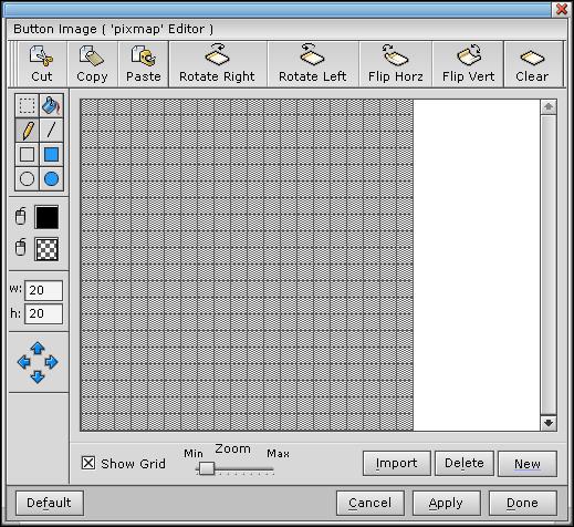
Sample pixmap editor session.
The editor has several drawing modes and tools, which are described in the sections that follow. The default is freehand mode -- you simply drag the pointer across the drawing grid.
The editor contains fields for the pixmap's height and width, both specified in pixels. To change a dimension, edit the field and press Enter.
|
If you reduce the size of a pixmap, part of the image may be cut off. |
The following applies to all drawing tools:
| In order to: | Use the: |
|---|---|
| Draw in the current color | Left mouse button |
| Erase a pixel or area (i.e. draw in the background color) | Right mouse button |
To choose the draw color:

The background (or erase) color is used when you draw with the right mouse button. To choose the background color:

For more info, see the Color editor section.
The freehand tool lets you draw freeform lines and erase single pixels for quick fix-ups.
To draw in freehand mode:

You can repeat this step as often you'd like.
|
To erase the pixel under the pointer, click the right mouse button. |
To draw lines, rectangles, or circles, you use one standard method:
You can repeat this step as often as you'd like.
To fill any enclosed area (i.e. any area made up of a single color):

|
If an outline area has a break, the fill operation spills out of the hole and might fill the entire pixmap display. |
To use some tools, you first select an area of the pixmap.
To select an area:

You can now "nudge" the area or perform any of the operations described in "Using the Pixmap toolbar," below.
To nudge a selected area one pixel at a time:

Some things to note:
The pixmap editor provides several other tools in its toolbar:

The Pixmap Editor's toolbar.
You can select an area and then use these tools to rotate, flip, cut, copy, clear, or paste the area.
Some things to note:
The pixmap editor also includes the following buttons:
| When you want to: | Use this control: |
|---|---|
| Toggle the grid on and off | Show Grid |
| Examine smaller or larger areas of the pixmap | Zoom |
| Delete the pixmap | Delete |
| Import an image (for image-type resources only) | Import |
| Create a new, empty image | New |
For a description of the standard editor buttons at the bottom of the editor, see the "Editing widget resources" section.
The color editor lets you modify any color resource. Where you click in the Resource control panel determines which color editor you see:
| To use the: | Click on the color resource's: |
|---|---|
| Full color editor | Name or description |
| Quick color editor | Current value |
If you click on the resource name or description (i.e. the left side in the Resource control panel), the full color editor is displayed:
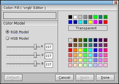
Full color editor.
The full color editor gives you the choice of:
|
Using a transparent fill might introduce flickering and worsen your application's performance, especially if your application modifies the display a lot. |
For a description of the standard editor buttons at the bottom of the editor, see the "Editing widget resources" section.
If you click on the value of a color resource (i.e. the right side in the Resource control panel), the quick color editor is displayed:
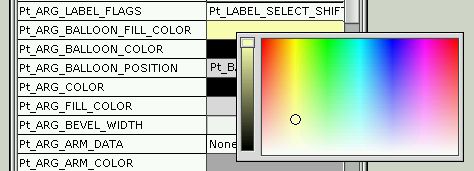
Quick color editor.
To change the value, move the slider on the left. To change the hue, click or drag in the color patch on the right.
Whenever you click on a flags resource or on a resource that lets you select only one of several preset values, you'll see the flag/choice editor. For example:
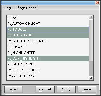
Flag/Choice editor.
If you click on a flag resource, this editor lets you make multiple selections from the displayed list.
To edit a flag list:
If you click on a resource that can have only one value, the flag/choice editor lets you make only one selection from the displayed list.
To choose an option from a list:
For a description of the standard editor buttons at the bottom of the editor, see the "Editing widget resources" section.
Whenever you select any font resource in the Resources control panel you'll see the font editor:
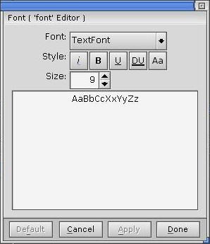
Font editor.
The font editor includes these options:
|
If a typeface doesn't support an applied style at a given type size, the corresponding style becomes dimmed or unselectable. |
For a description of the standard editor buttons at the bottom of the editor, see the "Editing widget resources" section.
Widgets such as PtList provide a list of text-based items. To edit the list, you use PhAB's list editor.
To open the editor and add the first item:
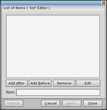
List editor.
|
If you need to type characters that don't appear on your keyboard, you can use the compose sequences listed in "Photon compose sequences" in the Unicode Multilingual Support appendix. |
To add more items to the list:
|
You can't create blank lines within the list of items. |
To edit an existing item:
|
For text-editing shortcuts, see "Text editors." |
To delete an item:
For a description of the standard editor buttons at the bottom of the editor, see the "Editing widget resources" section.
You can edit the value of a numeric resource right in the Resources control panel, or you can click on the resource name to use the number editor:
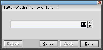
Number editor.
To change the value that the editor displays, you can:
Or:
For a description of the standard editor buttons at the bottom of the editor, see the "Editing widget resources" section.
You can edit a text resource right in the Resources control panel, or you can click on the resource to display a text editor. There are two text editors: one for single-line text, and one for multiline.
Whenever you click on a single-line text resource in the Resources control panel (e.g. the Text String resource for PtText), you'll see the text editor:
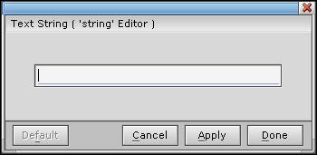
Text editor.
When you select any multiline text resource -- such as the Text String resource of a PtLabel or PtMultiText widget -- you'll see the multiline text editor:
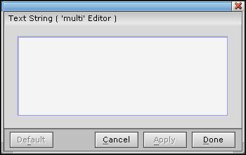
Multiline text editor.
The single-line and multiline editors are similar -- here are the common operations:
| In order to: | Do this: |
|---|---|
| Delete the character before the text cursor | Press Backspace |
| Delete the character after the cursor | Press Del |
| Delete several characters all at once | Drag the pointer across the characters, then press Del |
| Delete the entire line | Press Ctrl-U |
| "Jump" the cursor to any position in the line | Click on that position |
| Move the cursor character by character | Press <-- or --> |
| Move the cursor to the start or end of the line | Press Home or End |
For the single-line text editor:
| In order to: | Do this: |
|---|---|
| Process a text change | Press Enter, or click on Done or Apply |
For the multiline text editor:
| In order to: | Do this: |
|---|---|
| Enter a new line of text | Press Enter |
| Move the cursor to the start or end of a line | Press Home or End |
| Move the cursor to the start or end of the text string | Press Ctrl-Home or Ctrl-End |
| Apply your changes and dismiss the editor | Press Ctrl-Enter |
|
If you need to type characters that don't appear on your keyboard, you can use the compose sequences listed in "Photon compose sequences" in the Unicode Multilingual Support appendix. |
For a description of the standard editor buttons at the bottom of the editor, see the "Editing widget resources" section.
When you select a function resource, such as the Draw Function (Pt_ARG_RAW_DRAW_F) resource of a PtRaw widget, you'll see the Code editor:
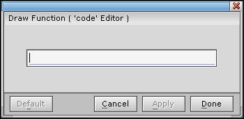
Code editor.
|
The widget must have a unique instance name before you can edit its function resources. |
Type the name of the function -- see "Function names and filenames" in the Working with Code chapter. If you've already given your application a name by saving it (see "Saving an application" in the Working with Applications chapter), you can edit the function by clicking the button to the right of the text field.
For a description of the standard editor buttons at the bottom of the editor, see the "Editing widget resources" section.
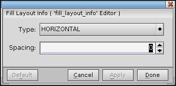
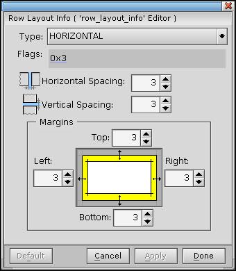
When you set the Layout Type resource Pt_ARG_LAYOUT_TYPE of a container widget to something other than the default Pt_ANCHOR_LAYOUT, you can then set the corresponding Layout Info resource. You can also set the corresponding Layout Data resource for widgets within the container widget. Each kind of Layout Info and Layout Data resource has an editor.
For more information about layouts, see Using layouts in the Geometry Management chapter.
Fill layout info editor.
When you set Pt_ARG_LAYOUT_TYPE to Pt_FILL_LAYOUT, you can open this editor by clicking on the Fill Layout Info resource (Pt_ARG_FILL_LAYOUT_INFO. Using this editor you can set the:
Row layout info editor.
When you set Pt_ARG_LAYOUT_TYPE to Pt_ROW_LAYOUT, you can open this editor by clicking on the Row Layout Info resource ( Pt_ARG_ROW_LAYOUT_INFO. Using this editor you can set:
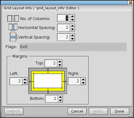
Grid layout info editor.
When you set Pt_ARG_LAYOUT_TYPE to Pt_GRID_LAYOUT, you can open this editor by clicking on the Grid Layout Info resource (Pt_ARG_GRID_LAYOUT_INFO. Using this editor you can set:
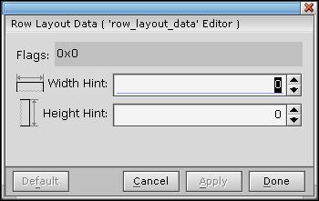
Row layout data editor.
When you set Pt_ARG_LAYOUT_TYPE to Pt_ROW_LAYOUT of a container widget, you can open this editor by clicking on the Row Layout Data resource (Pt_ARG_Row_LAYOUT_DATA of any child widget. Using this editor you can set the:
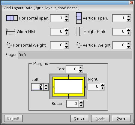
Grid layout data editor.
When you set Pt_ARG_LAYOUT_TYPE to Pt_GRID_LAYOUT of a container widget, you can open this editor by clicking on the Grid Layout Data resource (Pt_ARG_GRID_LAYOUT_DATA of any child widget. Using this editor you can set the:
For a description of the standard editor buttons at the bottom of these editors, see the "Editing widget resources" section.
Callbacks form the link between your application interface and your application code. For example, let's say you want your application to perform an action when the user selects a certain button. In that case, you would attach a callback function to that button's Activate callback. When the user selects the button, the widget invokes the callback function, and your application takes the appropriate action in the callback code.
Almost all widgets support several types of callbacks. These callbacks can be specific to the widget or inherited from its parent classes. Some of these types (defined in the PtBasic widget) are defined in the following table:
| Type | Resource | Typically invoked when the user: |
|---|---|---|
| Activate | Pt_CB_ACTIVATE | Presses and releases the left mouse button |
| Arm | Pt_CB_ARM | Presses the left mouse button |
| Disarm | Pt_CB_DISARM | Releases the left mouse button |
| Repeat | Pt_CB_REPEAT | Holds down the left mouse button |
| Menu | Pt_CB_MENU | Presses the right mouse button |
For more information about these callbacks, see the Widget Reference. If you're interested in using Pt_CB_MENU to display a menu module, see the Accessing PhAB Modules from Code chapter.
All Photon widgets inherit two other types of callbacks:
In the development environments for some windowing systems, you can attach only callback code functions to a widget's callbacks. But whenever you use PhAB to create a callback, you can go one step further and attach windows, dialogs, menus, and much more. As we mentioned earlier, this extended functionality is provided by PhAB's special form of callback, called the link callback.
Link callbacks also let you add functionality that isn't available when you attach callbacks "by hand." For example, if you link a dialog to a button widget, you can specify where the dialog appears. You can also specify a setup function that's automatically called before the dialog is realized, after the dialog is realized, or both.
PhAB provides two general categories of link callbacks:
For more information, see "Module callbacks" later in this chapter.
The Done and Cancel types provide an additional feature: they'll automatically close or destroy the widget's parent module after the callback function is called. You'll find these types useful for creating any button that closes a dialog window.
|
A Done callback in the base window exits the application. A Cancel callback in the base window closes the application's windows but doesn't exit the application. |
For more information, see "Code callbacks" later in this chapter.
The callback editor lets you add, change, delete, or view a widget's list of callbacks.
To add a callback to a command item or toggle item in a menu, see "Menu modules" in the Working with Modules chapter.
|
If you're adding a link callback to a widget, the widget's instance name must be unique. If PhAB tells you the name isn't unique, use the Resources or Callbacks control panel's Widget Instance Name field to edit the name. |
To open the callback editor and edit a widget's list of callbacks:
Here's a sample callback-editor session:
Callback editor.
A module-type link callback can be used to connect a widget to a module. For example, selecting a button could create a module.
|
When you use a module-type link callback to create a module,
the module becomes a child of your application's base window, not
a child of the module that contains the widget that the link callback
is defined for.
If you want the new module's parent to be something other than the base window, you need to use an internal link to create the module in your application's code. For more information about internal links and other cases where you'd use them, see the Accessing PhAB Modules from Code chapter. |
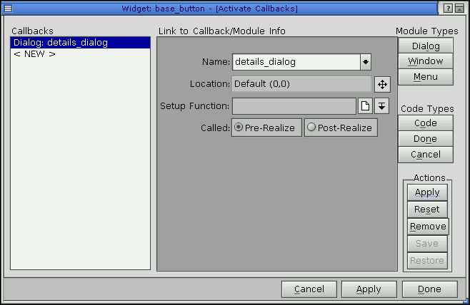
Depending on the kind of module-type link callback you're creating, PhAB's callback editor displays some or all of these fields:
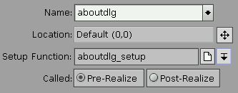
Callback editor fields for module-type link callbacks.
You can specify only one setup function -- the PhAB API calls the same function for both pre- and postrealization of the module. To distinguish which pass is being invoked, check the PhAB reason code.
Click on the icons beside the Setup Function field to edit the function or select from the existing callbacks.
The prerealize setup function lets you preset a module. For example, let's say your application needs to "fill in the blanks" of a dialog before displaying that dialog. In the setup function, you would use PhAB-generated manifest names to preset the resources of the dialog's various widgets.
After the setup function runs, it returns Pt_CONTINUE. The dialog is then realized and displayed on the screen, using all the preset values.
The postrealize function works much like the prerealize function, except that it's called after the dialog is displayed on the screen. You typically use this type of function when you need to update the module after it's become visible. PhAB's code-generation dialog provides a good example. It displays on the screen and then, using a postrealize function, updates a progress bar continuously as the application code is generated.
|
The setup function for a menu module is called only before the menu is displayed. For most applications, you would use this function to set the initial states of the menu items. For example, you could use it to disable certain menu items before the menu is displayed. |
When you specify a setup function, PhAB generates a stub function; for information on specifying the language (C or C++) and the filename, see "Function names and filenames" in the Working with Code chapter.
This type of callback lets you run a code function when the widget's callback is invoked.
|
You can add code callbacks from your application's code, but it's easier to do in PhAB. For more information, see "Callbacks" in the Managing Widgets in Application Code chapter. |
When you're creating a code-type link callback, the callback editor asks you to specify the following:
As described above, Done and Cancel are similar, except that a Done callback in the base window exits the application, while a Cancel callback closes the window but doesn't exit the application. There's no real difference between the Done and Cancel callback functions -- they simply provide different reason codes in the callback.
For example, let's say you have a dialog with a Done button and a Cancel button. If you attach a Done-type callback to the Done button and a Cancel-type callback to the Cancel button, you could use the same code function in both and just look at the reason code to determine which button the user selected.
When you specify a callback function, PhAB generates a stub function; for information on specifying the language (C or C++) and the filename, see "Function names and filenames" in the Working with Code chapter.
Widgets support hotkey callbacks. These callbacks let you attach keyboard keys to specific callback functions. When the application window gets focus, the hotkeys become active. Pressing one invokes the appropriate hotkey link callback.
This section includes:
Here's some basic information about hotkeys:
You can force the hotkey processing to be done first by setting Pt_HOTKEYS_FIRST in the Pt_ARG_CONTAINER_FLAGS resource of the container widget (window, pane, ...) that contains the widgets that would normally consume your would-be hotkey events. Setting this flag on the window guarantees all hotkey processing is done before any widgets get the key event. For more information, see "Processing hotkeys," below.
If the widget isn't normally selectable and you don't want its appearance to change when selected, you'll also want to set the Pt_SELECT_NOREDRAW widget flag.
Setting up a hotkey isn't enough -- you need to tell your user about it! You should display a hotkey label in the widget invoked by the hotkey:
In PhAB, each widget's callback list displays an entry called "Hotkey" or Pt_CB_HOTKEY that you use to define hotkeys. Before you define the hotkey, you need to determine where to do so. Where you define the hotkey callback depends on:
When you define the hotkey, you can specify where the module is to appear. For example, if the hotkey is meant to display the menu module associated with a PtMenuButton widget in your window's PtMenuBar, define the hotkey in the menu button. Use the Location dialog to have the menu appear under the menu button. For more information, see "Positioning a module" in the Working with Modules chapter.
The widget that owns the callback is the one passed to the callback function.
For example, if the hotkey is an accelerator for a menu item, add the hotkey to the window in which the menu is used, not to the menu module.
|
|
When you select the Pt_CB_HOTKEY callback, the callback editor pops up with a Hotkey field in the link-information area:
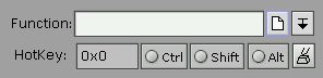
Hotkey field in the callback editor.
You must fill in the Hotkey field when creating a hotkey callback. There are two ways to set up the hotkey: one easy, the other not so easy.
|
Use lowercase letters for hotkeys; uppercase letters won't work. For example, for a hotkey Alt-F, look up the hex value for Pk_f, not Pk_F. |
The field also has 3 toggle buttons -- Ctrl, Shift, and Alt -- to let you specify modifiers for the hotkey value.
Here's how a hotkey works:
The Pt_ARG_CONTAINER_FLAGS resource of container-class widgets includes some flags that affect the processing of hotkeys:
The Pt_HOTKEY_TERMINATOR flag works only if it's set in a disjoint container-class widget.
Giving the user a visual indication that a hotkey is disabled is different from actually disabling the hotkey.
To give the visual indication, use the technique appropriate to the widget:
To disable the hotkey, use one of the following techniques:
Or
One good reason for this approach is that it works even if your application has the same hotkey defined in more than one window. For example, we might have an Edit menu in the base window and an Erase button in a child window, both with Alt-E as a hotkey. If the child window currently has focus and the user presses Alt-E, the child window's Erase button callback is called.
Now, if we disable the Erase button in the child window, we would want Alt-E to cause the base window's Edit menu to appear. In this scenario, as long as the Erase button is selectable, its callback would be called. So we simply make the Erase button unselectable. Now when the user presses Alt-E, the base window's Edit menu appears, even though the child window still has focus.
Or
Event handlers let you respond directly to Photon events. You can attach event handlers to any widget; they're like other widget callbacks, but with the addition of an event mask. Using this mask, you can choose which events your callbacks receive.
You'll find them particularly useful for getting the Ph_EV_DRAG events for a particular window. For more information on dragging, see " Dragging" in the Events chapter.
PtWidget defines the following event-handler resources:
|
For a description of raw and filter event handlers and how
they're used, see "Event handlers -- raw
and filter callbacks" in the Events chapter.
For information on adding event handlers in application code, see "Event handlers" in the Managing Widgets in Application Code chapter. |
To attach a raw or filter callback:
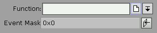
Event Mask field in the callback editor.
The Event Mask field lets you specify which Photon events you want the widget to be sensitive to. When any of those low-level events occur, the widget invokes the callback.
Click on the icon next to this field to open the event selector:
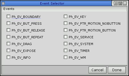
Event selector.
For more info, see the event types described for the PhEvent_t structure in the Photon Library Reference.
|
|
|
|