![[Previous]](image-lib/prev.gif) |
![[Contents]](image-lib/contents.gif) |
![[Index]](image-lib/keyword_index.gif) |
![[Next]](image-lib/next.gif) |
|
|
|
|
A button for initiating an action
PtWidget --> PtBasic --> PtLabel --> PtButton
For more information, see the diagram of the widget hierarchy.

<photon/PtButton.h>
The PtButton class draws a button. Buttons let you initiate an action within the application. Clicking the button invokes an application callback.
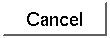
A PtButton widget.
A pushbutton is like a button you might find on a calculator or a control panel. The label is displayed within the button. The widget itself is shaded to appear like a raised button. When you click on the button, the shading is reversed to make it appear as though the button is recessed. The label inside the button is usually a text string and/or icon representing the action that's performed when the button is pressed.
You use the PtButton widget class to create pushbutton widgets. You specify a label for the pushbutton in the same way as for PtLabel widgets.
A pushbutton is usually associated with a command to be performed - when you click on the pushbutton, the command is executed. For more information, see PtBasic.
A visual cue is displayed when a pushbutton is armed. Usually the pushbutton is shaded so that the button appears recessed. The original appearance is restored once the pushbutton has been disarmed or activated.
You can also configure a pushbutton so that the background of the widget is filled with a different color to provide more noticeable feedback when the button is armed. Use the Pt_ARG_ARM_COLOR resource to set the fill color for armed pushbuttons. This resource is ignored if the Pt_ARG_ARM_FILL resource hasn't been set to Pt_TRUE.
When the pushbutton is displaying an image, you may want the image to change when the pushbutton is armed. This is useful if you want to change the color of the icon displayed or change the actual image, such as changing a mail box icon from one with the flag up to one with the flag down. It you wish to change only the color, the Pt_ARG_ARM_COLOR can be set when the image is a bitmap with backfill turned on. The arm color will be used in place of the widget's fill color.
To display a different image entirely when the button is armed, use the Pt_ARG_ARM_DATA resource. When the Pt_ARG_LABEL_TYPE resource (see PtLabel) is set to an image type, this resource is consulted to see if an alternate image is available for displaying when the pushbutton is armed. If the data points to an image, that image is displayed when the button gets armed.
| Resource | C type | Pt type | Default |
|---|---|---|---|
| Pt_ARG_ARM_COLOR | PgColor_t | Scalar | PgGray(170) |
| Pt_ARG_ARM_DATA | void * | Alloc | NULL |
| Pt_ARG_ARM_FILL | unsigned char | Scalar | Pt_TRUE |
| C type | Pt type | Default |
|---|---|---|
| PgColor_t | Scalar | PgGray(170) |
The background color used when the button is armed (pressed in).
| C type | Pt type | Default |
|---|---|---|
| void * | Alloc | NULL |
Contains a pointer. If the label type (Pt_ARG_LABEL_TYPE - see PtLabel) is Pt_Z_STRING, this resource points to a text string. If the label type is Pt_IMAGE, this resource points to a PhImage_t structure. For more information, see PtLabel.
Set the flags member of the PhImage_t structure to:
Ph_RELEASE_IMAGE | Ph_RELEASE_PALETTE |
Ph_RELEASE_TRANSPARENCY_MASK | Ph_RELEASE_GHOST_BITMAP
before providing the image to the widget. If you do this, the memory used for the image is released when the widget is unrealized or destroyed.
 |
Remember that this is an Alloc resource. When you set this resource, the widget copies the PhImage_t structure but not the data pointed to by the members of the structure. After setting this resource, you can free() the PhImage_t if you don't need it, but don't free() the members of it. |
| C type | Pt type | Default |
|---|---|---|
| unsigned char | Scalar | Pt_TRUE |
Determines whether or not Pt_ARG_ARM_COLOR will be used. Possible values:
If the widget modifies an inherited resource, the "Default override" column indicates the new value. This modification affects any subclasses of the widget.
|
|
|
|