![[Previous]](prev.gif) |
![[Contents]](contents.gif) |
![[Index]](keyword_index.gif) |
![[Next]](next.gif) |
|
|
|
|
 |
This version of this document is no longer maintained. For the latest documentation, see http://www.qnx.com/developers/docs. |
 |
This chapter provides an overview of the Photon microGUI, the graphical environment for QNX Neutrino. For more information, see the Photon documentation set. |
Many embedded systems require a UI so that users can access and control the embedded application. For complex applications, or for maximum ease of use, a graphical windowing system is a natural choice. However, the windowing systems on desktop PCs simply require too much in the way of system resources to be practical in an embedded system where memory and cost are limiting factors.
Drawing upon the successful approach of the QNX Neutrino microkernel architecture to achieve a POSIX OS environment for embedded systems, we have followed a similar course in creating the Photon microGUI windowing system.
To implement an effective microkernel OS, we first had to tune the microkernel so that the kernel calls for IPC were as lean and efficient as possible (since the performance of the whole OS rests on this message-based IPC). Using this low-overhead IPC, we were able to structure a GUI as a graphical “microkernel” process with a team of cooperating processes around it, communicating via that IPC.
While at first glance this might seem similar to building a graphical system around the classic client/server paradigm already used by the X Window System, the Photon architecture differentiates itself by restricting the functionality implemented within the graphical microkernel (or server) itself and distributing the bulk of the GUI functionality among the cooperating processes.
The Photon microkernel runs as a tiny process, implementing only a few fundamental primitives that external, optional processes use to construct the higher-level functionality of a windowing system. Ironically, for the Photon microkernel itself, “windows” do not exist. Nor can the Photon microkernel “draw” anything, or manage a pen, mouse, or keyboard.
To manage a GUI environment, Photon creates a 3-dimensional event space and confines itself only to handling regions and processing the clipping and steering of various events as they flow through the regions in this event space.
This abstraction is roughly parallel to the concept of a microkernel OS being incapable of filesystem or device I/O, but relying instead on external processes to provide these high-level services. Just as this allows a microkernel OS to scale up or down in size and functionality, so also a microkernel GUI.
The core microkernel “abstraction” implemented by the Photon microkernel is that of a graphical event space that other processes can populate with regions. Using native IPC to communicate with the Photon microkernel, these other processes manipulate their regions to provide higher-level graphical services or to act as user applications. By removing service-providing processes, Photon can be scaled down for limited-resource systems; by adding service-providing processes, Photon can be scaled up to full desktop functionality.
The “event space” managed by the Photon microkernel can be visualized as an empty void with a “root region” at the back. The end-user can be imagined to be “looking into” this event space from the front. Applications place “regions” into the 3-dimensional space between the root region and the end-user; they use those regions to generate and accept various types of “events” within this space.
Processes that provide device driver services place regions at the front of the event space. In addition to managing the event space and root region, the Photon microkernel projects draw events.
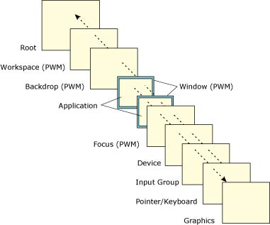
Photon regions.
We can think of these events that travel through this space as “photons” (from which this windowing system gets its name). Events themselves consist of a list of rectangles with some attached data. As these events flow through the event space, their rectangle lists intersect the “regions” placed there by various processes (applications).
Events traveling away from the root region of the event space are said to be traveling outwards (or towards the user), while events from the user are said to be traveling inwards towards the root region at the back of the event space.
The interaction between events and regions is the basis for the input and output facilities in Photon. Pen, mouse, and keyboard events travel away from the user towards the root plane. Draw events originate from regions and travel towards the device plane and the user.
Regions are managed in a hierarchy associated as a family of rectangles that define their location in the 3-dimensional event space. A region also has attributes that define how it interacts with various classes of events as they intersect the region. The interactions a region can have with events are defined by two bitmasks:
The sensitivity bitmask uses specific event types to define which intersections the process owning the region wishes to be informed of. A bit in the sensitivity bitmask defines whether or not the region is sensitive to each event type. When an event intersects a region for which the bit is set, a copy of that event is enqueued to the application process that owns the region, notifying the application of events traveling through the region. This notification doesn't modify the event in any way.
The opaque bitmask is used to define which events the region can or can't pass through. For each event type, a bit in the opaque mask defines whether or not the region is opaque or transparent to that event. The optical property of “opaqueness” is implemented by modifying the event itself as it passes through the intersection.
These two bitmasks can be combined to accomplish a variety of effects in the event space. The four possible combinations are:
| Bitmask combination: | Description: |
|---|---|
| Not sensitive, transparent | The event passes through the region, unmodified, without the region owner being notified. The process owning the region simply isn't interested in the event. |
| Not sensitive, opaque | The event is clipped by the region as it passes through; the region owner isn't notified. For example, most applications would use this attribute combination for draw event clipping, so that an application's window wouldn't be overwritten by draw events coming from underlying windows. |
| Sensitive, transparent | A copy of the event is sent to the region owner; the event then continues, unmodified, through the event space. A process wishing to log the flow of events through the event space could use this combination. |
| Sensitive, opaque | A copy of the event is sent to the region owner; the event is also clipped by the region as it passes through. By setting this bitmask combination, an application can act as an event filter or translator. For every event received, the application can process and regenerate it, arbitrarily transformed in some manner, possibly traveling in a new direction, and perhaps sourced from a new coordinate in the event space. For example, a region could absorb pen events, perform handwriting recognition on those events, and then generate the equivalent keystroke events. |
Like regions, events also come in various classes and have various attributes. An event is defined by:
Unlike most windowing systems, Photon classifies both input (pen, mouse, keyboard, etc.) and output (drawing requests) as events. Events can be generated either from the regions that processes have placed in the event space or by the Photon microkernel itself. Event types are defined for:
Application processes can either poll for these events, block and wait for them to occur, or be asynchronously notified of a pending event.
The rectangle list attached to the event can describe one or more rectangular regions, or it can be a “point-source” — a single rectangle where the upper-left corner is the same as the lower-right corner.
When an event intersects a region that is opaque to it, that region's rectangle is “clipped out” of the event's list of rectangles such that the list describes only the portion of the event that would ultimately be visible.
The best way to illustrate how this clipping is performed is to examine the changes in the rectangle list of a draw event as it passes through various intersecting regions. When the draw event is first generated, the rectangle list consists of only a single, simple rectangle describing the region that the event originated from.
If the event goes through a region that clips the upper-left corner out of the draw event, the rectangle list is modified to contain only the two rectangles that would define the area remaining to be drawn. These resulting rectangles are called “tiles.”
Likewise, every time the draw event intersects a region opaque to draw events, the rectangle list will be modified to represent what will remain visible of the draw event after the opaque region has been “clipped out.” Ultimately, when the draw event arrives at a graphics driver ready to be drawn, the rectangle list will precisely define only the portion of the draw event that is to be visible.
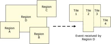
Opaque regions are clipped out.
If the event is entirely clipped by the intersection of a region, the draw event will cease to exist. This mechanism of “opaque” windows modifying the rectangle list of a draw event is how draw events from an underlying region (and its attached process) are properly clipped for display as they travel towards the user.
Graphics drivers are implemented as processes that place a region at the front of the event space. Rather than inject pen, mouse, or keyboard events (as would an input driver), a graphics driver's region is sensitive to draw events coming out of the event space. As draw events intersect the region, those events are received by the graphics driver process. In effect, the region can be imagined to be coated in “phosphor,” which is illuminated by the impact of “photons.”
Since the Photon drawing API accumulates draw requests into batches emitted as single draw events, each draw event received by the driver contains a list of individual graphical primitives to be rendered. By the time the draw event intersects the graphics driver region, its rectangle list will also contain a “clip list” describing exactly which portions of the draw list are to be rendered to the display. The driver's job is to transform this clipped draw list into a visual representation on whatever graphics hardware the driver is controlling.
One advantage of delivering a “clip list” within the event passed to the driver is that each draw request then represents a significant “batch” of work. As graphics hardware advances, more and more of this “batch” of work can be pushed directly into the graphics hardware. Many display controller chips already handle a single clip rectangle; some handle multiple clip rectangles.
Although using the OS IPC services to pass draw requests from the application to the graphics driver may appear to be an unacceptable overhead, our performance measurements demonstrate that this implementation performs as well as having the application make direct calls into a graphics driver. One reason for such performance is that multiple draw calls are batched with the event mechanism, allowing the already minimal overhead of our lightweight IPC to be amortized over many draw calls.
Since graphics drivers simply put a region into the Photon event space, and since that region describes a rectangle to be intersected by draw events, it naturally follows that multiple graphics drivers can be started for multiple graphics controller cards, all with their draw-event-sensitive regions present in the same event space.
These multiple regions could be placed adjacent to each other, describing an array of “drawable” tiles, or overlapped in various ways. Since Photon inherits the OS's network transparency, Photon applications or drivers can run on any network node, allowing additional graphics drivers to extend the graphical space of Photon to the physical displays of many networked computers. By having the graphics driver regions overlap, the draw events can be replicated onto multiple display screens.
Many interesting applications become possible with this capability. For example, a factory operator with a wireless-LAN handheld computer could walk up to a workstation and drag a window from a plant control screen onto the handheld, and then walk out onto the plant floor and interact with the control system.
In other environments, an embedded system without a UI could project a display onto any network-connected computer. This connectivity also enables useful collaborative modes of work for people using computers — a group of people could simultaneously see the same application screen and cooperatively operate the application.
From the application's perspective, this looks like a single unified graphical space. From the user's perspective, this looks like a seamlessly connected set of computers, where windows can be dragged from physical screen to physical screen across network links.
Colors processed by the graphics drivers are defined by a 24-bit RGB quantity (8 bits for each of red, green, and blue), providing a total range of 16,777,216 colors. Depending on the actual display hardware, the driver will either invoke the 24-bit color directly from the underlying hardware or map it into the color space supported by the less-capable hardware.
Since the graphics drivers use a hardware-independent color representation, applications can be displayed without modifications on hardware that has varied color models. This allows applications to be “dragged” from screen to screen, without concern for what the underlying display hardware's color model might be.
Photon uses Bitstream's Font Fusion object-oriented font engine, which provides developers with full font fidelity and high-quality typographic output at any resolution on any device, while maintaining the integrity of the original character shapes.
Photon is shipped with a limited number of TrueType fonts. These industry-standard fonts are readily available from various sources.
To support Asian languages (e.g. Chinese, Japanese, and Korean), Photon relies on Bitstream's stroke-based fonts. These high-speed fonts are ideal for memory-constrained environments. For example, a complete traditional Chinese font with over 13,000 characters can occupy as much as 8M in a conventional desktop system — a stroke-based version of the same font occupies less than 0.5M!
Apart from their compact size and fast rasterization, these fonts are also fully scalable, which makes them perfect for various nondesktop displays such as LCDs, TVs, PDAs, and so on.
Photon is designed to handle international characters. Following the Unicode Standard (ISO/IEC 10646), Photon provides developers with the ability to create applications that can easily support the world's major languages and scripts.
|
Scripts that read from right to left, such as Arabic, aren't supported at this time. |
Unicode is modeled on the ASCII character set, but uses a 16-bit (or 32-bit) encoding to support full multilingual text. There's no need for escape sequences or control codes when specifying any character in any language. Note that Unicode encoding conveniently treats all characters — whether alphabetic, ideographs, or symbols — in exactly the same way.
Formerly known as UTF-2, the UTF-8 (for “8-bit form”) transformation format is designed to address the use of Unicode character data in 8-bit UNIX environments.
Here are some of the main features of UTF-8:
Photon provides flicker-free animations by employing off-screen video memory where possible. For instance, a special container widget (PtOSContainer) creates a dedicated off-screen memory context for drawing images. The PtOSContainer widget uses a block of video memory large enough to hold an image the size of its canvas. (For more information about widgets, see the section “Widget library” in this chapter.)
Photon's graphics drivers also maximize the use of off-screen memory to enhance the perceptual performance of animated images. The graphics drivers support other advanced techniques, such as direct graphics mode, alpha-blending, chroma-key substitution, and more.
Besides the ability to superimpose a semi-transparent image on top of a background (alpha-blending) or to place a color-masked foreground image on top of a separate background (chroma-key), Photon also supports video overlay — a full-motion video image is rendered within a window on the display.
Some display controllers let you transparently overlay multiple “screens” on a single display. Each overlay is called a layer.
You can use layers to combine independent display elements. Since the graphics hardware performs the overlaying, this can be more efficient than rendering all of the display elements onto a single layer. For example, a fast navigational display can have a scrolling navigational map on a background layer and a web browser or other popup GUI element on a foreground layer.
The images on all the active layers of a display are combined, using alpha-blending, chroma-keying, or both, to produce the final image on the display.
Photon provides built-in printing support for a variety of outputs, including:
Photon also comes with a print-selection widget/convenience dialog to make printing simpler within developers' own applications.
Adding a window manager to Photon creates a fully functional desktop-class GUI. The window manager is entirely optional and can be omitted for most classes of embedded systems. If present, the window manager allows the user to manipulate application windows by resizing, moving, and iconifying them.
The window manager is built on the concept of filtering events with additional regions placed behind application regions, upon which a title bar, resize handles, and other elements are drawn and interacted with. Since the replaceable window manager implements the actual “look and feel” of the environment, various UI flavors can be optionally installed.
Photon provides a library of components known as widgets — objects that can manage much of their on-screen behavior automatically, without explicit programming effort. As a result, a complete application can be quickly assembled by combining widgets in various ways and then attaching C code to the appropriate callbacks the widgets provide.
The Photon Application Builder (PhAB), which is included as part of the Photon development system, provides an extensive widget palette in its visual development environment.
Photon provides a wide range of widgets, which can be classified as follows:
The label widget can display bitmaps, images, or textual information. The PtLabel widget is the superclass for all text-based widgets, providing many customizable attributes (e.g. font typeface, pop-up balloons, colors, borders, alignment, margins, etc.), all of which are inherited by all its subclasses.

Push buttons are a necessary component in every windowing system. They have a raised look that changes to depressed when pushed, giving a visual cue to let the user know the button has been selected. In addition to this visual behavior, push buttons automatically invoke an application-defined callback when they're selected.
Photon provides two text-input widgets:
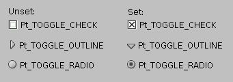
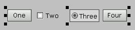
Toggle buttons are objects that display two states — on or off. Photon provides various styles of toggle buttons, each with a different visual appearance. Toggle buttons are used to display or request state information related to a command or action about to be performed.
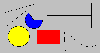
Photon has no shortage of graphical widgets. There's a widget to accomplish everything from simple lines and rectangles to complex multi-segmented Bézier curves. Graphical widgets provide attributes for color, fills, patterns, line thickness, joins, and much more.
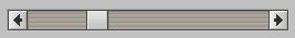
A scrollbar widget is used to scroll the display of a viewable area. The scrollbar is combined with other widgets (e.g. PtList, PtScrollContainer) to allow scrolling.
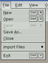
The separator widget is used to separate two or more different areas, such as the menu items as shown in this example. The separator can be customized for many different styles and looks.
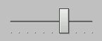
Sliders are different from scrollbars. A scrollbar defines a range, whereas a slider defines a single value.

Photon supports every major graphics file standard, so you can import graphics and display them inside widgets. Many Photon widgets directly support displaying graphics — the most common are PtButton for making push-button toolbars and PtLabel for displaying images.
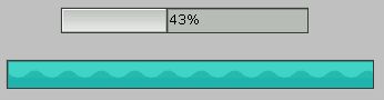
If an application needs to do something that takes a fair amount of time (e.g. loading a file), it can use the progress bar widget to let the user know what's happening and, more importantly, how much longer the process is going to take. The progress bar has many attributes for customization — it can be horizontal or vertical, it can display specific or indeterminate values (both are shown here), etc.
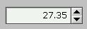
The PtNumericInteger class lets the user specify integer values between given minimum and maximum values. The PtNumericFloat class lets the user enter floating-point values.
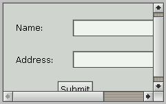
A container widget is a powerful and convenient interface tool that holds other widgets and manages their layout. Containers are used extensively in most Photon applications.
Windows are the main application containers. The main UI components (menu bars, toolbars, etc.) appear with the window widget. The widget automatically handles all the necessary interactions with the Photon Window Manager (PWM) — all you need to specify is what should and shouldn't be rendered or managed.
The group widget is a very powerful widget that manages the geometry of all its child widgets. It can align the widgets horizontally, vertically, or in a matrix. The widget also provides attributes that let you specify whether the children should be stretched to fit the group if it's resized larger due to anchoring.
The panel group widget is a container for panels, a useful element for organizing data in dialogs. Besides managing the geometry and layout of panels, PtPanelGroup also provides two selection modes to switch between panels: multiple-tab selection (each panel has its own tab to select) and single-tab selection (clicking the tab pops up a menu to select other panels).
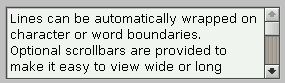
The PtScrollContainer widget is a very powerful widget that provides a viewport into a potentially larger container. You can place any number of widgets inside a scroll container and it will automatically display a scrollbar if the widgets are contained within the viewable area. PtScrollContainer widgets could be used to implement a text file viewer, wordprocessor, customized list display, and so on.
To scroll child widgets quickly, the scrolling area widget uses a hardware blitter (provided the underlying graphics driver supports it).
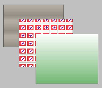
The background widget provides a way to create fancy background displays, from simple color gradations to tiled textures. This widget can handle just about any background requirement.
Armed with Photon's rich set of widgets, developers can build practically any graphical application imaginable. Here are some of the more powerful widgets at your disposal:

Photon has a widget for every menu-related requirement. There's a widget to simplify the creation of a standard menu bar. The menu widget handles the pop-up display, press-drag-release, point and click, keyboard traversal, and selection of menu items. The menu button widget is used for creating individual menu items.

This container holds buttons, labels, images, whatever widgets you wish, and aligns them either vertically or horizontally in a toolbar. The toolbar group widget lets you combine a toolbar with a menu bar to create a very flexible access element for your applications.
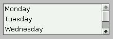
The list widget is a very powerful widget that manages a list of items. It provides many different selection modes, including single selection, multiple selection and range selection. The list widget also supports multi-columned lists through the use of a divider widget (PtDivider).
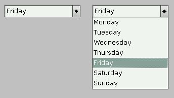
The pulldown list widget combines the PtText widget (for text input) with a pulldown button for displaying a list widget. When the user selects from the list, the text widget is automatically updated with the current selection. The pulldown list widget is very useful for displaying a list of items using a small space. Dialogs and containers use a lot less screen real-estate, which is important in embedded environments.
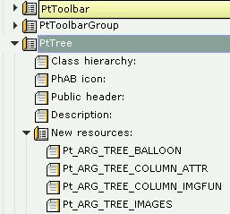
The tree widget is similar to the list widget — in fact they both have the same ancestors. The main difference is that the tree widget displays the items in a hierarchical manner. Items, called branches, can be expanded or collapsed; any number of tree branches can be created. Each branch can define its own unique image to display. Trees are useful because they display information in a very logical manner.
Photon applications that use the tree widget include the File Manager (directory display), PhAB (widget layout), Helpviewer, and many others.
A terminal widget creates and manages an entire text-mode terminal inside a widget. Just drop it into your application and you've created your very own pterm (Photon's terminal application).
The terminal widget doesn't stop there — it also provides complete cut-and-paste functionality and quick-launch help by highlighting any text within the widget.
This powerful widget manages its children in a unique and useful way. When you place two or more widgets inside a divider widget, it automatically puts little separators in between the child widgets. Using these separators, the user can drag back and forth, causing the child widgets on either side of the separator to be resized. This is very useful for creating resizable column headings for lists. In fact, if you drop a divider widget into a list widget, it will automatically turn your simple list into a resizable multi-column list.
Dividers aren't limited to just labels or buttons. Any widgets can be placed inside to create side-by-side resizable trees, scroll areas, and so on.
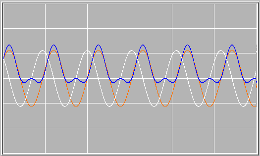
Realtime systems often require trend graphs. Photon comes with a trend bar widget, PtTrend, that supports the display of multiple trend lines simultaneously. If your graphics hardware supports masked blits, it can even smooth-scroll the trend across grid lines. The PtMTrend widget has additional features, such as a trace line, which make it appropriate for medical applications.
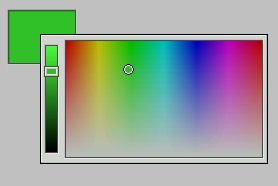
Photon provides several handy controls for building color-selection dialogs. This convenient set of widgets includes PtColorPanel, a compound widget that provides several ways to easily select a color.
The PtWebClient widget is used to start, interact, and control a web browser. The widget also provides a user-defined area within the application for the server to format and display web pages.
The application controls the server by setting widget resources. The server communicates status information and user interaction back to the application using the widget callbacks. The PtWebClient widget transparently supports the version of HTML that the server supports.
Once a widget has been created, you can take advantage of Photon's convenience functions to easily set up dialogs and control the widget.
Here are some examples of common dialogs created using the following convenience functions in Photon's widget toolkit:
For more information about these functions, see the Photon Library Reference.
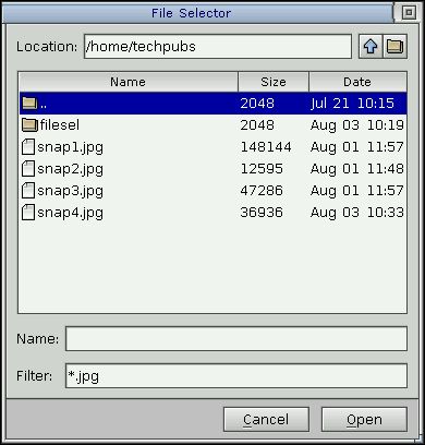
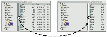
The PtFileSelection() function incorporates a tree widget that displays files, directories, links to files or directories, and custom entries. Besides selecting a particular file in response to an application prompt, users can also navigate an entire filesystem and choose their own file and directory.
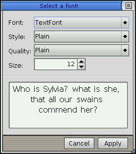
To accommodate the wide selection of fonts available, Photon provides a handy font-selector. The dialog displays a list of all available fonts and allows the user to choose the typeface and style (bold, italic, etc.) and to indicate whether the font should be anti-aliased.
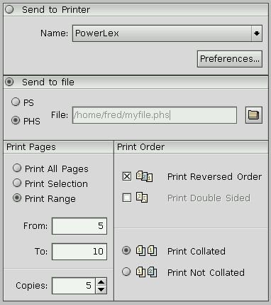
The print selector lets a user select a printer or control its properties. The user may also select a range of pages as well as the number of copies to print.
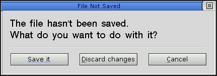
This modal dialog is useful for informing the user of some significant event and waiting for a response (e.g. clicking a button).
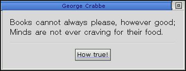
This dialog can display a message that may or may not require a response. This type of dialog often contains an “OK” button for the user to acknowledge the notice.
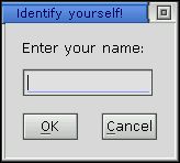
Like the alert dialog, the prompt dialog displays a message that requires the user to respond, but it also provides a field for inputting text within the dialog.
As a product geared towards developers, Photon offers all the tools needed to build high-performance, accelerated graphics drivers that can be readily tailored for particular graphics cards and chipsets.
Developers will be able to create drivers that support advanced graphics techniques (e.g. alpha-blending or chroma-key substitution) through a software-only approach, a perfect fallback for “simple” hardware that doesn't directly handle such techniques.
The Photon graphics driver development kit provides full source code for several sample drivers as well as detailed instructions for handling the hardware-dependent issues involved in developing custom drivers.
Photon represents a new approach to GUI building — using a microkernel and a team of cooperating processes, rather than the monolithic approach typified by other windowing systems. As a result, Photon exhibits a unique set of capabilities:
|
|
|
|