![[Previous]](prev.gif) |
![[Contents]](contents.gif) |
![[Index]](keyword_index.gif) |
![[Next]](next.gif) |
|
|
|
|
 |
This version of this document is no longer maintained. For the latest documentation, see http://www.qnx.com/developers/docs. |
A superclass of basic resources for most widgets
PtWidget --> PtBasic
Immediate subclasses:
For more information, see the diagram of the widget hierarchy.
<photon/PtBasic.h>
The PtBasic superclass provides basic resources for all widgets. It provides the fundamental callbacks for:
Also, PtBasic supports:
and provides resources for:
PtBasic defines some callback resources for actions involving the left pointer button. These callbacks are invoked only if the widget has Pt_SELECTABLE set in its Pt_ARG_FLAGS (see PtWidget).
| When you: | The widget becomes: | Callback invoked: |
|---|---|---|
| Press the left pointer button while pointing at the widget | Armed | Pt_CB_ARM |
| Release the left pointer button while pointing at an armed widget | Activated | Pt_CB_ACTIVATE |
| Release the left pointer button when the pointer is outside an armed widget | Disarmed | Pt_CB_DISARM |
 |
|
If you hold down the left pointer button, the widget's Pt_CB_REPEAT callbacks are invoked.
PtBasic also defines an action involving the right pointer button: when you press the right pointer button while pointing at a widget, the widget's Pt_CB_MENU callback list is invoked.
In order for this action to occur, the widget must have must have Pt_MENUABLE set and Pt_ALL_BUTTONS cleared in its Pt_ARG_FLAGS resource; the widget doesn't have to have Pt_SELECTABLE set. Pt_CB_MENU is invoked only when the pointer button is pressed, not when the button is released or held down.
|
If the widget has Pt_ALL_BUTTONS set in its Pt_ARG_FLAGS resource, the actions for all pointer buttons are those for the left button. |
PtBasic defines resources that give you full control over the widget's colors, shadings, and borders.
A widget's border is made up of various components, all of which are optional; set the bits in Pt_ARG_BASIC_FLAGS to indicate which components to display. These components, going from outside to inside, are:
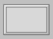
A widget displaying all the border components.
The color of the bevel is the same as the widget's fill color unless overridden by Pt_ARG_BEVEL_COLOR. The bevel is shaded according to Pt_ARG_BEVEL_CONTRAST, which is used to calculate the default values of Pt_ARG_DARK_BEVEL_COLOR and Pt_ARG_LIGHT_BEVEL_COLOR. You can override the contrast by setting the light and dark bevel colors explicitly. By default, the upper left corner of the bevel is a gradient that goes from the light bevel color to the light fill color. The lower right bevel goes from the dark fill color to the dark bevel color.
If you set Pt_STATIC_BEVEL_COLORS in Pt_ARG_BASIC_FLAGS, the bevel color doesn't change when you set Pt_ARG_FILL_COLOR.
You can display a full (i.e. half-round) bevel by setting Pt_FULL_BEVELS in Pt_ARG_BASIC_FLAGS:
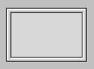
A widget displaying a half-round bevel.
You can use Pt_ARG_FILL_COLOR to specify the widget's fill color. These bits in Pt_ARG_BASIC_FLAGS affect the fill:
You can specify the amount of contrast between the light and dark fill colors by setting Pt_ARG_CONTRAST. If this resource doesn't give you the look you want, you can override it by setting Pt_ARG_DARK_FILL_COLOR and Pt_ARG_LIGHT_FILL_COLOR explicitly.
Pt_ARG_COLOR specifies the foreground or drawing color.
|
Setting Pt_ARG_FILL_COLOR overrides any previous setting of Pt_ARG_DARK_FILL_COLOR, and Pt_ARG_LIGHT_FILL_COLOR. If Pt_STATIC_BEVEL_COLORS isn't set in Pt_ARG_BASIC_FLAGS, the new fill color also overrides Pt_ARG_BEVEL_COLOR, Pt_ARG_DARK_BEVEL_COLOR, and Pt_ARG_LIGHT_BEVEL_COLOR. |
| Resource | C type | Pt type | Default |
|---|---|---|---|
| Pt_ARG_BANDWIDTH_THRESHOLD | unsigned long | Scalar | 0 |
| Pt_ARG_BASIC_FLAGS | unsigned long | Flag | Pt_ALL_ETCHES | Pt_ALL_BEVELS | Pt_ALL_OUTLINES | Pt_FLAT_FILL |
| Pt_ARG_BEVEL_COLOR | PgColor_t | Scalar | Pg_LGREY |
| Pt_ARG_BEVEL_CONTRAST | char | Scalar | 75 |
| Pt_ARG_COLOR | PgColor_t | Scalar | Pg_BLACK |
| Pt_ARG_CONTRAST | char | Scalar | 20 |
| Pt_ARG_DARK_BEVEL_COLOR | PgColor_t | Scalar | Set internally |
| Pt_ARG_DARK_FILL_COLOR | PgColor_t | Scalar | Set internally |
| Pt_ARG_FILL_COLOR | PgColor_t | Scalar | Pg_LGREY |
| Pt_ARG_FILL_PATTERN | PgPattern_t | Struct | Pg_PAT_FULL |
| Pt_ARG_HIGHLIGHT_ROUNDNESS | unsigned char | Scalar | 0 |
| Pt_ARG_INLINE_COLOR | PgColor_t | Scalar | Pg_DGRAY |
| Pt_ARG_LIGHT_BEVEL_COLOR | PgColor_t | Scalar | Set internally |
| Pt_ARG_LIGHT_FILL_COLOR | PgColor_t | Scalar | Set internally |
| Pt_ARG_MARGIN_HEIGHT | unsigned short | Scalar | 0 |
| Pt_ARG_MARGIN_WIDTH | unsigned short | Scalar | 0 |
| Pt_ARG_OUTLINE_COLOR | PgColor_t | Scalar | Pg_WHITE |
| Pt_ARG_STYLE | See below | Complex | |
| Pt_ARG_TRANS_PATTERN | PgPattern_t | Struct | Pg_PAT_NONE |
| Pt_CB_ACTIVATE | PtCallback_t * | Link | NULL |
| Pt_CB_ARM | PtCallback_t * | Link | NULL |
| Pt_CB_DISARM | PtCallback_t * | Link | NULL |
| Pt_CB_GOT_FOCUS | PtCallback_t * | Link | NULL |
| Pt_CB_LOST_FOCUS | PtCallback_t * | Link | NULL |
| Pt_CB_MENU | PtCallback_t * | Link | NULL |
| Pt_CB_REPEAT | PtCallback_t * | Link | NULL |
| C type | Pt type | Default |
|---|---|---|
| unsigned long | Scalar | 0 |
PtBasic defines this resource but ignores any attempts to set it. It is overridden and used by some of PtBasic's descendents. In general, it defines a threshold below which a widget optimizes drawing on a system with a slow connection.
| C type | Pt type | Default |
|---|---|---|
| unsigned long | Flag | Pt_ALL_ETCHES | Pt_ALL_BEVELS | Pt_ALL_OUTLINES | Pt_FLAT_FILL |
This flag resource controls which "edge decorations" are rendered for a widget when it's highlighted (see Pt_ARG_FLAGS, defined by PtWidget). It gives you individual control over the rendering of the top, bottom, left, and right edges of a widget. It also gives you control over the fill type (flat or gradient) and several behavior elements with regards to the rendering of a widget's border.
Valid Pt_ARG_BASIC_FLAGS bits (applied only if the widget is also highlighted) control:
These convenience manifests make working with these bits easier:
These bits affect how the widget behaves when set (depressed) or unset (raised):
| C type | Pt type | Default |
|---|---|---|
| PgColor_t | Scalar | Pg_LGREY |
The main color of the bevel. See PgColor_t in the Photon Library Reference.
|
This value is automatically generated when you set Pt_ARG_FILL_COLOR. Setting Pt_ARG_FILL_COLOR overrides any values set previously via this resource. |
| C type | Pt type | Default |
|---|---|---|
| char | Scalar | 75 |
This value determines how much the dark and light bevel colors differ from the base bevel color (Pt_ARG_BEVEL_COLOR). The higher the value, the greater the difference:
The effect of this resource is visible only if the widget has bevels displayed (see Pt_ARG_BASIC_FLAGS).
| C type | Pt type | Default |
|---|---|---|
| PgColor_t | Scalar | Pg_BLACK |
The widget's foreground or drawing color. See PgColor_t in the Photon Library Reference.
| C type | Pt type | Default |
|---|---|---|
| char | Scalar | 20 |
This value determines how much the dark and light fill colors differ from the base fill color (Pt_ARG_FILL_COLOR). The higher the value, the greater the difference:
|
The effect of this resource is visible only if the widget is filled with a gradient (see Pt_ARG_BASIC_FLAGS). |
| C type | Pt type | Default |
|---|---|---|
| PgColor_t | Scalar | Set internally |
This resource, with Pt_ARG_LIGHT_BEVEL_COLOR, specifies the outermost colors used when applying a bevel to a widget. See Pt_ARG_BASIC_FLAGS to find out when gradients and borders are rendered for a given widget.
|
These values are automatically generated when you set Pt_ARG_FILL_COLOR. Setting Pt_ARG_FILL_COLOR overrides any values set previously via these resources. |
| C type | Pt type | Default |
|---|---|---|
| PgColor_t | Scalar | Set internally |
This resource, with Pt_ARG_LIGHT_FILL_COLOR, specifies the colors with which a gradient (if applied) starts and ends. These values are also used as the inner color for the bevels (i.e. the bottom bevel normally goes through a transition from Pt_ARG_DARK_BEVEL_COLOR to Pt_ARG_DARK_FILL_COLOR when a bevel is applied to the widget). See Pt_ARG_BASIC_FLAGS to find out when gradients and bevels are rendered for a given widget.
|
These values are automatically generated when you set Pt_ARG_FILL_COLOR. Setting Pt_ARG_FILL_COLOR overrides any values set previously via these resources. |
| C type | Pt type | Default |
|---|---|---|
| PgColor_t | Scalar | Pg_LGREY |
The base fill color for the widget. See PgColor_t in the Photon Library Reference.
This color is used as the base color when generating the Pt_ARG_BEVEL_COLOR, Pt_ARG_LIGHT_BEVEL_COLOR, Pt_ARG_DARK_BEVEL_COLOR, Pt_ARG_LIGHT_FILL_COLOR, and Pt_ARG_DARK_FILL_COLOR.
|
Setting this resource effectively overrides all values previously set for the LIGHT and DARK resources. This is like setting the chroma for a widget. |
If the widget uses a flat fill, that fill is Pt_ARG_FILL_COLOR. If the widget uses a gradient fill, the gradient runs from Pt_ARG_LIGHT_FILL_COLOR to Pt_ARG_DARK_FILL_COLOR. If the widget uses a bevel, it's rendered with color ranges as defined by Pt_ARG_LIGHT_BEVEL_COLOR to Pt_ARG_LIGHT_FILL_COLOR and Pt_ARG_DARK_BEVEL_COLOR to Pt_ARG_DARK_FILL_COLOR.
| C type | Pt type | Default |
|---|---|---|
| PgPattern_t | Struct | Pg_PAT_FULL |
The widget's background pattern. You can't edit this resource in PhAB.
| C type | Pt type | Default |
|---|---|---|
| unsigned char | Scalar | 0 |
The radius, in pixels, of the widget's borders. The default value of 0 results in square corners.
|
If you set this resource to a nonzero value, the widget library has to work with a nonrectangular widget. It might take longer to draw the widget, and you might notice some flickering. You can reduce the flickering by placing the widget inside a PtOSContainer. |
| C type | Pt type | Default |
|---|---|---|
| PgColor_t | Scalar | Pg_DGRAY |
The color of the inline of the border. See PgColor_t in the Photon Library Reference.
The inline is drawn if any of Pt_TOP_INLINE, Pt_BOTTOM_INLINE, Pt_LEFT_INLINE, and Pt_RIGHT_INLINE are set in Pt_ARG_BASIC_FLAGS.
| C type | Pt type | Default |
|---|---|---|
| PgColor_t | Scalar | Set internally |
This resource, with Pt_ARG_DARK_BEVEL_COLOR, specifies the outermost colors used when applying a bevel to a widget. See Pt_ARG_BASIC_FLAGS to find out when gradients and borders are rendered for a given widget.
|
These values are automatically generated when you set Pt_ARG_FILL_COLOR. Setting Pt_ARG_FILL_COLOR overrides any values set previously via these resources. |
| C type | Pt type | Default |
|---|---|---|
| PgColor_t | Scalar | Set internally |
This resource, with Pt_ARG_DARK_FILL_COLOR, specifies the colors with which a gradient (if applied) starts and ends. These values are also used as the inner color for the bevels (i.e. the bottom bevel normally goes through a transition from Pt_ARG_DARK_BEVEL_COLOR to Pt_ARG_DARK_FILL_COLOR when a bevel is applied to the widget). See Pt_ARG_BASIC_FLAGS to find out when gradients and borders are rendered for a given widget.
|
These values are automatically generated when you set Pt_ARG_FILL_COLOR. Setting Pt_ARG_FILL_COLOR overrides any values set previously via these resources. |
| C type | Pt type | Default |
|---|---|---|
| unsigned short | Scalar | 0 |
The amount of vertical space between the widget's canvas and the widget's border. The canvas is the valid drawing area of the widget and is inside all borders and margins.
| C type | Pt type | Default |
|---|---|---|
| unsigned short | Scalar | 0 |
The amount of horizontal space between the widget's canvas and the widget's border. The canvas is the valid drawing area of the widget and is inside all borders and margins.
| C type | Pt type | Default |
|---|---|---|
| PgColor_t | Scalar | Pg_WHITE |
The color of the outline of the border. See PgColor_t in the Photon Library Reference.
The outline is drawn if any of Pt_TOP_OUTLINE, Pt_BOTTOM_OUTLINE, Pt_LEFT_OUTLINE, and Pt_RIGHT_OUTLINE are set in Pt_ARG_BASIC_FLAGS.
| C type | Pt type | Default |
|---|---|---|
| See below | Complex |
The style to use for this widget instance. This resource is a complex one, so it requires special handling, as described below.
A style is a collection of override methods that can change how a widget looks and behaves. Styles can also add widget resources. For more information, see "Widget Styles" in the Managing Widgets in Application Code chapter of the Photon Programmer's Guide.
When setting this resource, the value is a character string that's the name of the style. For example:
PtSetResource( widget, Pt_ARG_STYLE, "MyStyle", 0);
Setting this resource has the same effect as calling PtSetWidgetStyle(). For more information, see the Photon Library Reference.
When you get the value of this resource, you get a pointer to a PtWidgetClassStyle_t structure. For example:
PtWidgetClassStyle_t *style = NULL;
...
PtGetResource( widget, Pt_ARG_STYLE, &style, 0);
|
Don't access the members of the PtWidgetClassStyle_t structure directly; call PtGetStyleMember() instead. |
| C type | Pt type | Default |
|---|---|---|
| PgPattern_t | Struct | Pg_PAT_NONE |
The widget's transparency pattern. You'll find this handy for "ghosting" widgets. You can't edit this resource in PhAB.
| C type | Pt type | Default |
|---|---|---|
| PtCallback_t * | Link | NULL |
A list of PtCallback_t structures that define the callbacks that the widget calls when it becomes activated. To activate a widget, you typically release the left pointer button while pointing at an armed widget.
|
These callbacks are invoked only if the widget has
Pt_SELECTABLE set in its
Pt_ARG_FLAGS.
PtText, PtMultiText, and PtComboBox have special versions of Pt_CB_ACTIVATE. |
Each callback is passed a PtCallbackInfo_t structure that contains at least the following members:
These callbacks should return Pt_CONTINUE.
If you multi-click on a widget, its Pt_CB_ACTIVATE callbacks are invoked once for each click. The callback data includes the click count (1 for the first click, 2 for the second, and so on).
If you want to process only the last of a series of clicks, use a Pt_CB_RAW callback to look for a Ph_EV_BUT_RELEASE event with a subtype of Ph_EV_RELEASE_ENDCLICK. For more information, see PhEvent_t in the Photon Library Reference.
|
The Ph_EV_BUT_RELEASE event with a subtype of Ph_EV_RELEASE_ENDCLICK occurs approximately half a second after the click, which could be annoying to the user. Most Photon applications don't use multiple clicks because of this. |
| C type | Pt type | Default |
|---|---|---|
| PtCallback_t * | Link | NULL |
A list of PtCallback_t structures that define the callbacks that the widget calls when it becomes armed. To arm a widget, you typically press the left pointer button while pointing at the widget.
Each callback is passed a PtCallbackInfo_t structure that contains at least the following members:
These callbacks should return Pt_CONTINUE.
| C type | Pt type | Default |
|---|---|---|
| PtCallback_t * | Link | NULL |
A list of PtCallback_t structures that define the callbacks that the widget calls when it becomes disarmed. To disarm a widget, you typically release the left pointer button when not pointing at an armed widget.
Each callback is passed a PtCallbackInfo_t structure that contains at least the following members:
These callbacks should return Pt_CONTINUE.
| C type | Pt type | Default |
|---|---|---|
| PtCallback_t * | Link | NULL |
A list of PtCallback_t structures that define the callbacks invoked when a widget gets focus or its focus status changes (e.g. a child widget gets focus from its parent or the focus switches from a child to its parent). You can call PtIsFocused() to find the current focus state of any widget.
Each callback is passed a PtCallbackInfo_t structure that contains at least the following members:
These callbacks should return Pt_CONTINUE.
|
Returning Pt_END doesn't make your widget refuse focus; if the widget doesn't want focus, it has to give focus to another widget by calling one of the focus functions described in the Photon Library Reference. |
| C type | Pt type | Default |
|---|---|---|
| PtCallback_t * | Link | NULL |
A list of PtCallback_t structures that define the callbacks that the widget calls when it loses focus.
Each callback is passed a PtCallbackInfo_t structure that contains at least the following members:
These callbacks should return:
Or:
| C type | Pt type | Default |
|---|---|---|
| PtCallback_t * | Link | NULL |
A list of PtCallback_t structures that define the callbacks that the widget calls when you press the right button while the pointer is on top of the widget.
|
The widget must have Pt_MENUABLE set and
Pt_ALL_BUTTONS cleared in its
Pt_ARG_FLAGS
resource.
The widget doesn't need to have Pt_SELECTABLE set in its
Pt_ARG_FLAGS for these callbacks to be invoked.
Pt_CB_MENU is invoked only when the pointer button is pressed, not when the button is released or held down. |
Each callback is passed a PtCallbackInfo_t structure that contains at least the following members:
These callbacks should return Pt_CONTINUE.
| C type | Pt type | Default |
|---|---|---|
| PtCallback_t * | Link | NULL |
A list of PtCallback_t structures that define the callbacks that the widget calls when it receives Ph_EV_BUT_REPEAT events. These events occur when you hold down the left pointer button (or the right pointer button if the widget has Pt_ALL_BUTTONS set in its Pt_ARG_FLAGS resource).
Each callback is passed a PtCallbackInfo_t structure that contains at least the following members:
These callbacks should return Pt_CONTINUE.
If the widget modifies an inherited resource, the "Default override" column indicates the new value. This modification affects any subclasses of the widget.
|
|
|
|